GCSE Photography Mock Exam: Order And Disorder
Create

Visit
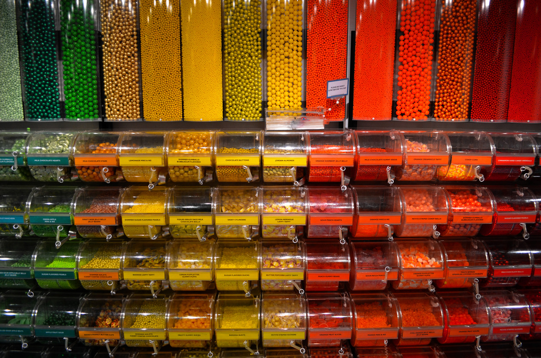
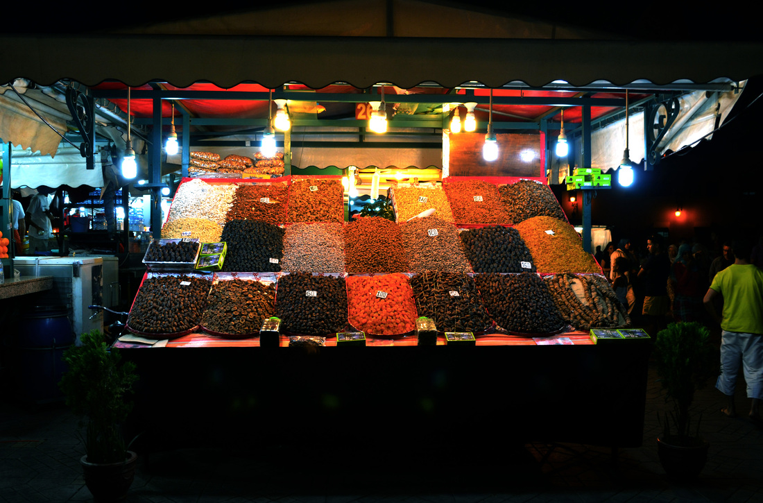
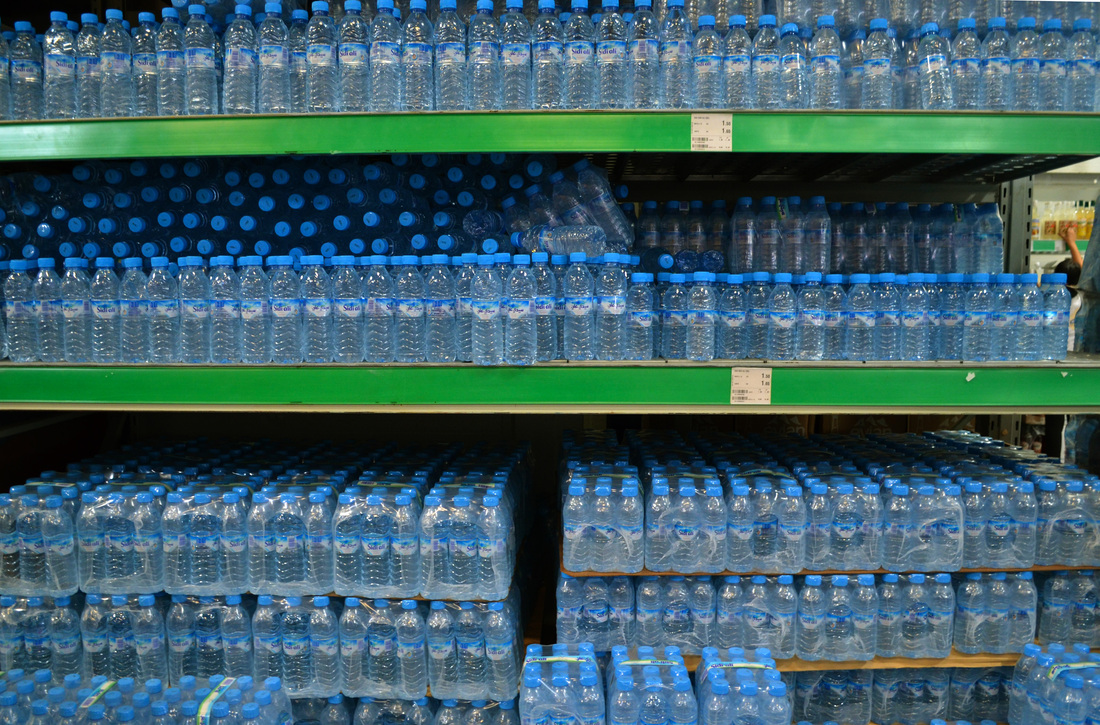
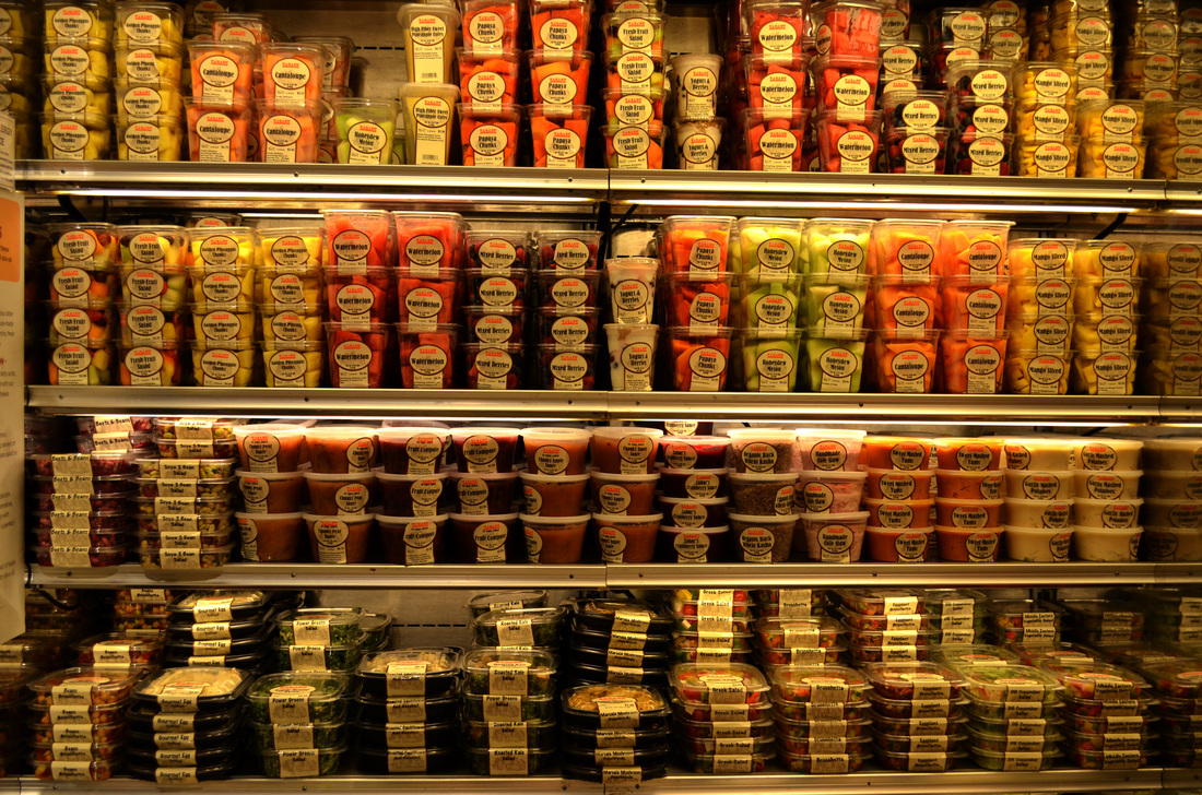
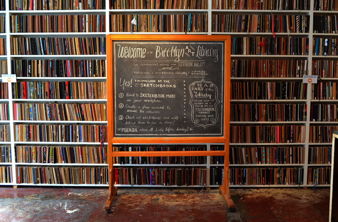
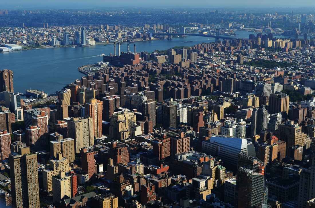
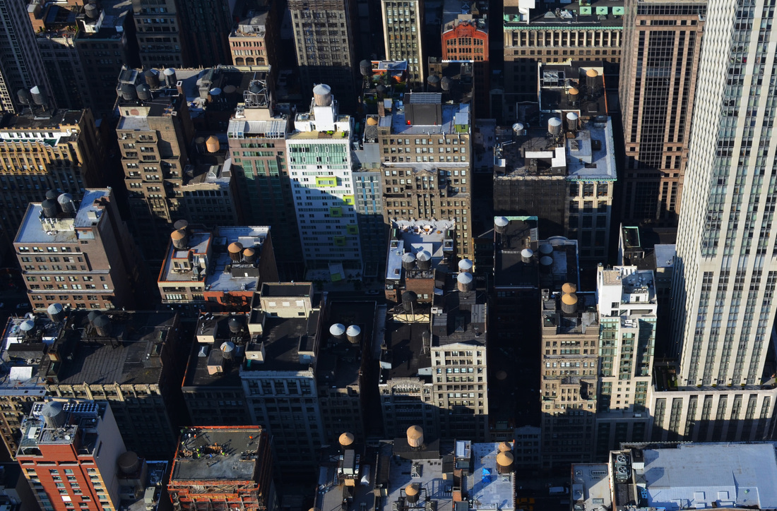
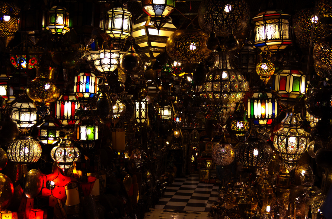
In the summer holidays I went on holiday to Marrakech in Morocco and New York City in America.
In the summer holidays I went on holiday to Marrakech in Morocco and New York City in America.
Sanaa - The New Museum New York
Here and Elsewhere
Here and Elsewhere is an exhibition of contemporary art from the Arab world. It has videos, installations, painting, drawing, sculpture and photographs from 45 artists. The exhibition explores the role of the artist in historical events and many of the artworks draw on recent events in the Arab world and conflict in some of the countries. Three of the artworks I found interesting are these.

A photographer called Hrair Sarkissian takes photographs of public squares in Syrian cities similar to the one where, as a child, he witnessed a criminal execution one day in the early morning. Syrian executions usually take place at 4.30am and then the bodies are left on view of the public until around 9.30 am. Sarkissian was 11 when he first saw a dead body hanging after execution whilst on his way to school. Haunted by this experience he says he aims to use his photography to erase the memory and confirm these bodies no longer exist.

Another really interesting piece was the video portraits by Bouchra Khalili that show the clandestine journeys of migrants seeking to enter Europe. The maps shown in the videos have lines being drawn on them showing the journeys taken by the migrants with a soundtrack explaining how they had to keep going back to a place or failed to get across a border. The journeys back and forth make you think about the time and effort involved and how life for some people is very different from ours.
|

Ziad Antar’s photographs are taken using expired film to look at photography’s relationship to history. The images are grey and not good quality as some of the film used was 30 or 40 years old, and the age of the film and the faded image makes you think about time passing and how photographs can record historical events.
|
Photograph
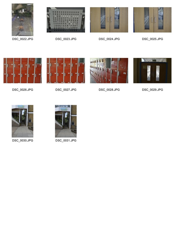
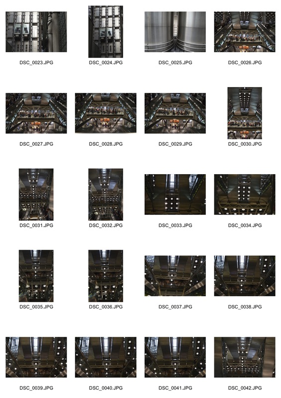
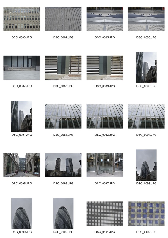
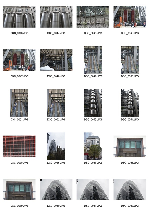
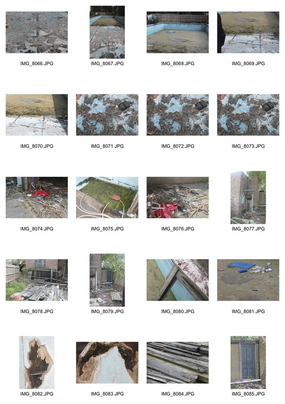
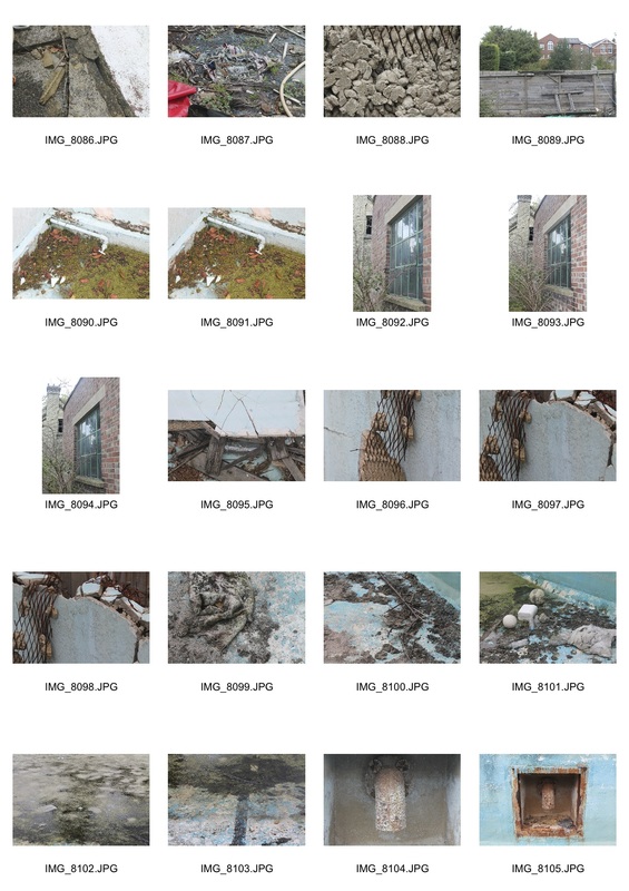
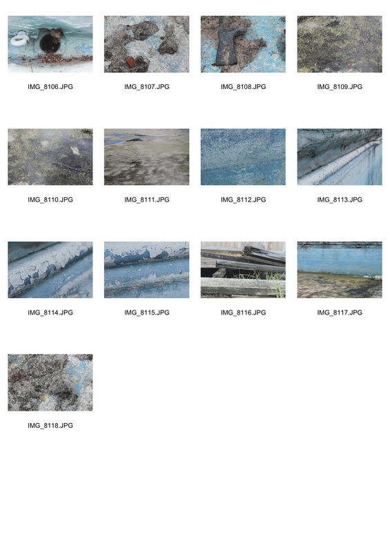
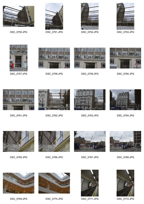
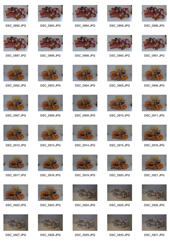
Whilst I was on holiday in New York and Marrakech I took some photos to show order and disorder. There was many different environments, objects etc which allowed me to show the theme of order and disorder in many varied ways. Here are my contact sheets:
Whilst I was on holiday in New York and Marrakech I took some photos to show order and disorder. There was many different environments, objects etc which allowed me to show the theme of order and disorder in many varied ways. Here are my contact sheets:
Selected photos
Order


|
|
Disorder

|
|
|

|
Analysis
I think my work went reasonably well as I showed order and disorder in a number of different ways. I tried to use my imagination to present order and disorder, however I think some of my work was lacking creativity. I also think I could show order and disorder in many more interesting ways. I intend to do this throughout this unit. My photographs were just straight forward views of order and disorder, but I want to explore different ways of illustrating the theme.
I think my work went reasonably well as I showed order and disorder in a number of different ways. I tried to use my imagination to present order and disorder, however I think some of my work was lacking creativity. I also think I could show order and disorder in many more interesting ways. I intend to do this throughout this unit. My photographs were just straight forward views of order and disorder, but I want to explore different ways of illustrating the theme.
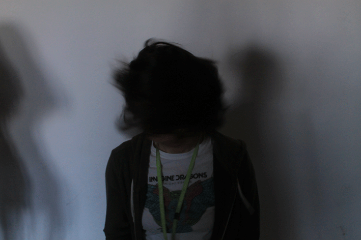
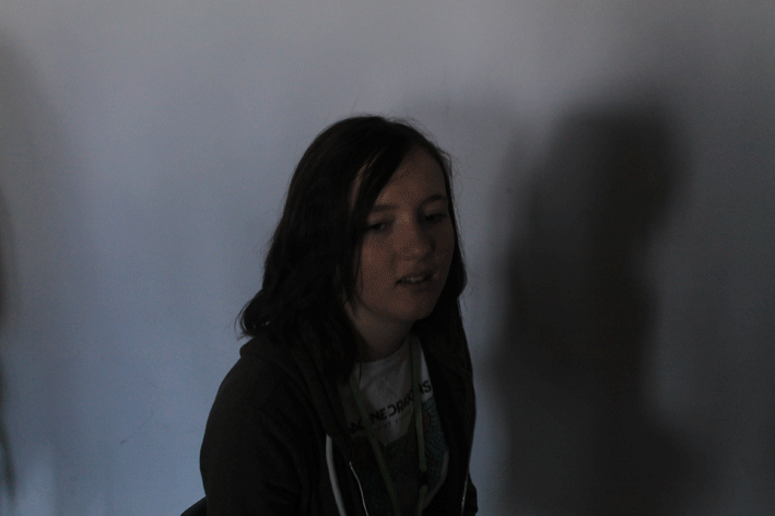
Disorder: Portrait GIFs
We creates GIFs on photoshop, here is the process I followed to create these GIFS.

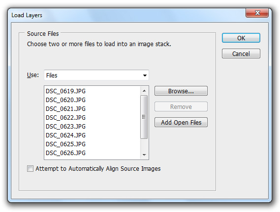
To open all the images needed for the GIF in one file I loaded them into a stack.
|
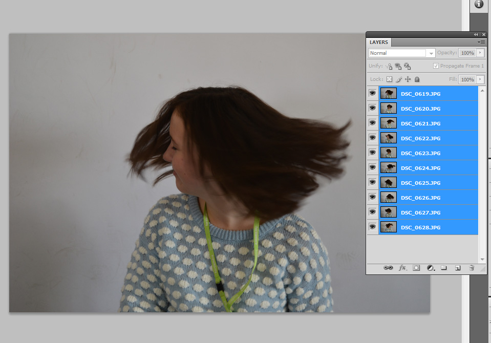
I selected the images that I needed.
|
Once they had all opened and were separate layers on the one GIF file, I selected all the layers.
|

By going layer > arrange > reverse, I could reverse the order of all the layers so the frames were in the correct order that I originally took the photos in.
|
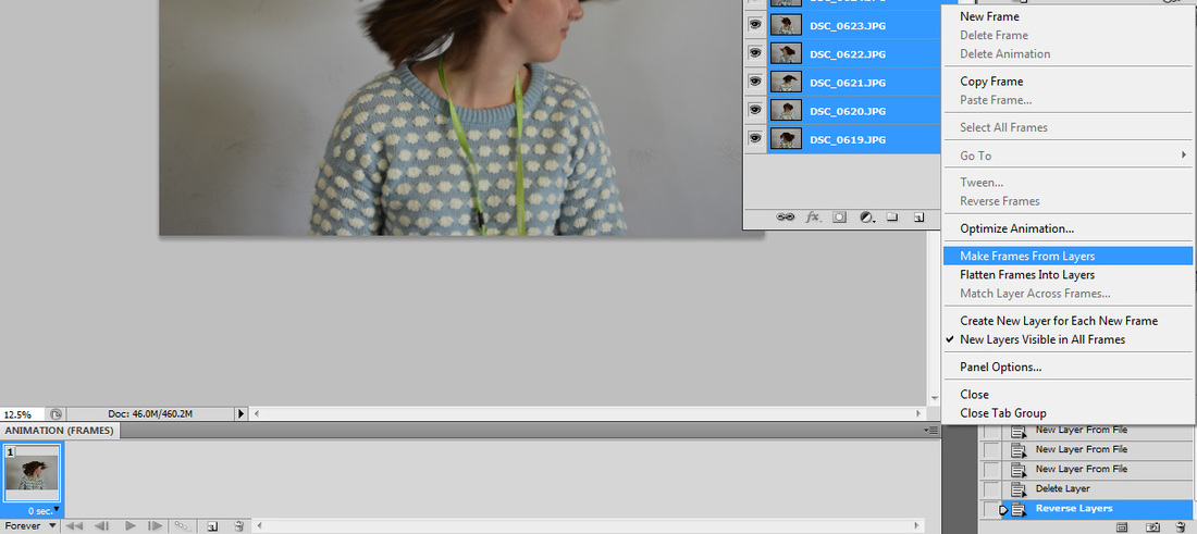
Then on the animation window I clicked "Make Frames From Layers" to put the layers into a GIF.
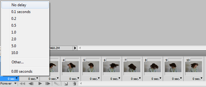
By clicking the arrow next to each frame, I changed the time to "No Delay" so the GIF was smoother.
|

I resized the GIF from 41.72cm to 10cm.
|

I saved via "Save for Web & Devices" so it saves as a moving GIF.
|
These GIFs did not work so well. There shadows do not look good and the image is too dark.
|
|
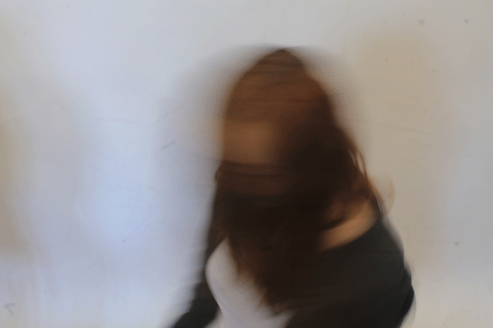
Development
I developed these by using a longer shutter speed. This meant that the individual frames were blurred and not as sharp as the photos taken with shorter shutter speeds. This creates more of a sense of motion.
This GIF is continuous, this is because she is spinning in a 360 degrees turn, which then repeats itself each time, making it continuous.
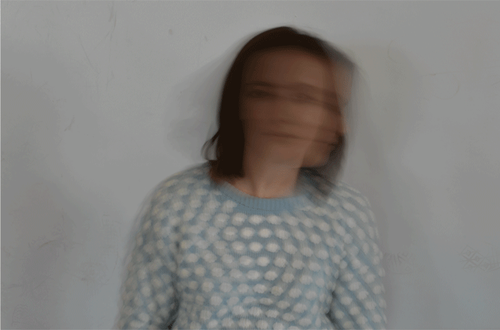
|
This GIF is the brightest out of my four selects, this is because I used a longer shutter speed. This also means she is more blurred.
On this GIF I used a lower ISO which meant although the frames were sharp, the image was still light.
|
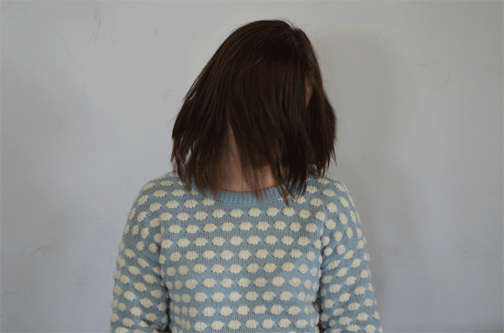
Disorder: Portrait 3D Effect
For this I was inspired by Leo Thomson.

Mise en Scene
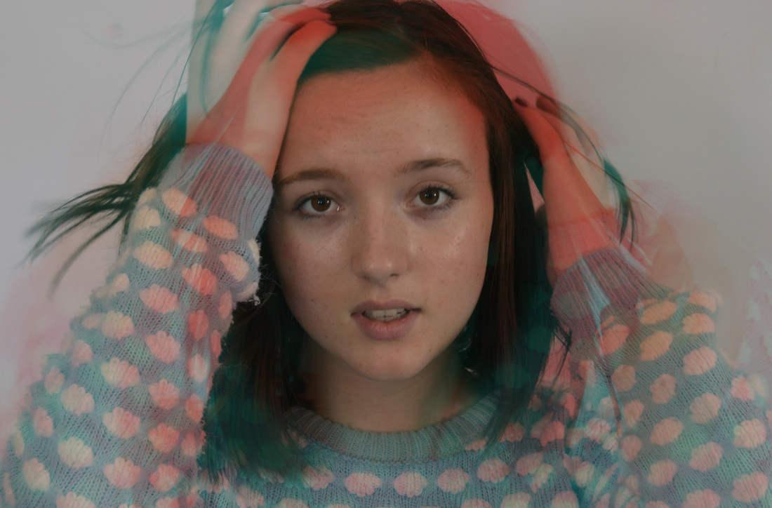
In the photograph the image is made up of three overlapping images of a girl from the waist up, all in slightly different colours. It looks like the picture has been printed incorrectly with the different layers not lined up. The effect it gives is one strong central image with a sort of shadowing effect. The layers also give the feeling of movement, as if the girl has moved quickly and her blurred image been caught on camera with a memory of where she was before. Key words Blur, ghostly, colour, shadow Process On Photohop. By duplicating the original layer three times and changing the colour of each layer in the blending options. Then moving each layer a very small amount to each side. What ideas do I take from the artist? I like the idea of manipulating an image to make something that isn’t really there. Also to make a sort of other worldly, ghostly image that conjures up ideas. |

Mise en Scene
The second image is a boy with his eyes shut and we see his face, repeated in slightly different colours. This is different from the image of the girl as the shadow are just to one side and the right hand side of his face is sharp. In the photograph there are different layers not lined up and similar to the image of the girl there is one strong central image with a sort of shadowing effect. The layers here do not give so much of a feeling of movement, maybe because it is a close-up and the eyes are shut. It looks as if the boy is ghostly or maybe dreaming. Key words Thought, dreams , layers Process Same process as last photograph. What ideas do I take from the artist? I like the idea of using a face, like a portrait but changing it to express other feelings. Also to make an image that allows lots of different interpretations. |

Mise en Scene
The third image looks like a plastic model of a baby’s head. It looks quite gruesome because the colours are stronger and the main image is in red. It could almost be inside someone’s head. Like the image of the boy on side is sharp and one side is a repeating overlapping image. It looks like shadows or memories of a previous state. You cannot see if the eyes are open or not but something about this image is quite unsettling. Maybe because it is a baby you attach feelings to it and this affects the way the viewer reacts. Key words Blood, organic, corpse, inside Process Same process as last photograph. What ideas do I take from the artist? I like the idea of using stronger colours. Also using an image of a model of a face rather than a real face, It is also interesting to create feelings in the viewer by the choice of face – they will react differently to a baby or a grown-up, or a boy to a girl and so on. |
Comparing my work to the Artists' work
|

|
In Thomsons' work he created a more prominent 3D effect. You can see the individual layers a lot more, this makes the 3D effect quite striking. Also the colours he used are quite similar. In my work the 3D effect is more subtle. I only moved the coloured layers on Photoshop a small amount, this meant the photo itself could look quite ordinary if you were just to glance at it. Another difference is that I used colours which were very different to the original colour of the image, this means you can see the 3D effect clearer. Also in my work hair was covering her face because the photo was taken as the girl moved. This creates a sense of motion and movement. In Thomsons' work the image is more peaceful and stationary. This effect is created by the face being the main subject in the frame, the models' eyes being closed and the photo not being taken as he moved.
My response
How I created a 3D effect in Photoshop:
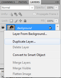
I duplicated the background layer.
|
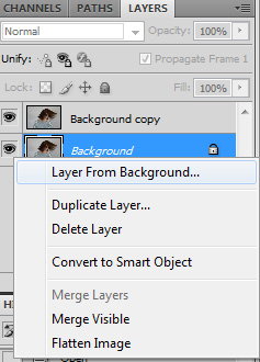
I then made a layer from the background, which was not locked. Then I duplicated this again, so I had three identical unlocked layers.
|

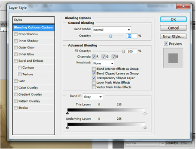
I right clicked each layer to edit the "Blending Options".
|
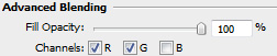
I disabled the blue channel for the top layer.
|
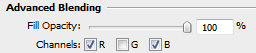
I disabled the green channel for the second top layer.
|
Using the move tool I moved the top layer a small amount to the right. This exposed the second lower layer, so you could see the yellow colour on the left and the blue colour on the right.
|
Here are the photos I edited using this technique:

|

|

|

I liked the idea of flicking hair because added dimension to the photo and helped create a good 3D effect. By being able to see individual clumps of hair, the colours were emphasised.
|

This is more blurred than the others, this creates a more abstract effect. I liked how this looked, but I think the other photos were the image is sharper look better.
|
Development
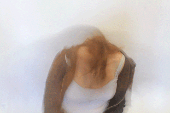
On these photos, I placed two different photos on top of each other. These photos taken only a few seconds apart. Then I disabled a different colour channel for each layer, instead of duplicates of the same layer. Using two images meant that the 3D effect was more striking because instead of just having the sides of the girl coloured, her whole face/body was changed. This creates a sense of motion.
On these photos, I placed two different photos on top of each other. These photos taken only a few seconds apart. Then I disabled a different colour channel for each layer, instead of duplicates of the same layer. Using two images meant that the 3D effect was more striking because instead of just having the sides of the girl coloured, her whole face/body was changed. This creates a sense of motion.

|
On this photo, I erased her face on the second layer, so it looks like only her hands were moving.
|
Order: Symmetry
I was inspired by Sasha Levin

Mise en Scene
In the photograph there are three escalators with a man standing in the centre of the middle one. The escalators fill the bottom section of the frame. The roof of the building is in the top section of the frame. The whole photography is symmetrical and the square shape emphasizes the symmetry. The single figure in the photograph almost makes it look like a portrait and even though there are escalators there is no movement in the photograph, contrasting with the photograph on the right where there are people on escalators. It looks like time standing still. Key words Poise, statue, parallel, portrait Process Levin has used a tripod to accurately position the camera. This has meant that the photo can be taken with complete symmetry. They may have also used lights to create symmetrically light the subject. They may have also cropped the photo. What ideas do I take from the artist? I like the idea of using a person in the centre of the frame. I think it effectively draws your eye into the image. I also like the idea of using sets of three and creating symmetry. |

Mise en Scene
In this photograph there are two boys pictured below an underpass or bridge; again symmetry plays an important part in the composition. The structure is almost symmetrical, though with variations in lighting, shadow and background. The scale of the structure is overbearing, making the figures look tiny and given their size they would look insignificant, but the setting and in particular the perspective of the underpass as it goes into the distance, focuses the viewer’s attention on the figures. As you look at the figures it becomes apparent that they are in the middle of an action or just about to move. Even though they are still they bring a strong feeling of movement and anticipation. Process The process is similar to the previous picture however the colours have been adjusted to give it a grey look. The use of strong shadows is important to the composition of the picture. Keywords concrete, power, overbearing, anticipation, grey What ideas do I take from the artist? The contrast of people and background and how that can be used to create an effect is interesting. I also like the idea of using perspective to give depth and to emphasize an effect. |

Mise en Scene
Perspective and symmetry also play an important part in this photograph. The composition is almost symmetrical and in a way the symmetry is used to emphasise the lack of symmetry that comes from the up and down escalators, with people traveling up on one side and going down on the other. This also gives the picture a sense of movement The order that the picture exhibits makes the people look like they are parts of a machine or a bigger organisation of some sort where everyone has to do the same or is controlled in some way. This order is broken by the two boys on the up escalator looking across so you see them in profile rather than just their backs, also by the occasional flash of colour in the overall greyness of the photograph. Keywords control, movement, people, authority, soldiers Process The process is the same as the previous pictures, however in this photograph he may have adjusted the tone and contrast of the colours to emphasis the people against the grey background What ideas do I take from the artist? Using crowds of people is interesting and playing with the idea of whether they are moving or not. I also like the idea of having a sort of washed out colour overall with a flash of brightness. Maybe also having someone looking in a different direction to everyone else in a crowd. |
My response
|
|
|
Selects

|

|

|

|

|
I liked how these turned out, but I think they could have been more effective if I had used people like how Levin did. For example having people walking on the two photos on the right. Some of these photos are not completely symmetrical which does not look as good.
Order: Photoshopped Symmetry
Sometimes it can be difficult to have perfect symmetry, so on these photos I used Photoshop to create the symmetry.
|
Original image.
The image is not symmetrical. 
|
Flipped once.
This means only the left and right side are symmetrical. 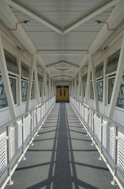
|
Flipped twice.
This makes me the bottom and the top symmetrical with each other. 
|
Order: Architectural
This was also inspired by Sasha Levin.
This was also inspired by Sasha Levin.
|
|
|
Selects

|

This photo is not only symmetrical it is also very ordered. The roof creates a sense of order and sequence.
|
Comparing my work to the Sasha Levin's work
I liked the idea of using different types of lines to show order. I think the curved lines and straight lines work really well in Levin's work to show order and symmetry. I recreated this in my work with the lines on the roof and the symmetric handrails. We both also used light to create symmetry. I really like how the lights create a blurred brightness across the roofs of both our photos. We also both did not have complete symmetry by having people on either sides of the photo. I think instead of losing the symmetry, this emphasises it because you realise how normal the photos are and how the symmetry can often be over looked.
I liked the idea of using different types of lines to show order. I think the curved lines and straight lines work really well in Levin's work to show order and symmetry. I recreated this in my work with the lines on the roof and the symmetric handrails. We both also used light to create symmetry. I really like how the lights create a blurred brightness across the roofs of both our photos. We also both did not have complete symmetry by having people on either sides of the photo. I think instead of losing the symmetry, this emphasises it because you realise how normal the photos are and how the symmetry can often be over looked.

Sasha Levin's work
|

My work
|
Here are my selects.


I used Photoshop to flip this image to perfect the symmetry.

|


|

|

The escalators here are very symmetrical which contrasts with the people who are not symmetrical. I like this effect because it emphasies the architectural symmetry,
|
Exhibition Visit
Walead Beshty exhibition at the Barbican December 2014
A partial dissembling of an invention without a future.
Walead Beshty exhibition at the Barbican December 2014
A partial dissembling of an invention without a future.


|
What is it and how is it made?
This is an exhibition using 12000 cyanotype prints made over the course of a year. The prints were made with discarded paper coated in UV sensitive cyanotype chemistry and an object from the artist's studio was places on top and the print exposed. They are displayed in chronological order and cover the entire wall of a large gallery space. The exhibition is interesting because the artwork that is displayed is made up of many images. These are all similar in that they are blue cyanotype prints but are of different objects. They have been sized and placed on the wall to fit together in an order though there is disorder in the images. Is this order or disorder? The overall effect is one of order at first glance because all the prints are similar and arranged in a neat pattern. However when you look closer you realise that every single one is different which makes it seem more disordered. Not only are they different images but they are printed on different backgrounds. Some are on newspaper and you can read the newsprint behind the image, others are on leftover pieces of paper and cardboard with labels and notes. The time line is also interesting as that is part of the work. They are laid out in date order and you can see that if you look at the newspapers but you may not know. Knowing the timing adds to the order of the arrangement. I find it interesting that you can see two contrasting themes within one work of art. |
Disorder: Water Droplets
These are some photographs of a process I decided to explore where I filled a balloon with water, burst the balloon and took a photograph with a fast shutter speed. I was trying to catch the moment the balloon burst and the water still held the shape. This is to illustrate order and disorder - the water is 'ordered' in the balloon shape for a tiny amount of time before it 'disorders'. This was an interesting experiment which resulted in these images.

|


|

|

|

|

|
Disorder: Rust
I was inspired by Colin Winterbottom. Here is some of his work that I was particularly inspired by.

Mise en Scene
This photograph is a close-up of a rust on piece of metal. The two things that are initially most striking are the colours and the shapes formed. By focusing on an area of rust in isolation to what is around it the photographer makes you see it in a different way. It is no longer just a rusty piece of metal but becomes beautiful and makes the viewer imagine what it might be. It looks like it could be a view of landscapes taken from in space maybe or a close up of some organic matter. The lighter colour stands out and looks like light striking the metal but might just be the colour of the material. As with some of the previous photographs the difference between what something actually is and what it looks like in the photograph is interesting and makes the viewer see something in a new way. Key words Bronze, organic, shapes, light Process The photo was taken using a macro lens. Lighting is also used to achieve the reflective and bright surface. This particular area was maybe chosen as it shows rough and smooth surfaces. What ideas do I take from the artist? I like the idea of using a close up of a familiar object to turn it into something unfamiliar and strange. Also to take something that is normally seen as unpleasant and make it beautiful as this makes you think you can find beauty in everything if you look in particular way. |

Mise en Scene
This photograph is also a close-up of a rust on piece of metal , but is a simpler form where the outer coating of something looks like it is peeling off. As with the previous photograph two things that stand out are the colours and the shapes. The range of colours is quite beautiful ranging from pink to brown and makes you think of autumn leaves or other organic matter. The shapes look interesting because this is just a small part of a larger scene and the detail looks like it is enlarged it makes the viewer focus on the shapes. The way that the photograph is composed is also interesting. It looks like it has been cropped to display the shapes and flakes of rust. The shape in the bottom left corner that sticks out is nicely placed in relation to the flaking pieces of rust and balances the image. Key words Coating, flakes, leaves, fragility Process The photo was taken using a macro lens. Th e image may have been edited to adjust the tones of the colours and this particular section possibly selected. What ideas do I take from the artist? As with the previous photograph I like the idea of using a close up of a familiar object to turn it into something unfamiliar and strange, but also beautiful. The photograph makes you think of other organic shapes and matter, The framing of the image is also used to emphasize the content. |
My response
|
|
|
Selects

I think this photo works well, the bright chipping paint contrasts with the greyish green on the piece of frayed cloth. This adds a feeling of aging to the photo because both the cloth and paint looks very worn out.
|

The blue paint looks very cheerful and happy when you first see it which is very different from the inside of the square shape. The pipe and the area around it look very grubby. This creates a strong sense of disorder because of the colours look joyous when you first see them, but then once you see how the paint is chipping and the rust of the pipe the photo looks distressed.
|

The cracked blue board and broken bits of would create a feeling of aging. The whole frame is filled with old items which emphasis the disorder.
|

There is a lot of emphasis on how chipped the paint is. My use of shallow depth of field brings the attention purely to the old paint. The layers of paint are different colours which adds to the feeling of age.
|
Disorder: Architectural
|
|
Selects
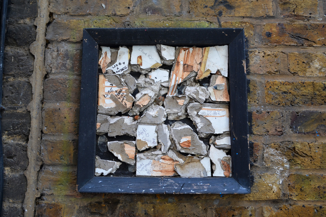
In this photo the broken up pieces of tile are very disordered. This contrasts with the black square frame which they are in.
|
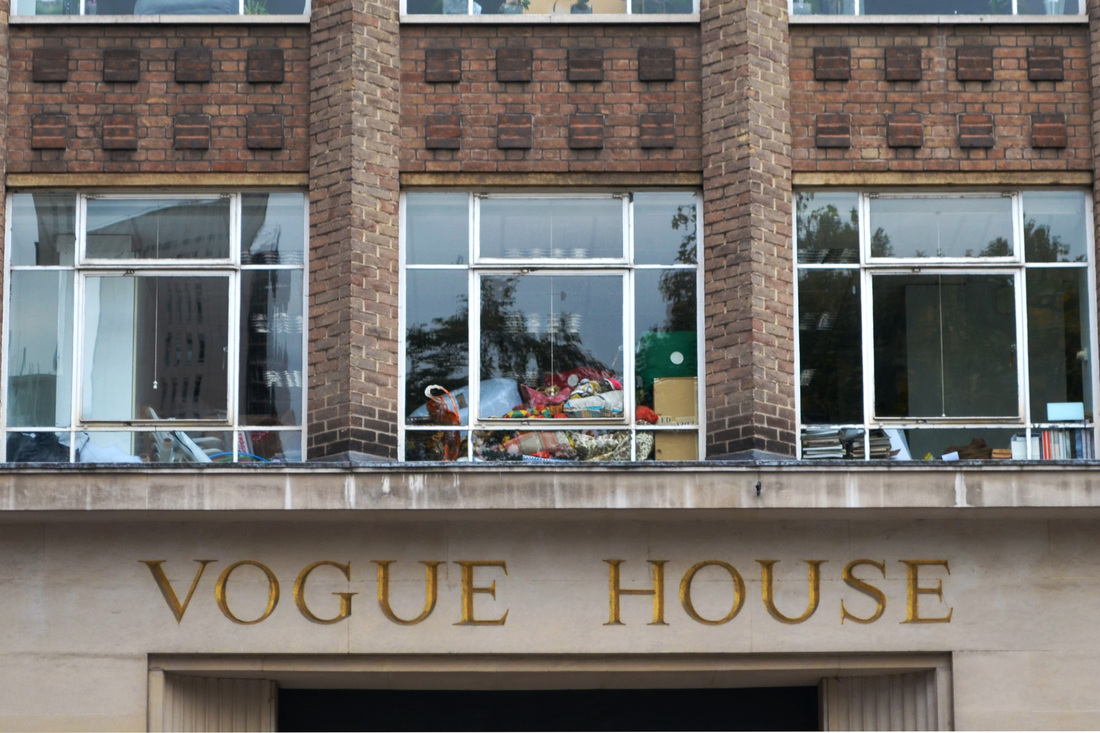
The name of the building, "Vogue House", would seem to be something very near and clean. However the untidy window above the name contrasts with this.
|
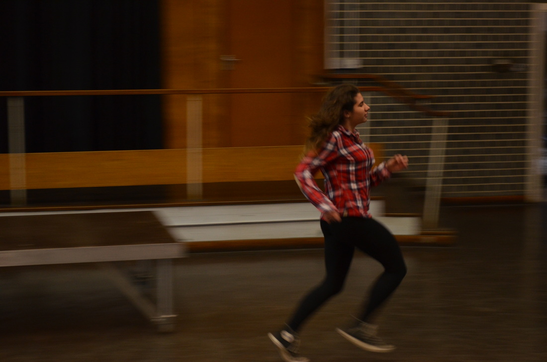
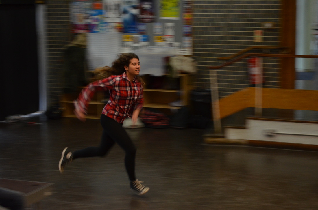
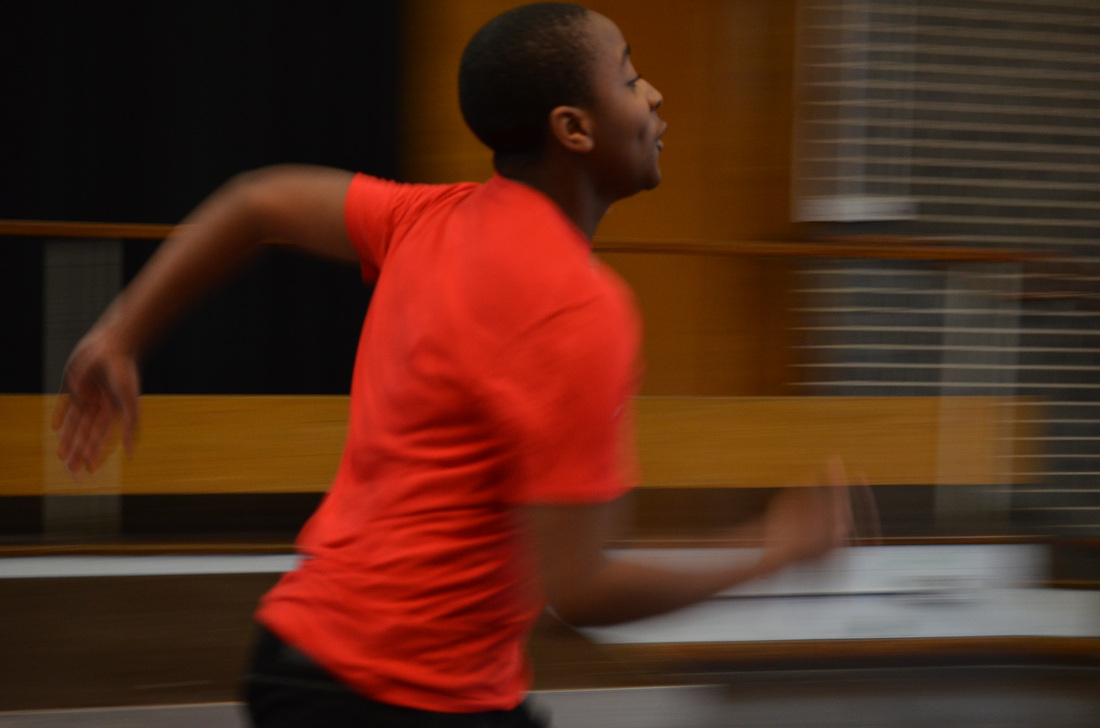
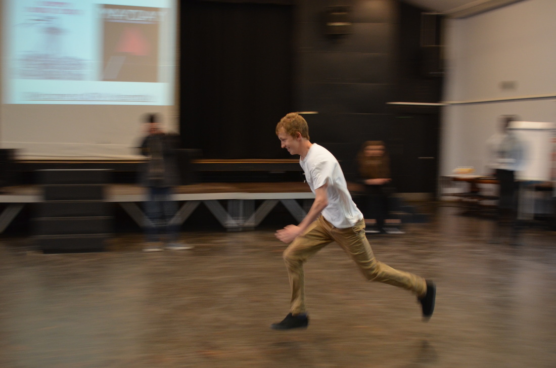
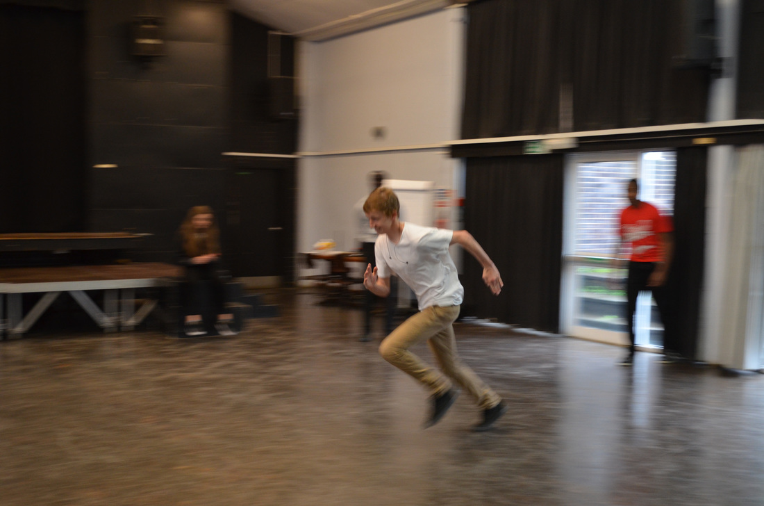
Disorder: Panning
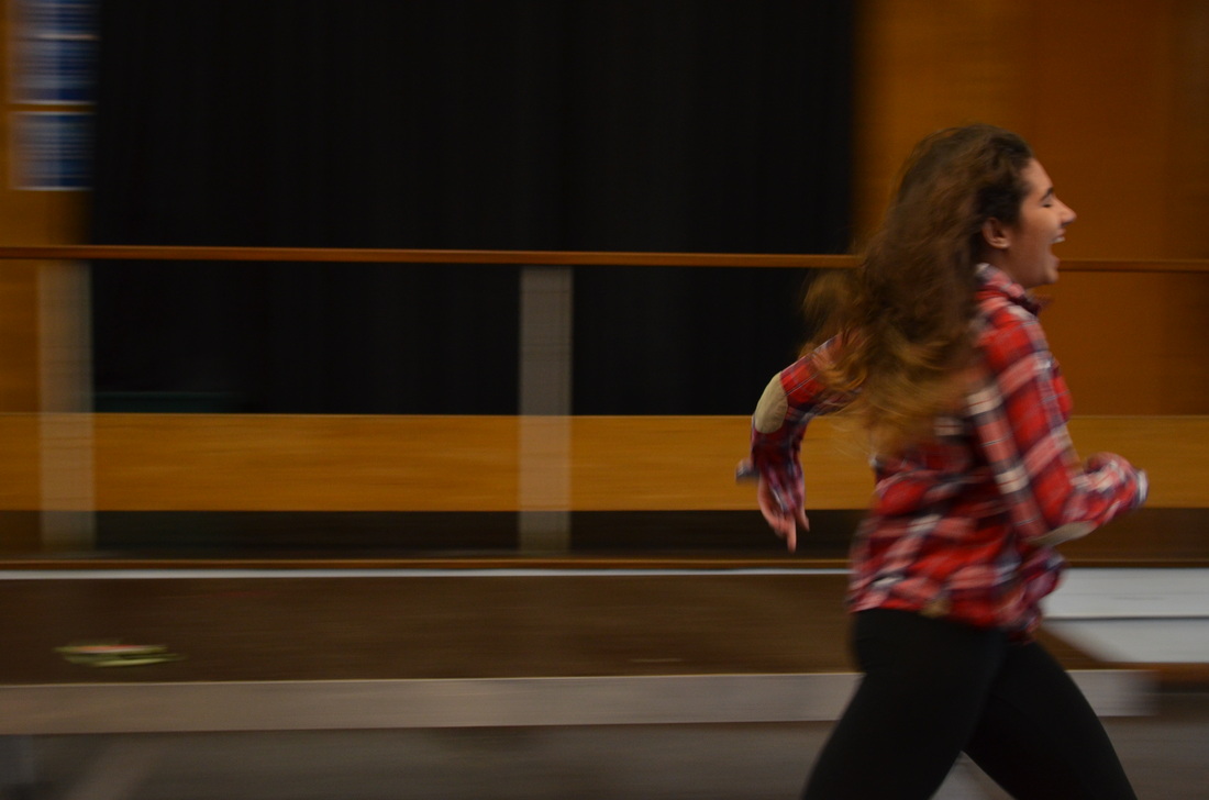
The shutter speed was 1/50 and the aperture was f/5.6.
We created the panning effect by using a long shutter speed and following the subject with the camera as they moved across the room. I found it worked better when the camera was very steady and the person running ran as fast as possible. This meant the background was more blurred.
The blurred background meant that the subject appeared sharper and clearer. It created a sense of disorder due to the lack of visibility and the disruption of a normal steady background.
|
|
|
|
|
|
Exhibition Visit: Horst
|
Haute Couture
Horst was one of the leading photographers of the 20th-century and is famous for his photographs of high fashion, Haute Couture and this exhibition shows more than 250 photographs from his long career. His photographs appeared in Vogue magazine and showed clothes made by famous designers of the time like Chanel and Schiaparelli, worn by famous models and actresses. His photographs show off the clothes very well and way that they are photographed is very striking. Horst also photographed the fashion designers including Coco Chanel stretched out on a sofa. |
Surrealism
The images in the exhibition show that Horst was influenced by Salvador Dalí and the surrealists. The models were photographed in a very artistic and stylised way, looking almost like paintings, often with a person on a plain background so the shapes and composition becomes very important. Horst also used symbols in his photographs like the Surrealists. Horst worked with Salvador Dali on his costumes for the Dream of Venus Pavilion, which was shown at the New York World Fair in 1939. |
Horst uses light and shade to create a dramatic photograph by contrasting darkness and light in the black and white image. He also creates a geometrical effect with the shapes made by the light and shadows.
Key words – shadow, sharp, pain, silk
|
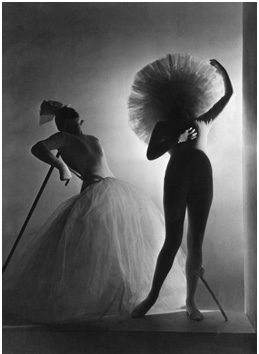
This image is a photograph of ballet costumes designed by Salvador Dali and photographed by Horst. The figures are portrayed almost like puppets in a stylised way where the shapes become more important than the actual people. The figure in the foreground is dark and creates a strong shape that seems to disintegrate toward the hat with no face or head visible. The figure in the background is leaning on a stick but also looks not human. This is surreal because the people are not shown as people but as shapes and the image looks dreamlike and not real.
|
|
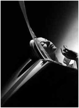
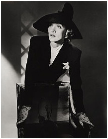
Stage and Screen
Horst was involved in art, fashion, theatre and high society and as one of Vogue’s star photographers he photographed many famous people. Many of the photographs are of stars of stage and screen, such as Rita Hayworth, Ginger Rogers and Marlene Dietrich in a black suit and hat. The settings in the photographs sometimes look like stage sets and his models look beautiful and often very dramatic. |
Patterns from Nature
The book Patterns from Nature was published in 1946, and comprises of close-up black and white images of plants, shells and minerals. These photographs were taken in the USA and consider the shape and form of nature, The shots are close-ups, so the items are taken out of context and seen in a different way. This makes the viewer see the shape without any attachments in a way so you see the actual object as itself rather than as a part of something else. Horst had studied architecture in Hamburg with the famous architect Le Corbusier and you can see how that influences his works as some of the photographs look architectural even though they are not photographs of buildings. |
The model looks uncomfortable in this photograph and she sort of blends with the chair giving an odd effect here you cannot see half her body. She looks like she is waiting for someone or something to happen. It is dramatic because her face and neck are emphasised by the lighting creating shapes of light and dark.
|
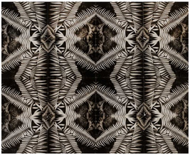
Horst has created this image by cropping a photograph of a leaf and the using the image 16 times, reflecting it to create a pattern. He takes a natural organic shape and creates symmetry and order.
|
The studio
Horst was very methodical in setting up a photographic shoot. He used lighting very carefully to create effects, He would use spotlights from different angles and sometimes have a spotlight pointing down from the ceiling. He is said to have spent up to two days setting up the lighting for one shot. His photographs show this careful use of light. Most of his work is in black and white, but some of his color photography includes black and white backgrounds to show of a brightly coloured outfit. When Horst had taken the photograph he would normally let someone else develop, print, crop, and edit his work.
Horst was very methodical in setting up a photographic shoot. He used lighting very carefully to create effects, He would use spotlights from different angles and sometimes have a spotlight pointing down from the ceiling. He is said to have spent up to two days setting up the lighting for one shot. His photographs show this careful use of light. Most of his work is in black and white, but some of his color photography includes black and white backgrounds to show of a brightly coloured outfit. When Horst had taken the photograph he would normally let someone else develop, print, crop, and edit his work.
Fashion in Colour
The large colour prints are hung together in a large room with white walls to show of the bright colours. Apparently these colour photographs are not often exhibited because not many of them are available to be shown. But they are shown in this exhibition with Vogue covers and the effect is striking.
The large colour prints are hung together in a large room with white walls to show of the bright colours. Apparently these colour photographs are not often exhibited because not many of them are available to be shown. But they are shown in this exhibition with Vogue covers and the effect is striking.
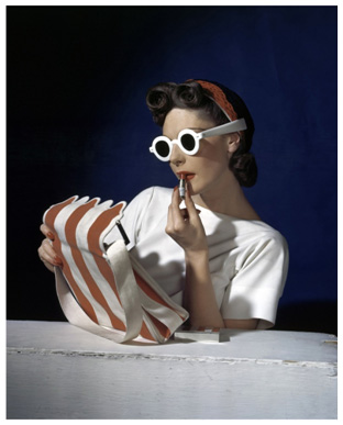
The colours – striking red and white and black and blue are clean and contrasting. There are only a limited number of colors in the photograph and it is very sharp and crisp.
Keywords contrast, USA, white, sharp
|
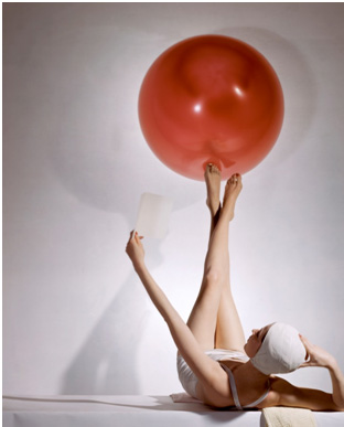
The red ball is the main in this image. Horst uses the model as a sort of support. His use of line is to emphasise her legs and arms as straight lines to balance and support the curved ball. Her legs lift the image.
|
Order: Typology
I was inspired by Macro Ugolini.


|


|
Mise en Scene
In these photographs the food has been selected by colour and the four photographs each show a shopping basket full of food of one mainly one colour. The basket is located on the floor of what looks like a supermarket or shop as the floor looks shop-like, we can just see a shop fitting in the red photograph and the basket is the type that is used in shops. What is most striking about the photographs is that the food and other items have been selected because of their colour. This is odd because it is not the way that shopping or food would normally be selected. It therefore makes you look at the items in the basket in a new way. For example, a banana is not seen as a piece of fruit but as a yellow item. The order in these photographs is expressed by the colour and the disorder by the variety of items in the basket. Also, having just the basket of food in the photograph and nothing else focuses your attention on the basket and the food as an image rather than as an everyday shopping basket and somehow subverts what you are seeing into something strange and unusual.
Process
Ugolini collected a selection of food items that are all that colour then put them into baskets and photographed them. He presented his work in a grid layout.
Keywords – colour, similarity, variety, strangeness
What ideas do I take from the artist?
Using just one main colour in a photograph to create an effect is interesting. Also taking something normal out of context and showing it in a new way can change your view of what you are seeing.
My response


|


|
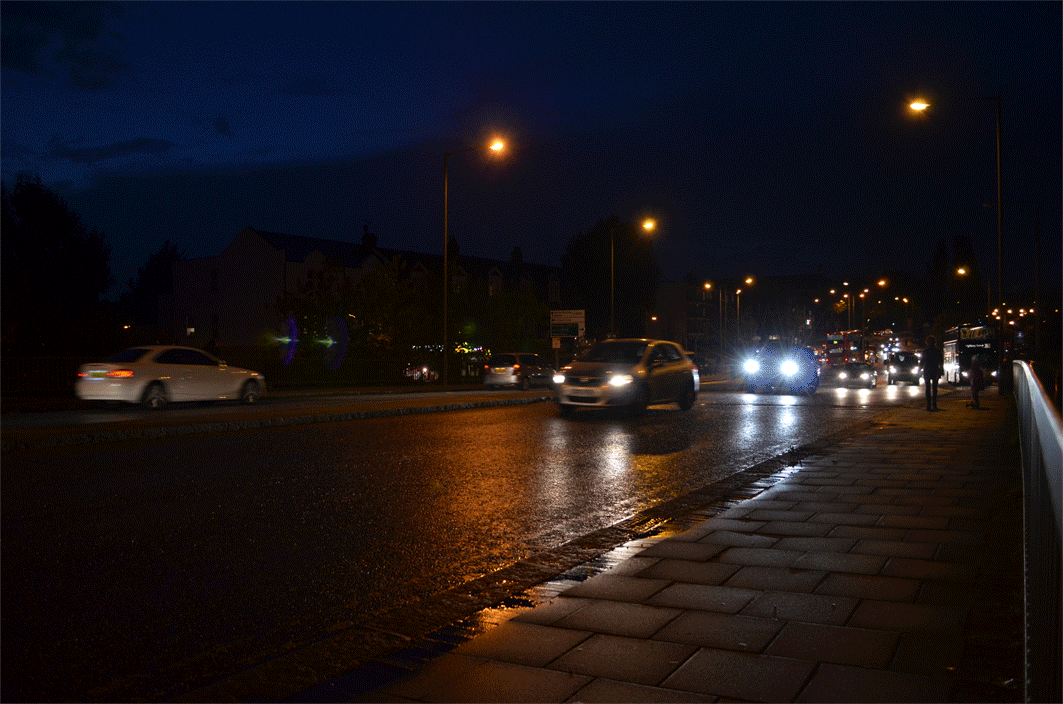
Disorder: City
I was inspired by Fellx Schmidt (view his flickr by clicking here.)

|
Mise en Scene
In this photograph the image uses the car lights in an abstract way creating an image that is unreal and dramatic. He creates contrast by using the white front light of cars and the red rear lights to give different colures lines. The photograph is obviously of a road and so you imagine the vehicles are traveling fast and this creates a feeling of speed and movement. Process. By taking one photo and then edited the colours on Photoshop. Then using the stamp tool to duplicate parts of the image (eg her hand.) Keywords – colour, speed, night, journey What ideas do I take from the artist? Using his technique to photograph moving vehicles is interesting. It changes an ordinary scene into something abstract. I also like the simple colours he uses, just red blue and black, which emphasise the image. |
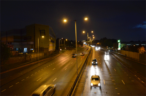
My response

|
|
I like how on these GIFs you can see the front lights from the cars moving towards the camera. This illuminates the road in front of them which creates a nice effect.

This photo just shows one car over a short period of time. I like how it does not take up the whole frame. I also like how the car's lights illuminate the road surface.
|

For this photo I used a long shutter speed which meant there are a lot of long light trails.
|

On this photo I flipped it vertically. I liked the effect that this created.
|

Here I flipped the photo four times. This is a lot more abstract.
|

Here I duplicated the layer three times, each with a different main colour channel.
|

I like how this photo does not just have one colour. By photographing both directions of cars it meant I had white lights and red lights. The green lights were from a bus which I also liked. I had a long shutter speed which meant some of the trails were not continuous. I like how this looks, however I think it's also effective to have a long shutter speed so the trails are long and go through the whole frame.
|
3 Strands
1st strand: City disorder
2nd strand: People disorder
3rd strand: Ink in water
4th strand: Portrait disorder
2nd strand: People disorder
3rd strand: Ink in water
4th strand: Portrait disorder
1st Strand - City Disorder
First development - light painting with cars


|

|
Second development - London Eye

|

|

2nd Strand -People Disorder
I photograpped crowds of people using a long shutter speed. This meant they all blurred together.


|

 |
3rd Strand - Ink in Water
|
I used water colouring in water and filmed it. I liked the effect that this created. I decided not to develop this as it did not fit in with what I wanted to develop my previous work to. However, I think it is an interesting way to show abstract disorder.
|
|
4th Strand - Portrait Disorder
Inspiration - Rupert Tapper

|
Mise en Scene
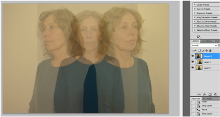
In this image the original photograph looks like it has been cut up and is superimposed in fragments. The colours have been changed to gives just red blue and flesh colour and this gives the image an even more abstract appearance. He has taken what is really a portrait and by changing it has created a more interesting and striking image that still works as a portrait but with an extra dimension. Process By using a long shutter speed, you can see the light trails of cars. Keywords – colour, face, drama, dimension What ideas do I take from the artist? Using this technique can change a straightforward portrait into something more interesting. It simplifies the portrait in a way because it reduces it to a series of shapes, but also make it more complicated by adding layers and duplicating images. I also like the use of colours to emphasise the effect. |
My responses
First development
First development
I lowered the opacity for the two top layers.
|
|
I used the eraser to remove overlaying parts of the layers which I did not like, for example the shoulders.
|

I did not really like this photo. I think it is not very striking and a bit boring.
|
Second Development

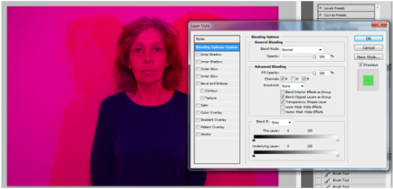
I repeated the steps shown before, but removed a different colour channel from each layer.
|

|

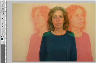
I merged the layers and put the photograph into black and white.
|

I edited it using curves.
|

|
Photographs I edited using the same technique.

|

|

On this one I didn't change the colours, I only lowered the opacity of the layers. I think this is effective because it creates a felling of movement, without having the different colours.
|
Third Development
Then I experimented using different ways to show portrait disorder. In these photos I split up the layer using the polygonal lasso tool then I created a new layer of the left side of the photo. This meant I could move it around without changing the right side of the photo. Then I merged the layers and changing the colour of the photo by removing one of the colour channels. This created a disorder portrait,
I repeated this three more times, each time removing a different colour channel. This reminds me of typology, because each photo is the same but with a different colour. Typology is usually a way of showing order, however here I used it to show both order and disorder.
I repeated this three more times, each time removing a different colour channel. This reminds me of typology, because each photo is the same but with a different colour. Typology is usually a way of showing order, however here I used it to show both order and disorder.

|

|

|

|
Fourth Development

I selected her face using the quick selection tool. I then selected the inverse (which was the wall) and copied and pasted this as a new layer.
|

I put on the sand layer inbetween the wall layer and the original layer.
|

I lowered the opacity of the sand layer so that you can see some of her face from behind in the original background layer.
|
Photos I edited using this technique:

|

|
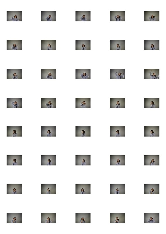
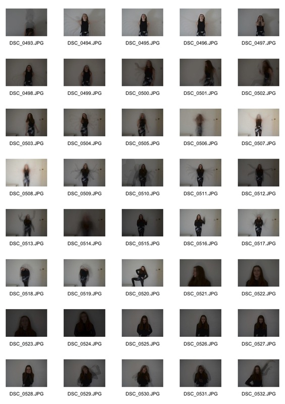
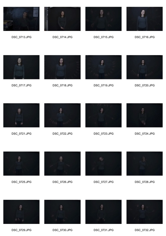
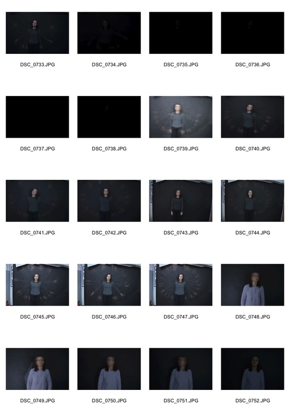
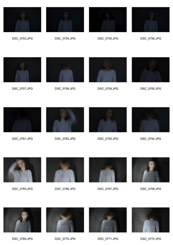
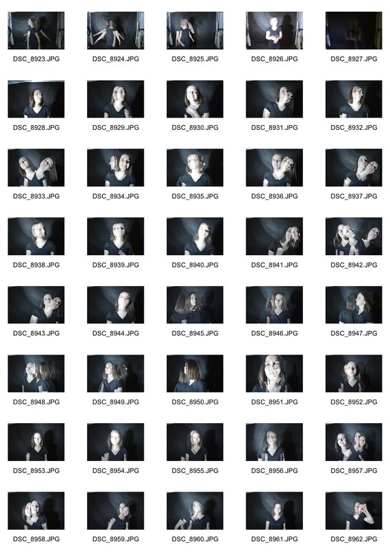
Fifth Development - Mock Exam
Contact sheets
Contact sheets
|
|
|
|
First photo

|
First, I horizontal flipped a duplicate of the original layer. I made sure it was an exact mirror flip of the original layer. Then I lowered the opacity of the second layer to 50%.
|

|
Using curves, I edited the individual colours. I made the green most prominent. I used the ample eyedropper tool on curves to adjust each colour and contrast.
|

|
I merged both the layers to create one layer. Then I edited the whole photo using curves and levels. On levels, I adjusted the red, green and blue separately.
|

|
I think what's particularly striking about this photo is how strange it is. What started out as quite a normal photo turned into a very unnatural and bizarre one. Her hair, which is something quite normal, turns into weird abstract item. However, once you see her shoulders you realise that it is simply two photos mirrored horizontally. This creates quite an unsettling effect.
I like this photo because it shows disorder in a unique and confused manner, however I am not going to develop it as I don' think I could take it much further. |
Second photo

|
I selected the background of the image and created a new layer with it. Then I put this in front of the original layer.
|

|
I added a photo of water droplets that I had taken in between the first and second layer. I resized it so that it covered the girl.
|

|
Then I put the second layer of the background back on top. I lowered the opacity of the water droplets layer.
|

|
Third photos
These photos were developed from 3D effect photos that I have previously done. I tried to focus on what went well last time, for example having two images taken a few seconds apart and then putting them together.
These photos were developed from 3D effect photos that I have previously done. I tried to focus on what went well last time, for example having two images taken a few seconds apart and then putting them together.

|

|

|

|
Development
I hope to develop my portrait disorder work by using a strobe light.

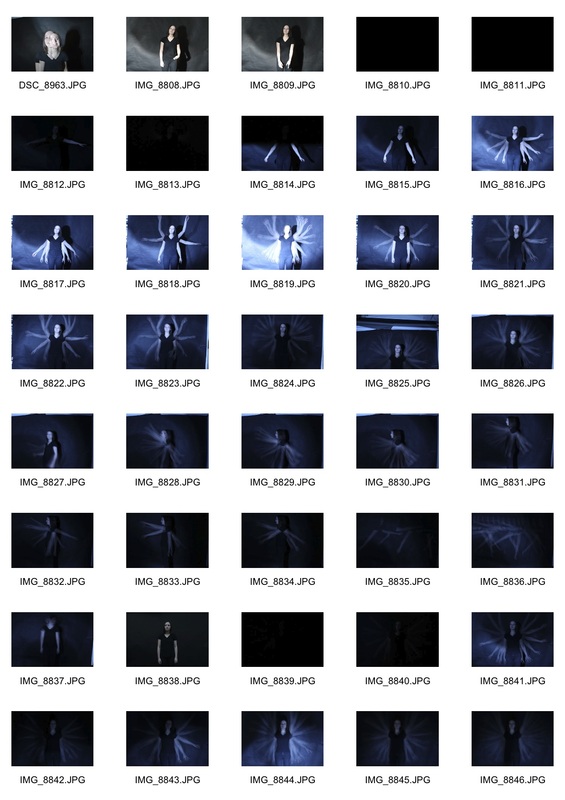
Inspiration
Gus Solomons
|
Mise en scene
This photograph is a gelatin silver print of a man who is a dancer standing on a stage with his arms outstretched. He is moving his hands from above his head to his side. Edgerton took his pictures using a motion picture camera converted to shoot at previously impossible speeds, and lighting them with an electric flash he invented himself. This ‘motion’ picture camera captured a series of images happening so fast the human eye is incapable of comprehending them individually. This photograph is of Gus Solomons who was a dancer and is in black and white. He is moving his arms up and down and the photograph captures the movement with a series of images. Process The equipment he used is called stroboscopic and this image shows strobe photography where a very fast series of images are taken and used together in on photograph. Gus Solomons raises his arms through a 50 cycles/second strobe in a single photographic exposure. Key words movement, dance, night, action What ideas do I take from the artist? The idea of using strobe light. Of course I was able to use a digital camera which made the process more straightforward. I also took the idea of presenting the image in black and white to create an effect. Also using a single person against a plain background to emphasise the strobe effect. |
|
Mise en scene
Kalliope Amorphous is an American visual artist, poet, fine-art photographer and performance artist who lives and works in New York. Amorphous is best known for her self portrait photography. This image is a self portrait and is part of a series called Designing Time. It uses stroboscopic photography but here the image is quite vague and ghostly. The photographs shows the upper part of her body and her head and she is moving her arms up and down. The effect is blurred and barely visible. Key words ghostly, soft, shadow, floating Process She used a stroboscope and may have edited the image. What ideas do I take from the artist? The idea of using strobe lighting to create a softer effect and a gently blurred image. Also the idea of creating an image where it is not exactly clear what it is and the viewer has to look closely and maybe make their own interpretation. |
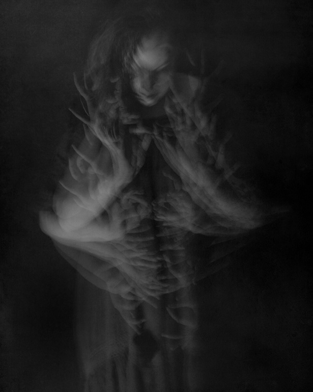
Kalliope Amorphous
|
First Response
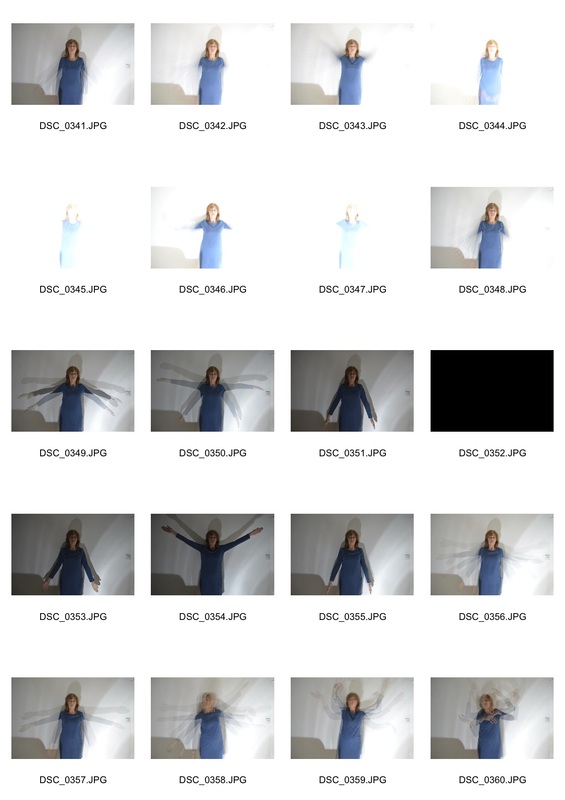
I created many different effects using the strobe light. I did so by changing the speed at which the light flashed and the ISO of my camera.
I created many different effects using the strobe light. I did so by changing the speed at which the light flashed and the ISO of my camera.

|
In this photograph the light is on very fast, this means that the image is quite light even though the ISO is only 200. It also means you see more of the position of her arms with smaller spaces in between each of the positions of her ams.
I thought this technique of using the strobe light on the fast setting was not very successful. I prefer only being able to see five or six positions of her arms rather than 20+. |

|
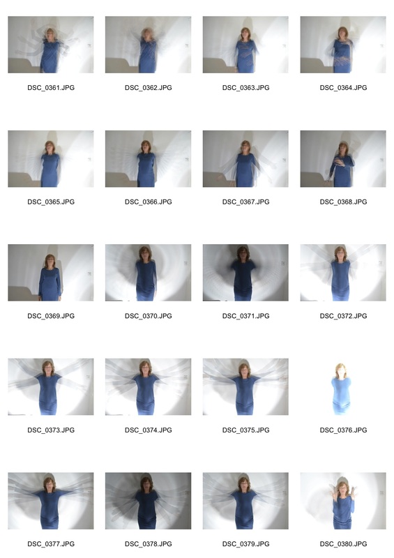
Here I used the same ISO of 200 but I used a much slower strobe light speed. This meant each time the light went on it stayed on for a long period of time, meaning the photo got more exposed. This meant that although the ISO was the same as the photo above, the photo was brighter. This was also due to the fact that I had a wider aperture, meaning more light could enter the lens.
I think this technique of using the strobe light on a slow setting and a wide aperture worked well because it meant less positions of the woman were visible. |

|
|

|
Edited selects


|


|
I liked how her hands were moving as well as her face as this created more of a sense of motion. I also liked how the background was plain white as this created more focus on the subject. To develop this I think I could think of more creative ways to use the strobe light. For example, GIFs and whole body movements.
Second Response
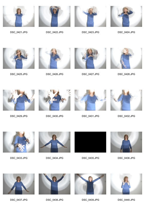
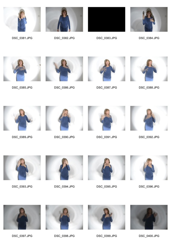
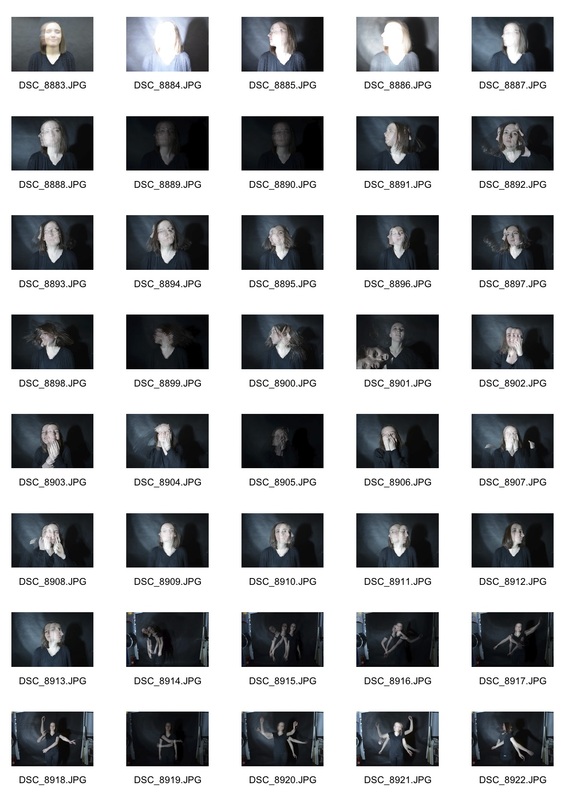
Contact sheets
Contact sheets
|
|
|

|


|

|

|

I created this GIF by merging five different photos. I changed the opacity of each photo each time that I created a frame for the GIF. This meant that the GIF was smooth. Then I duplicated all the frames and reversed the duplication, making the GIF continuous each time it restarts.
I like the effect this creates, however I preferred my previous still photographs to this because I think you can do more with the strobe light whilst just taking a single image compared to a GIF.
I like the effect this creates, however I preferred my previous still photographs to this because I think you can do more with the strobe light whilst just taking a single image compared to a GIF.
Third Response
Contact sheets
Contact sheets
|
|
|


These are my favourite two selects from all my responses because I think I used the strobe light effectively and created a nice sense of movement and motion in a imaginative way. I plan to develop these even further for my final piece.
Final Development
For my final development I decided to develop my previous work with strobe lights. I tried to focus on work which had been success previously and develop these ideas. For instance, I liked showing movement and separation of frames through body movements.
For my final development I decided to develop my previous work with strobe lights. I tried to focus on work which had been success previously and develop these ideas. For instance, I liked showing movement and separation of frames through body movements.
|
|

|
|
Whole Body Movements

|

|

|

|

|

|
Face Movement

|

|

|

|

|

|

|


|

|

|
Final Selects
I selected my favourite photographs from my final development to use as my final piece.
I selected my favourite photographs from my final development to use as my final piece.

|

|


