2015 Exam - Apart and/or Together
We started the exam unit by doing set tasks. The first of these being looking at putting portraits together to produce genetic portraits, inspired by Ulric Collette.
Together: Portraits
Artist Inspiration: Ulric Collette's genetic portraits
Mise en scene
These portraits are part of a series of genetic portraits where the photographer takes photographs of family members and merges two portraits to form a new picture. As the two people are family members - siblings, parent and child etc - there are likely to be similarities in the two faces but also differences sometimes due to age difference or gender. This photograph is a mother and daughter. Process Two photos were taken and then using Photoshop, they were merged together. This merge was made to look natural by lowering the opacity of each layers in the section were the images blend and using the eraser at a low opacity. Keywords Blend, age, transition, change, parent What ideas do I take from the artist? I like how the theme of ageing is shown in this photograph. It's not just two random people joined together, but a mother and daughter. I think this transition is shown effectively and the portrait emphasises ageing as the mother is what the daughter will turn into as she ages. The idea of connection is also strong as the photograph shows the genetic connection between the two people. |
Mise en scene
This photograph is part of the same series but one part is male and one is female. This might be mother and son or sister and brother. What I think is striking about this photograph is the similarity between the two faces even though they are different genders. Also one has a beard and one has long hair but they both look very similar in terms of shape of face and features. Process The process is as before and the two photographs are merged to form one picture using Photoshop. Keywords Difference, similarity, family What ideas do I take from the artist? The photograph shows the connection between members of the same family, even when they are different genders. I like the idea of contrast showing similarity as well as difference. It makes me think about how people are joined together by all sorts of things, not just family and shows that we are all human beings whatever our differences. |

Mise en scene
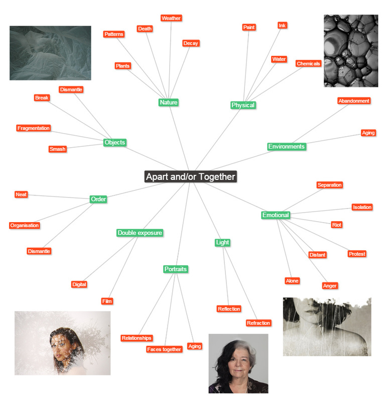
This photograph shows two men merged. They are father and son and they look similar but one looks older. As they are both male the age difference is what the photograph emphasises. The difference is more subtle in this photograph as both are men with similar hairstyles. The side of the face with grey hair seems to have fallen and this seems to show the effect that life has had on the older man. The people being father and son also shows that the younger face will inevitably turn into the older. Process The process is as before and the two photographs are merged to form one picture using Photoshop. Keywords Brothers, sons, connection, life What ideas do I take from the artist? This photograph seems to show a slow progression as the the two parts are more similar than the other portraits. But even though there is less difference it is definitely two different people and this makes you think again of family connections through different ages. The side of the face with grey hair which looks older and more worn and shows how a photograph can show time passing and how one thing can slowly turn into another. I like the idea of a still photograph showing the passing of time. |
My Response
|
|
Artist & me
|
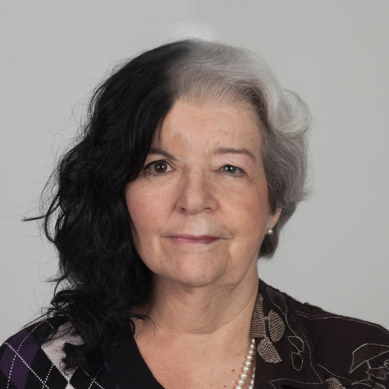
I chose to compare the Ulric portrait of father and son with my response as both show a subtle difference in the two people merged, it is not a dramatic change from one face to another. In the portrait by Ulric the two people are father and son. They are wearing the same clothes, or the part of the photograph containing the clothing was from just one portrait. In my response I merged the faces but kept the shoulders and hair from one portrait. This gives both images a similar look - it could almost be a photograph of just one person, it is not until you look more closely that you see that it is two faces merged. I think my image works well as the merging is very subtle and you cannot see how the two faces join, this is is similar to the portraits by Ulric. However his images have an extra element because the people are related and you see a father and son. I am just using two people who know each other but are not related so my response does not have the same depth as the Ulric portraits which comments on ageing and relationships.
|

|
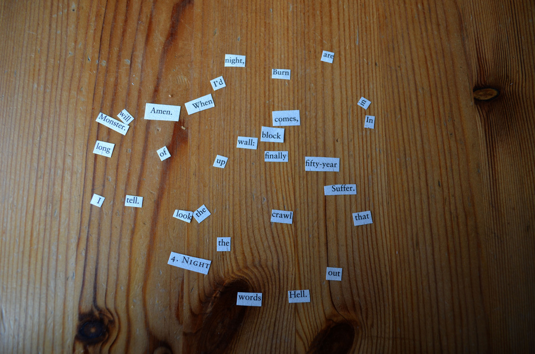
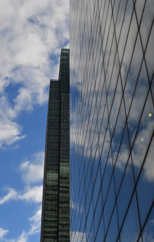
As the next set task, we looked at taking things apart. As inspired by William S. Burroughs, who cut up texts to create poems, we cut up texts and took photos based on them. This surrealist technique added a sense of unexpectedness and randomness to our photographs.
Apart: Cut Ups
“Cut-ups are for everyone. Anybody can make cut-ups... You cannot will spontaneity. But you can introduce the unpredictable spontaneous factor with a pair of scissors” - William S. Burroughs.
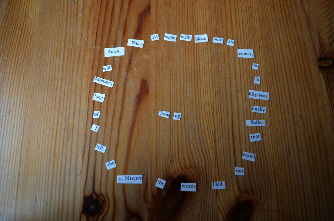
I cut up a book of poems by Carol Ann Duffy. I thought it was interesting to rearrange a poem where the words purposefully arranged in a particular order. By rearranging the words you can make new phrases, which is a new way of looking at the poem. I made the phrase "look up" and then created a series of photos based on this phrase.
I cut up a book of poems by Carol Ann Duffy. I thought it was interesting to rearrange a poem where the words purposefully arranged in a particular order. By rearranging the words you can make new phrases, which is a new way of looking at the poem. I made the phrase "look up" and then created a series of photos based on this phrase.
|
|
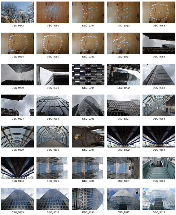
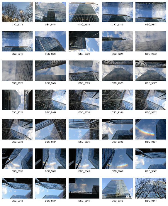
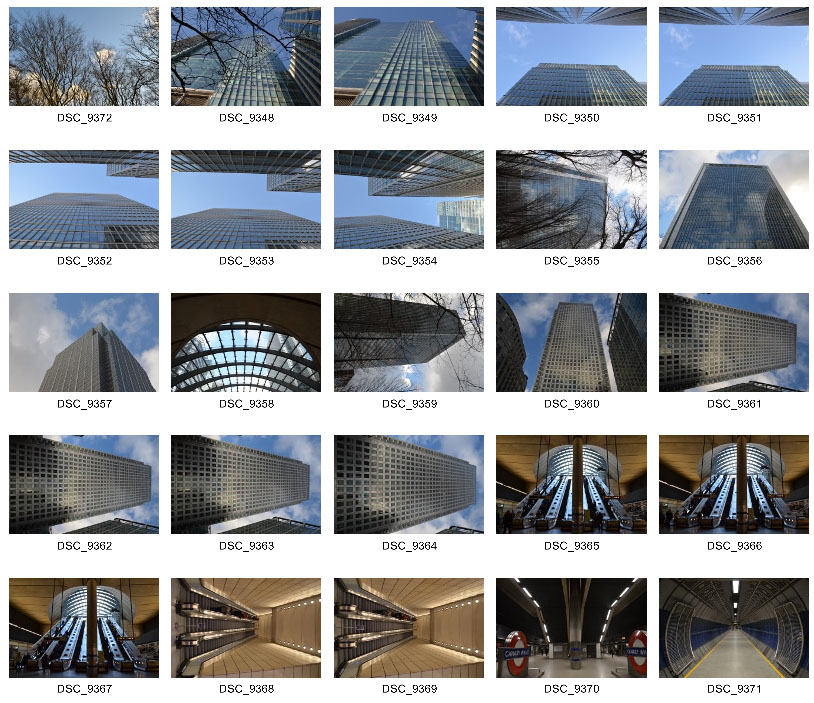
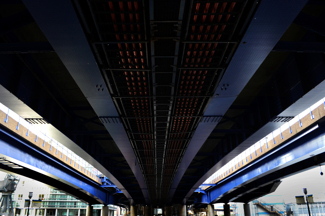
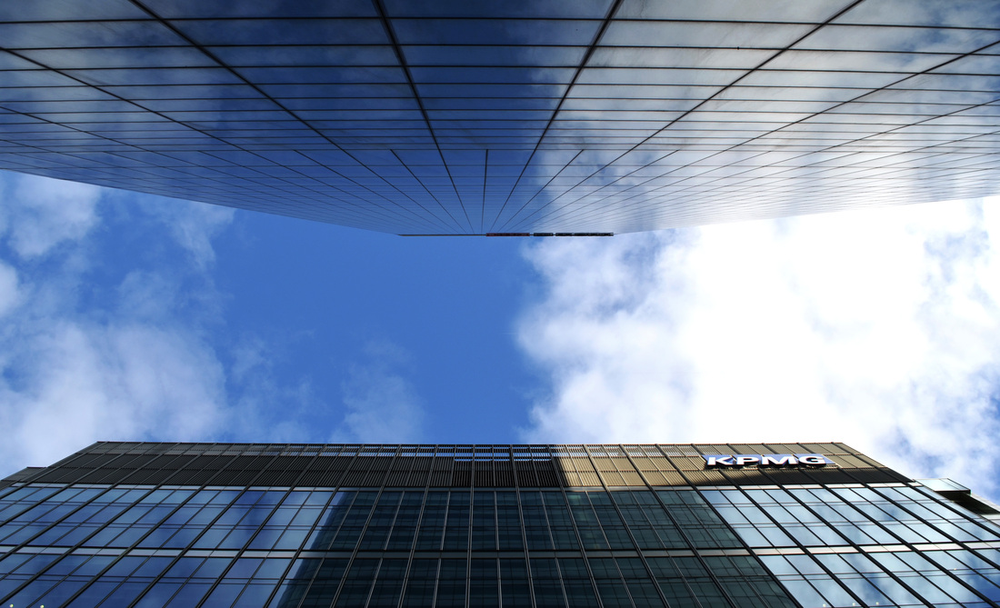
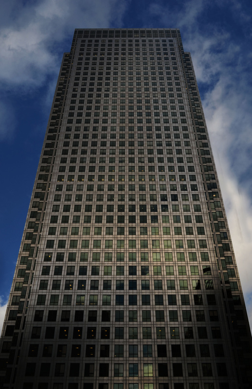
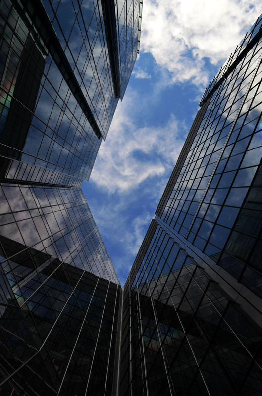
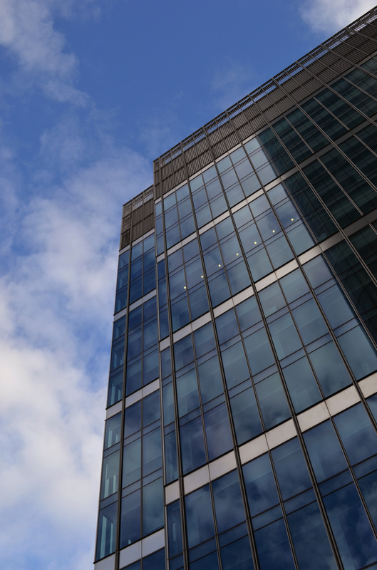
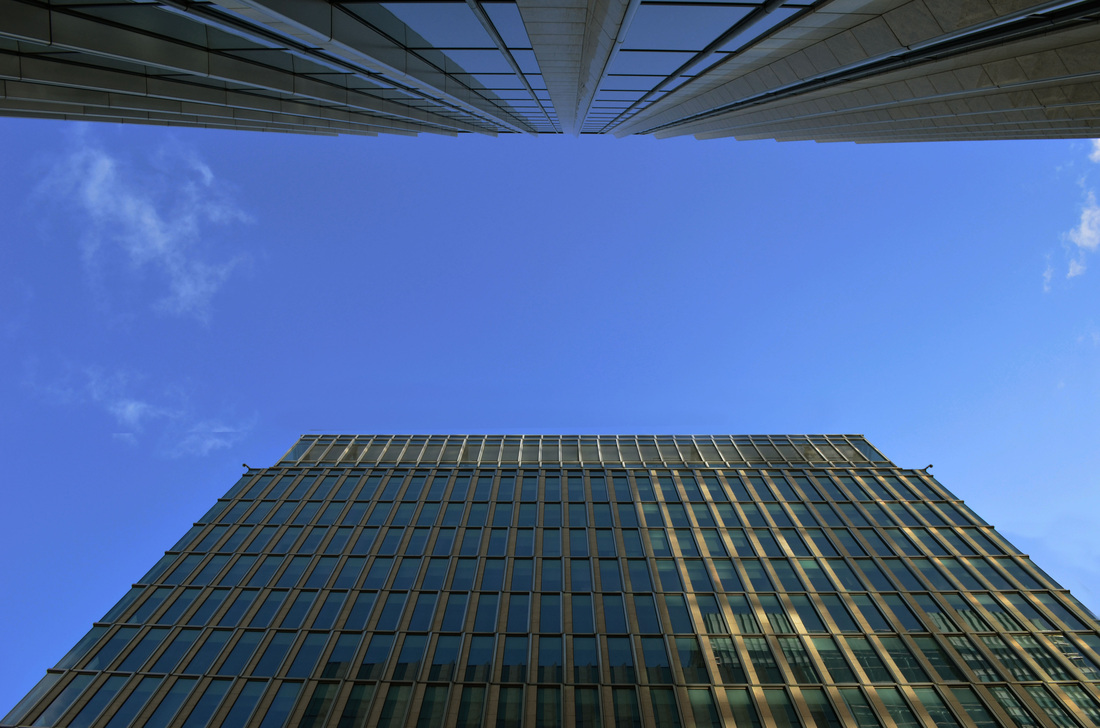
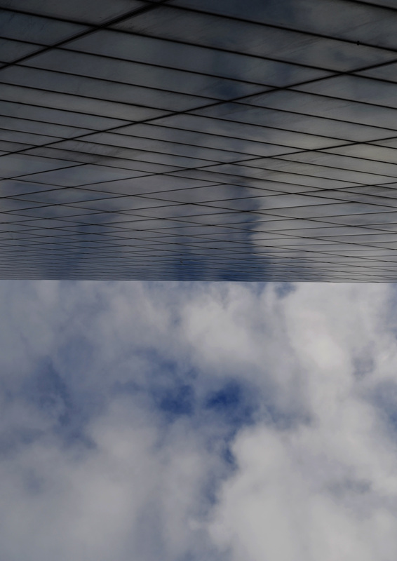
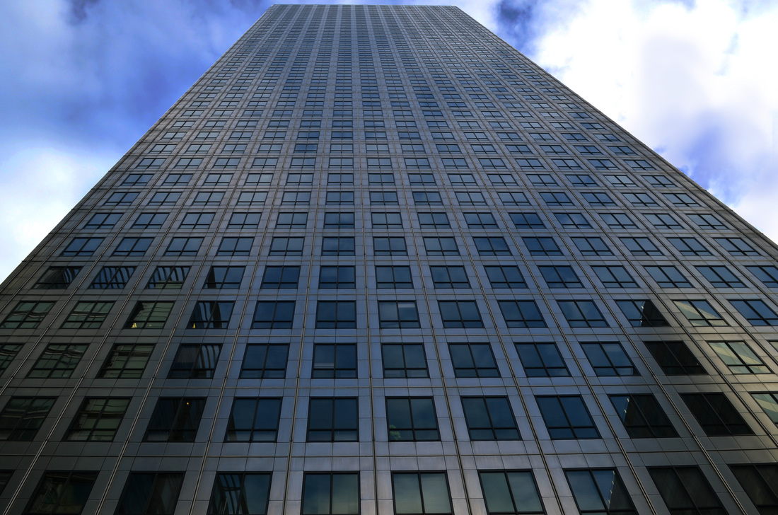
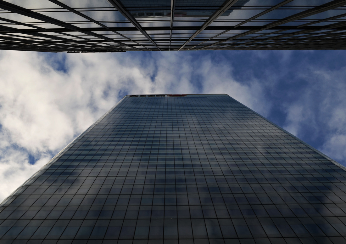
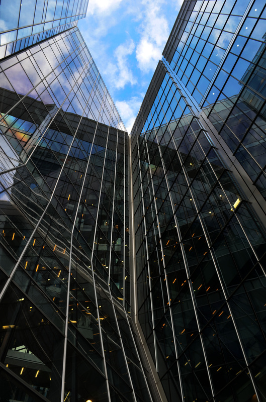
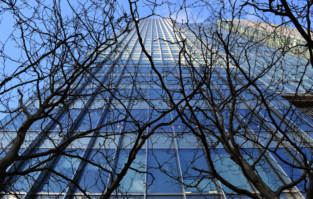
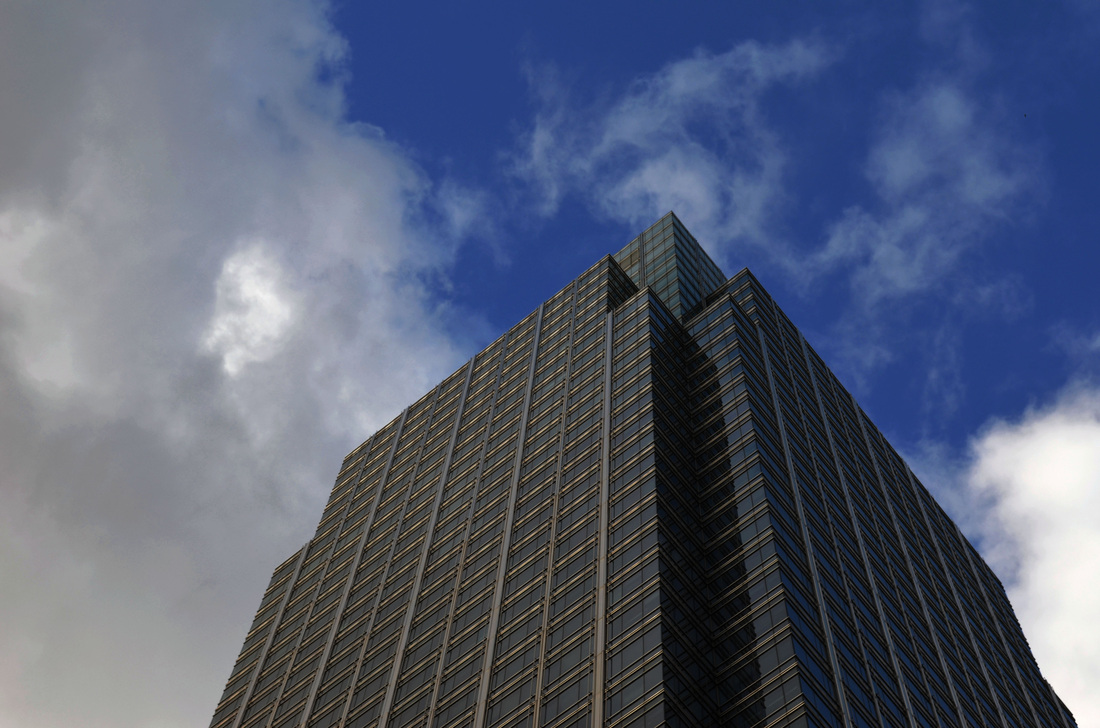
I decided to present this phrase, look up, literally. I took photos looking up at buildings. I found using this perspective interesting because the buildings often looked strangely different when you looked at them from a lower angle and I liked the contrast between the straight architectural lines with the randomly shaped moving clouds. These selects are all about looking upwards.
Contact sheets
|
|
|
Selects
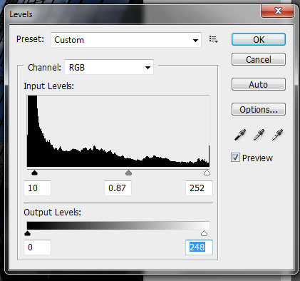
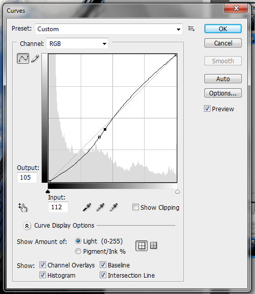
I edited these on Photoshop. I adjusted the levels and curves to change the brightness, contrast and tones. I found these photos look best when I had darkened the sky a bit and lightened the buildings.
|
|
|
|
|
Exhibition Visit:
Saatchi Gallery
Saatchi Gallery
|
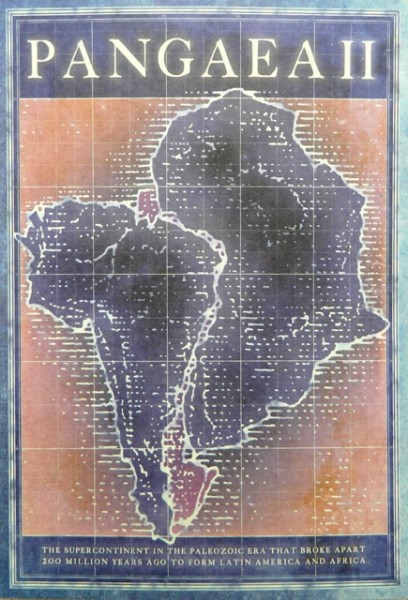
Pangaea II: New Art from Africa and Latin America at the Saatchi Gallery
Panagaea is the name for a supercontinent which is a land mass that around 270 million years ago contained all today’s known continents. This exhibition focuses on art form Africa and Latin America and shows similarities and differences and how both places and the themes of the art being created there are ‘apart and/or together’. It is interesting to see how current trends can cross from one continent to another, but also be influenced by the country in which the art is created. |
|
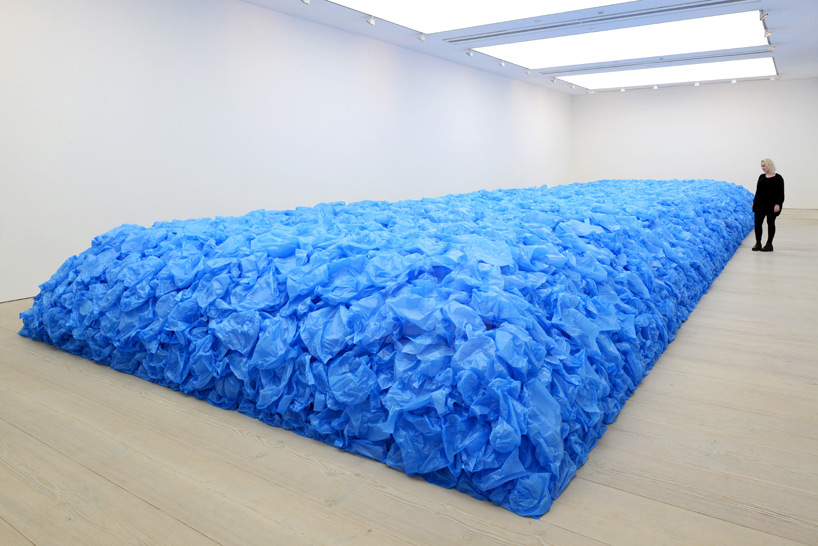
Everything must go by Jean Francois Bocle
This large-scale installation which is a sea of blue plastic bags is described as ‘a quasi-memorial to lives lost at sea during the transatlantic slave trade’. The bags from supermarket checkouts are inflated and the air is supposed to symbolise ‘the priceless commodity that is life itself’. This is interesting because of the link to the works of Francois Delfosse that can be seen in my next artist inspiration. It also shows a vision of Apart and/or Together as the bags represent individuals but together they form a memorial. There is a similarity also in using plastic bags in a creative way to make art. |
|
|
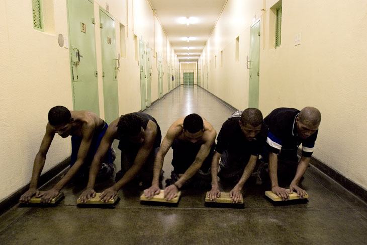
Pasvang Pollsmoor Maximum Security Prison by Mikhael Subotzky
This photograph is part of a series that were taken in a prison in Capetown South Africa. The photographs are supposed to show how space and buildings control the people within them. But this photograph I think illustrates the theme of Apart and/or Together because all the men are together and doing the same thing but when you look at the picture you wonder about each of them separately and what their life is like and why they are in prison. |
For the next set task we looked at a another way of showing apart, by destroying objects, inspired by Francois Delfosse.
Apart: Destroying Objects
Artist Inspiration: Francois Delfosse
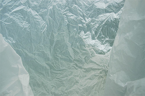
Mise en scene
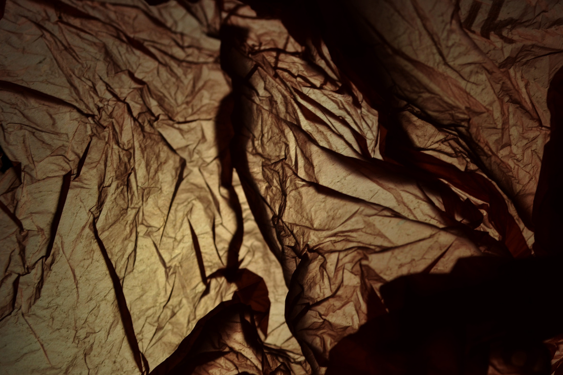
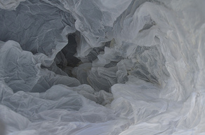
This photograph is of a glacier cave just north of the South Pole viewed from inside a plastic bag. The plastic bags are crumpled and creased and look similar to an actual glacier cave but the photographer is changing your perception in a way by taking the photograph of that location but from inside a plastic bag. The creases in the bag are quite beautiful when viewed closely and start to look like something else. This photograph is light and bright and gives the impression of light shining on a rough surface. Process The photograph was taken inside a plastic bag. It was then edited so that the colours and shadows looked more similar to them of glaciers. Key words Crease, crumpled, opaque, difference What ideas do I take from the artist? One of the ideas is how things look different depending on whether you know what they are - your expectations can influence what you see. Another idea is crumpling or breaking up an object to create something else. |
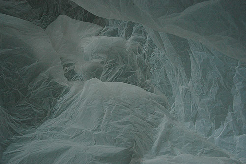
Mise en scene
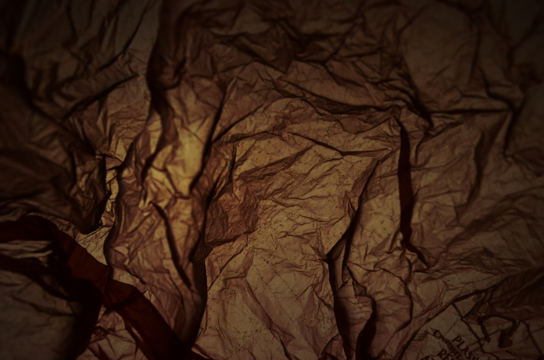
This is a similar photograph to the one of the left but this is darker and has shadows. The photograph was taken in the same way, though a plastic bag but the overall effect is softer as the photograph does no have light illuminating the peaks and troughs as in the proviso photograph. The lower light level gives a softer look and a gloomier feel. Process Same process as previous photo. Key words Darkness, shadow, gloom, cave What ideas do I take from the artist? As well as the points made for the previous photograph, this picture gives a feeling of darkness and gloom. The softer lines create an atmosphere and the actual object is transformed. |

Mise en scene
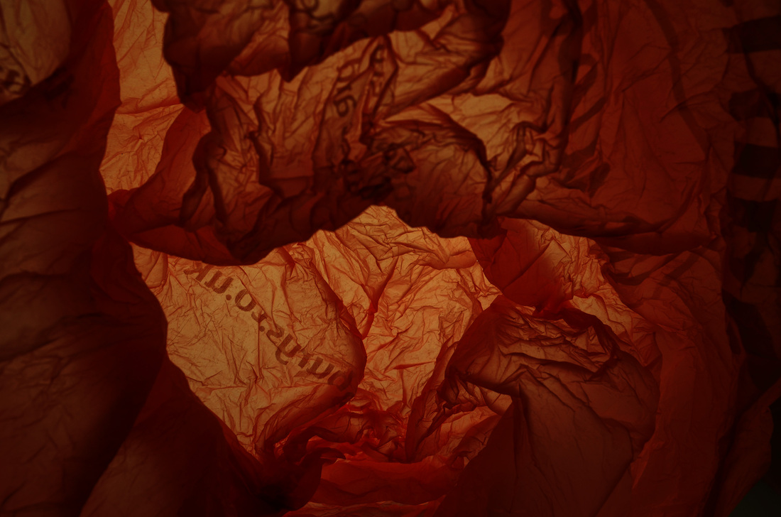
This is a similar photograph to the other two but this is even softer and the shapes start to look organic or cloud-like. The photograph has a darker centre which focusses the eye and seems to lead you in. There is an expectation of something to be found in the centre, but it is not clear what. Again the photograph is a distortion of reality in a way as it gives the impression of something else, not what it actually is. The bag is destroyed but is used to give something new and different. Process Same process as previous photo. Key words Cloud, soft, organic What ideas do I take from the artist? As well as the points made for the previous photographs, this picture gives a feeling of darkness and gloom. The softer lines create an atmosphere and the actual object is transformed.The theme of apart and/or together is expressed here by crumpling the bag together which makes you focus on the centre, but also by the overall idea of something being apart and/or together at the same time and not what it seems. |
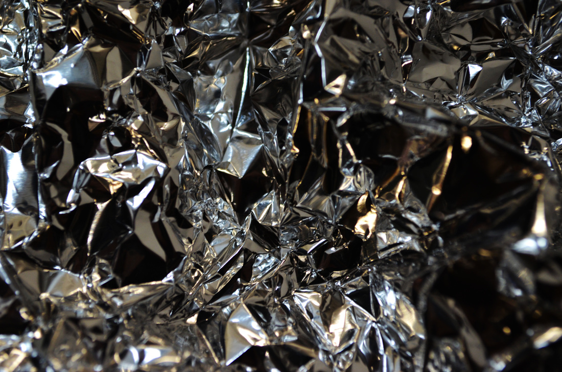
My Response
I think this task shows both apart and together.
When I broke and smashed objects I was taking them apart, but when I scrunched up objects, they were more together.
I used:
- Tin foil, which I scrunched up then flattened out. Light reflected on the creases which created sharp shadows.
- Plastic bags, similarly I scrunched these up then pulled them apart. I shone a light from behind which meant the creases were darkened as light shone through the sections of the plastic which weren't creased.
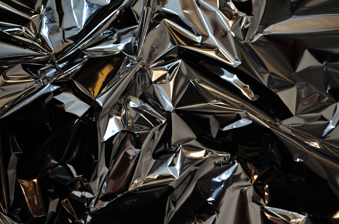
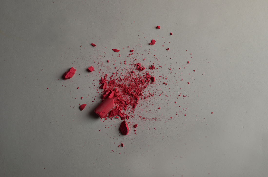
- Chalk, I experimented with smashing this up into different sized pieces ie into a dust like form, breaking it in half and smashing sections of the stick of chalk.
I think this task shows both apart and together.
When I broke and smashed objects I was taking them apart, but when I scrunched up objects, they were more together.
I used:
- Tin foil, which I scrunched up then flattened out. Light reflected on the creases which created sharp shadows.
- Plastic bags, similarly I scrunched these up then pulled them apart. I shone a light from behind which meant the creases were darkened as light shone through the sections of the plastic which weren't creased.
- Chalk, I experimented with smashing this up into different sized pieces ie into a dust like form, breaking it in half and smashing sections of the stick of chalk.
Contact sheets
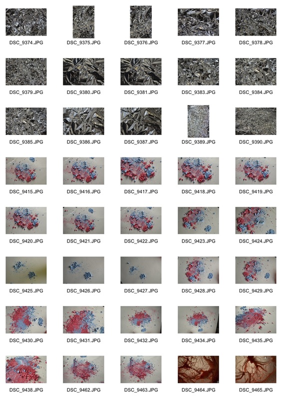
|
|
Selects
On the tin foil photos in particular I used the dodge tool and the burn tool to lighten and darken certain areas of the photo so that the shadows looked more intense compared to the lighter areas.
|
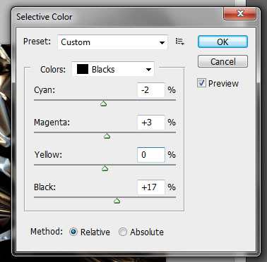
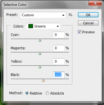
On the tin foil photos and the plastic bag photos I used selective colour to adjust the tone of the image until I like it. I also adjusted the black tones for certain colours to darken very specific areas.
|
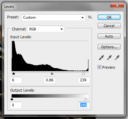
On all the photos I edited the levels to adjust the brightness and contrast.
|
|
|
|
|
|
|

|
|
Artist and Me: Francois Delfosse
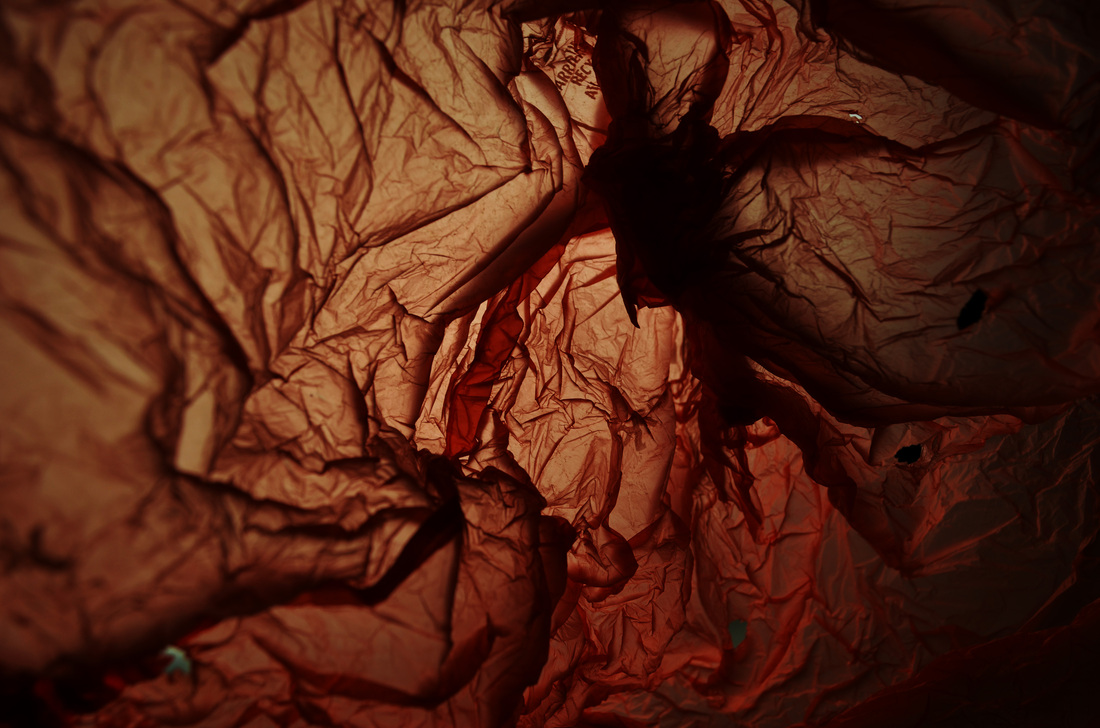
The first obvious difference between Delfosse's work and mine is that mine is mostly orange with darker areas, whilst Delfosse's is a lot lighter with dark grey areas. I think the effect of a lighter image is that it looks more like a glacier, when mine looks more like what it actually is, a plastic bag. If I was looking to be completely inspired by Delfosse, then this difference would be quite important. However, I felt of him more as an inspiration to base my first ideas on, meaning the fact that mine does not look so much like a glacier, does not matter as much.
In my work, the darker areas are a lot darker than the darkest areas in Delfosse's work. This means that mine is my photo is more sharp and harsh, when his photo is more delicate and light. I think the reason behind this is that I shined a light from behind the bag, which made the dark areas a lot darker.
I think if I was to develop my work, I would try experimenting with a white coloured bag and going for a lighter feel like Delfosse did to achieve photos which look more like glaciers. To do this I could shine a light from both the back and the front of the bag, meaning more of it would be illuminated.
Their work
|
My work
|
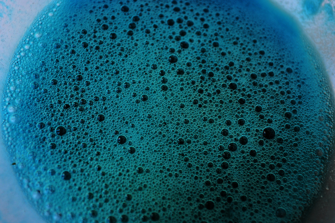
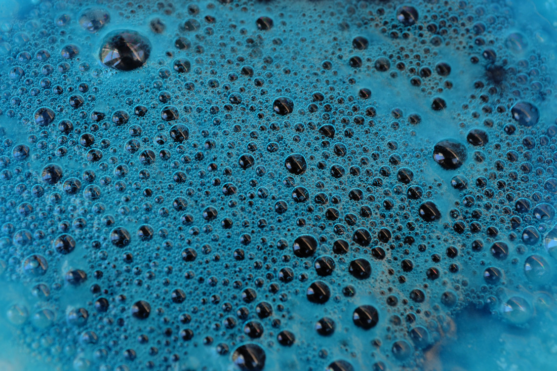
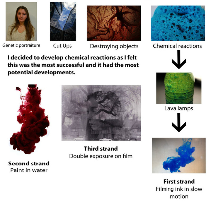
For the next set task we looked at a different way of putting things together, this time chemical reactions. This allowed us to react a number of different substances together to create new things to photograph.
Together: Chemical Reactions
Artist Inspiration: Berenice Abbot
|
Mise en scene
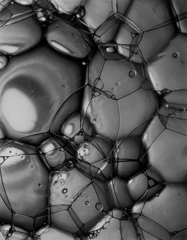
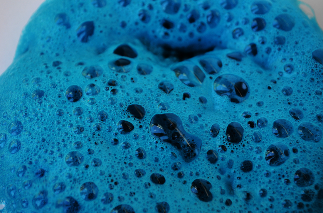
This photograph is called Soap Bubbles and is a black and white close-up of bubbles taken in 1945/6. The photographer worked with the Massachusetts Institute of Technology on a series of scientific photographs with the aim of uniting art and science. As it is a close up view with no context the image becomes abstract as you cannot easily identify what it is. This also means that you focus on the appearance not the idea of what it is. The bubbles become just a beautiful image. The bubbles look like cells or even pebbles and show the beauty in nature- even in something as everyday as soap bubbles. Process Abbot may have used a macro lens to allow her to capture the bubbles in full depth and focus. She may have then edited the image so that it is in black and white and so that the darker areas of the image are more intense. Keywords Organic, reaction, chemical, natural What ideas do I take from the artist? I like the idea of using close-up view to create an abstract image. Also using something very mundane to create a beautiful photograph. Using black and white is also interesting as it removes the photo from the actual object somehow, as it is different to the view in reality, and makes it seem more abstract . |
My Response
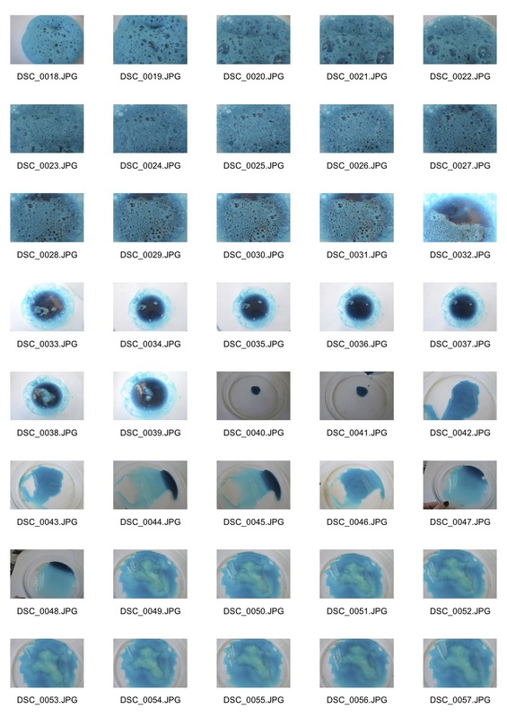
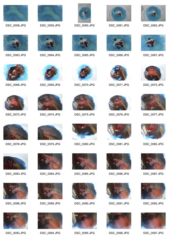
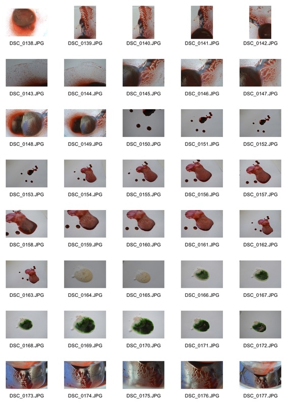
I experimented with different ways of putting vinegar, baking soda and food colouring together at home. This created strange bubbles and colours. I found the different colours which I made particularly interesting, especially when I used two different food coloring's (ie red and blue.) The colours merged slowly which allowed me to photograph them joining together.
Contact sheets
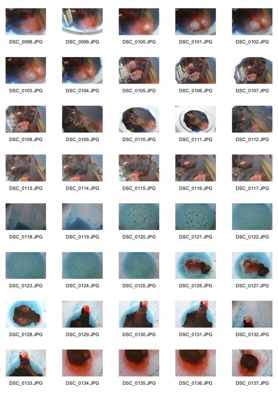
|
|
Selects

|
|
|
|
|
|
|
|
|
Artist & me

Abbot's work
|
The photograph by Berenice Abbot is in black and white and is taken using a macro lens in a camera that she constructed herself. The bubbles were tiny in real life but the image shows them magnified. These are soap bubble that were in a glass tray and she lit the photograph from below to help create the effect. that you see in the image. Apparently she spent 3 days creating the photograph. My photograph of bubbles is in colour and the bubbles are a lot smaller. The photograph by Berenice looks like it is part of a larger picture however in my photograph I have selected the image to frame the shape that the bubbles make, against background that is not bubbly. The extreme close up view in her photograph is what makes it so impressive and I have not done this, however my photograph is a similar attempt to transform something by focusing on it closely and we both are trying and succeeding to make an abstract image of a physical object.
|
My work
|
Exhibition Visit
Revelations: Experiments in Photography
Revelations: Experiments in Photography
The exhibition Revelations: Experiments in Photography was on at the Science Museum and showed the influence of early scientific photography on modern and contemporary art. The exhibition had some of the rarest images from the pioneers of photography.
Blow Up by Ori Gersht
|
From the 1840s, scientists were using photography to record and measure things which could not be seen by the human eye. The photographs may have beed developed for scientific reasons but the beauty of the images and the revolutionary techniques that were used influenced the development of photography and also modern and contemporary art photographers.
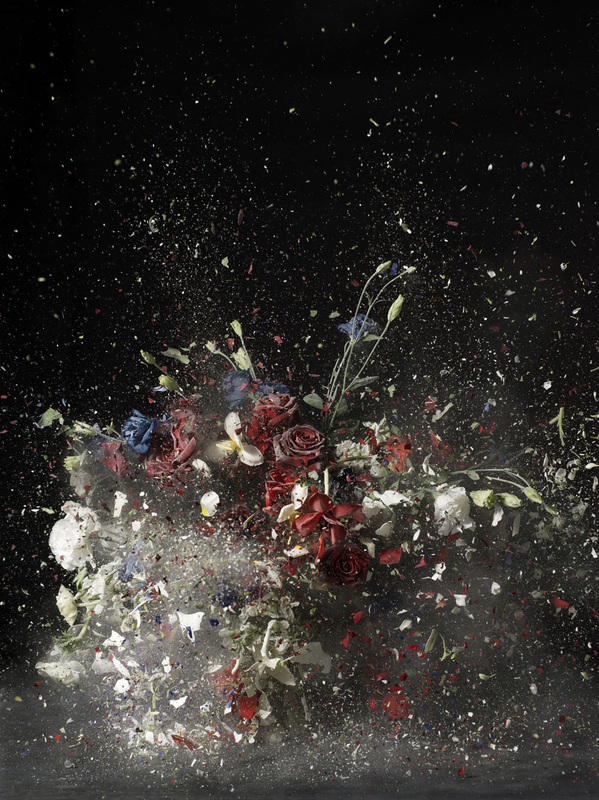
The exhibition had images from the National Photography Collection by people including William Henry Fox Talbot and Eadweard Muybridge. There were also modern photographs by contemporary artists including Harold Edgerton and Hiroshi Sugimoto . The photographs on display included an original photographic print of X-Ray, the earliest recorded images of the moon and 19th century photographs showing electrical discharges. Of the newer artworks I particularly liked Blow Up by Ori Gersht that shows how photography can freeze time with a high-speed camera. He froze flowers in liquid nitrogen and then blew up the arrangements to who the ‘uneasy beauty in destruction’. The exhibition inspired me to investigate these themes myself and to try to photograph chemical reactions such as those in a lava lamp and interesting effects like putting ink in water. These things, when photographed, become something else. The photographs allow you to see the beauty that is there when you closely examine a reaction or process and by taking a single photograph you can freeze an ongoing process into an image that would not normally be seen for any length of time. The contrast in the exhibition with the older photographs and the newer artist’s work show how using photography to explore a process can then inspire a new work of art. |
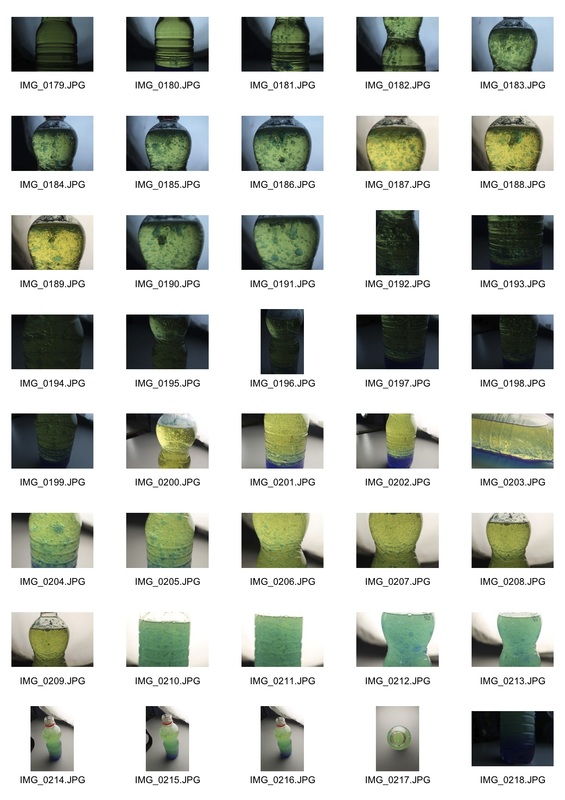
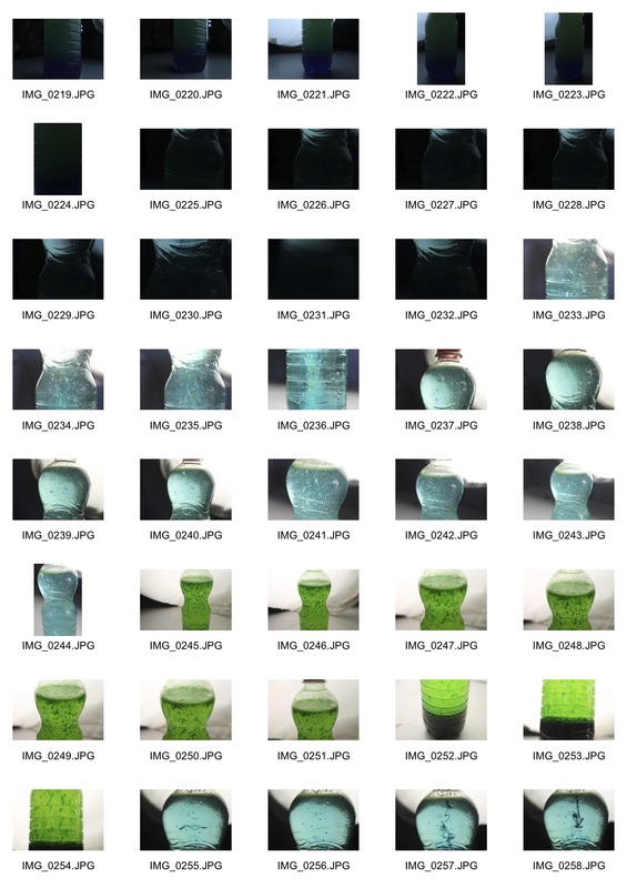
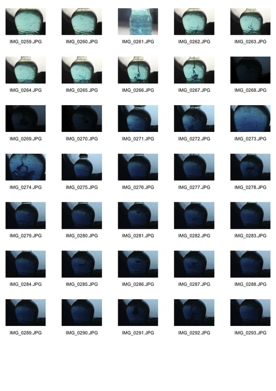
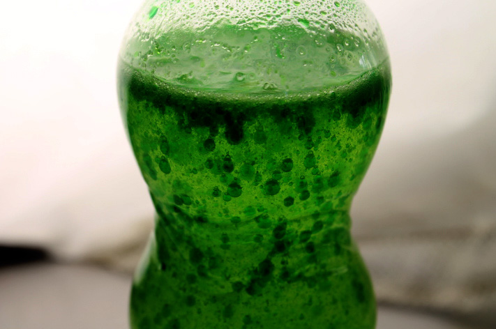
For the final set task we developed the earlier chemical reactions and made lava lamps. In lava lamps there are many little bubbles separate from the main body of bubbles. This shows how substances come apart.
Together: Bubbling Lava Lamps
|
Materials I used:
- Empty water bottle with lid - Vegetable oil - Food colouring - Alka Seltzer tablet - Water |
|
Steps:
- Fill up bottle to 3/4 with vegetable oil - Fill the rest up with water - Add 10-15 drops of food colouring - Add Alka Seltzer tablet in |
My Response
I used a wide aperture to create a shallow depth of field so that only the bubbles were in focus. I also used a short shutter speed because the bubbles were moving and I wanted to capture them sharply.
|
|
|
Selects
|
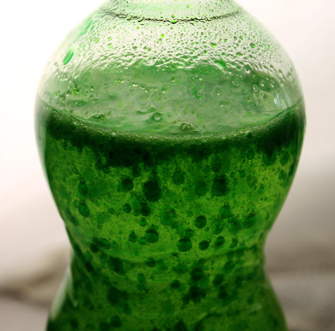
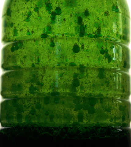
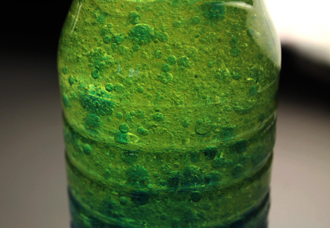
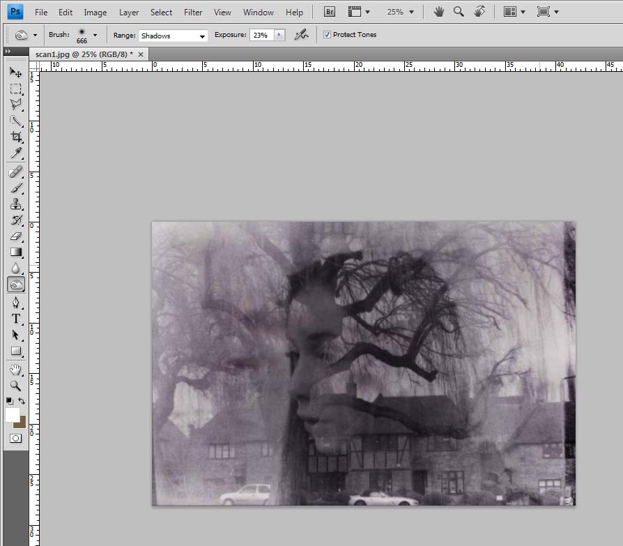
I edited these photos on Photoshop using mostly the selective colour tool to adjust the colours and tones in the image. For example, I darkened the darker greens bubbles so that they contrasted more with the main body of green liquid. I also cropped the images and lightened the background so that the lava lamps stood out more and were the main subject of the photos.
|
|
|
|
|
3 Strands
First Strand - Filming ink in slow motion and photographing it
Second Strand - Photographing paint in water
Third Strand - Double exposure of film
Second Strand - Photographing paint in water
Third Strand - Double exposure of film
First Strand
Inspiration
|
|
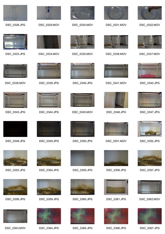
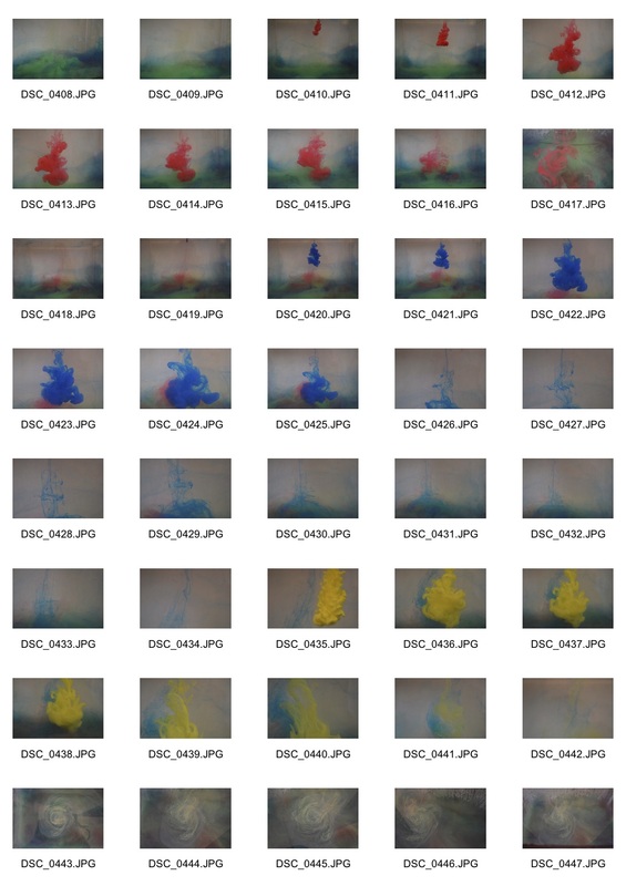
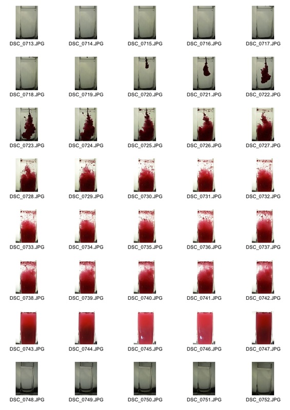
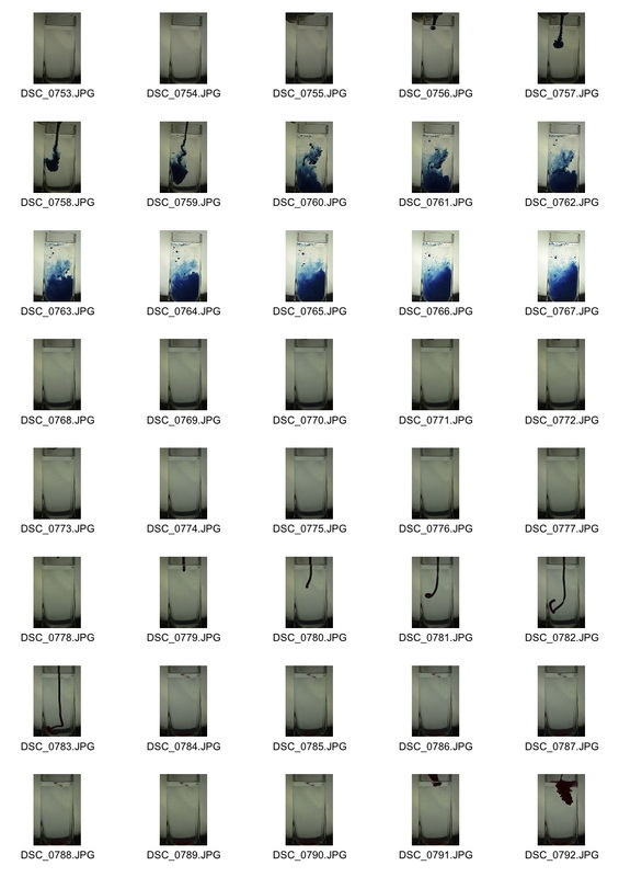
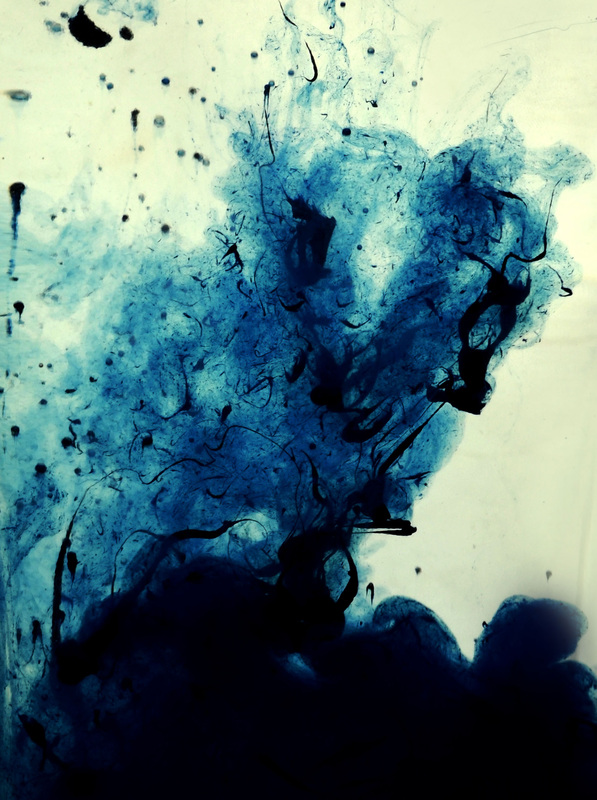
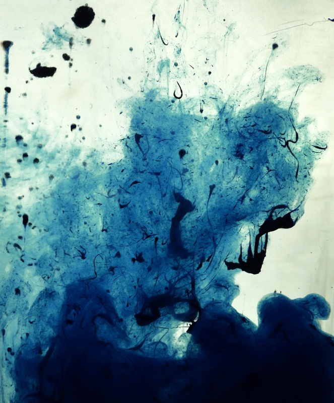
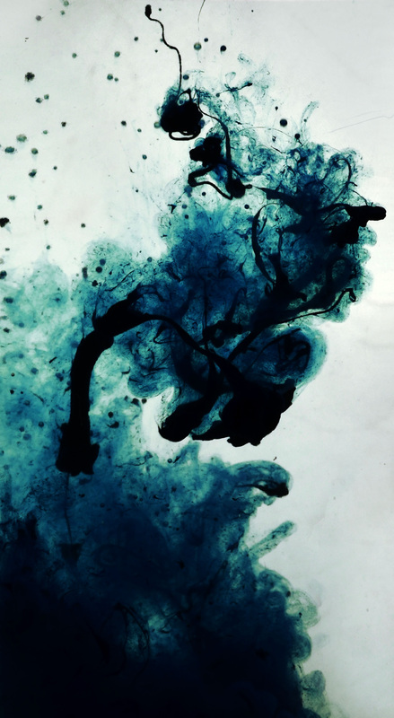
I found a video online of people trying to photograph ink in water and the video gave me ideas about what methods to try and what equipment to use. In the video they use a large fish tank with a sheet of white cardboard behind to give a white background. They also use a video camera and film in slow motion, which I did too. I do have a fish tank though and so I used that and put a sheet of white paper behind, like in the video. One of the problems with this was you had to empty and refill the fish tank every time you put the ink in. I also used the same kind of ink that they use in the film as when I tried with another sort it did not work very well. I tried various ways of putting the ink in the water but in the end went out and bought a plastic syringe like they use in the video as this seemed to work best. It was a really interesting experiment and I want to develop this idea further.
|
For my first strand I decided to develop the earlier set tasks of putting 2 substances together and photographing how they react, or in this case mix.
|
Materials I used:
- Daler Rowney FW acrylic ink - A syringe - A fish tank full of water |
Steps:
- Filled the tank up with water - Filled the syringe up with ink - Placed the syringe just under the water surface so that it injected straight down inside - Quickly injected the ink straight downwards inside - Took photos on continuous shooting or a film as the ink diffused around the tank - Emptied the tank and repeated the process |
|
|
|
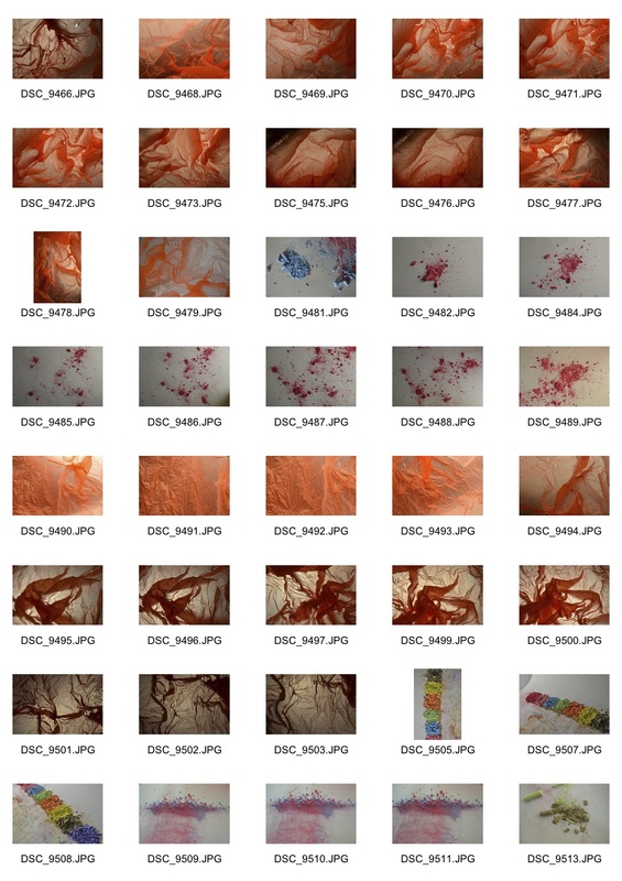
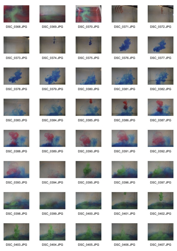
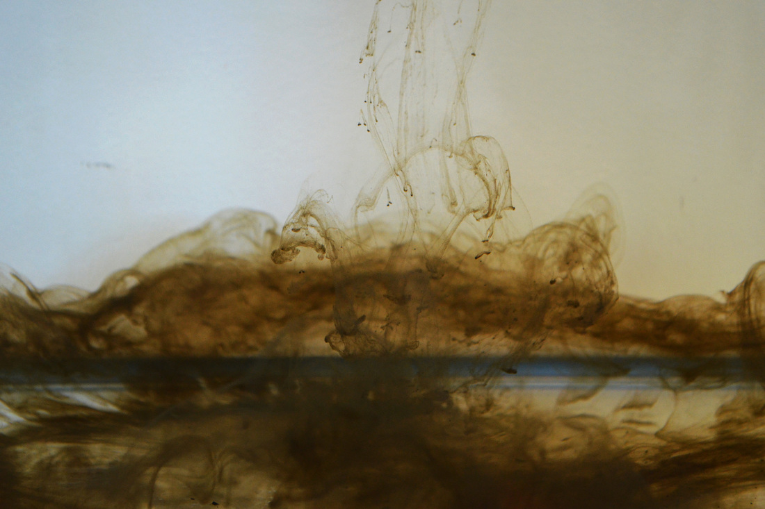
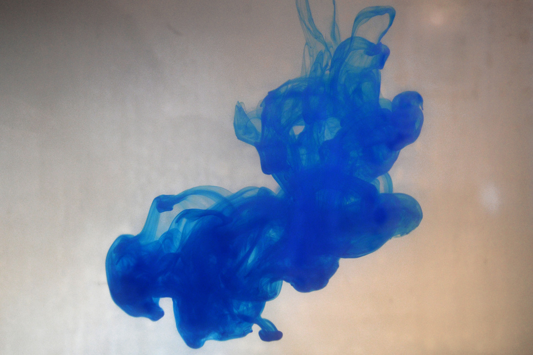
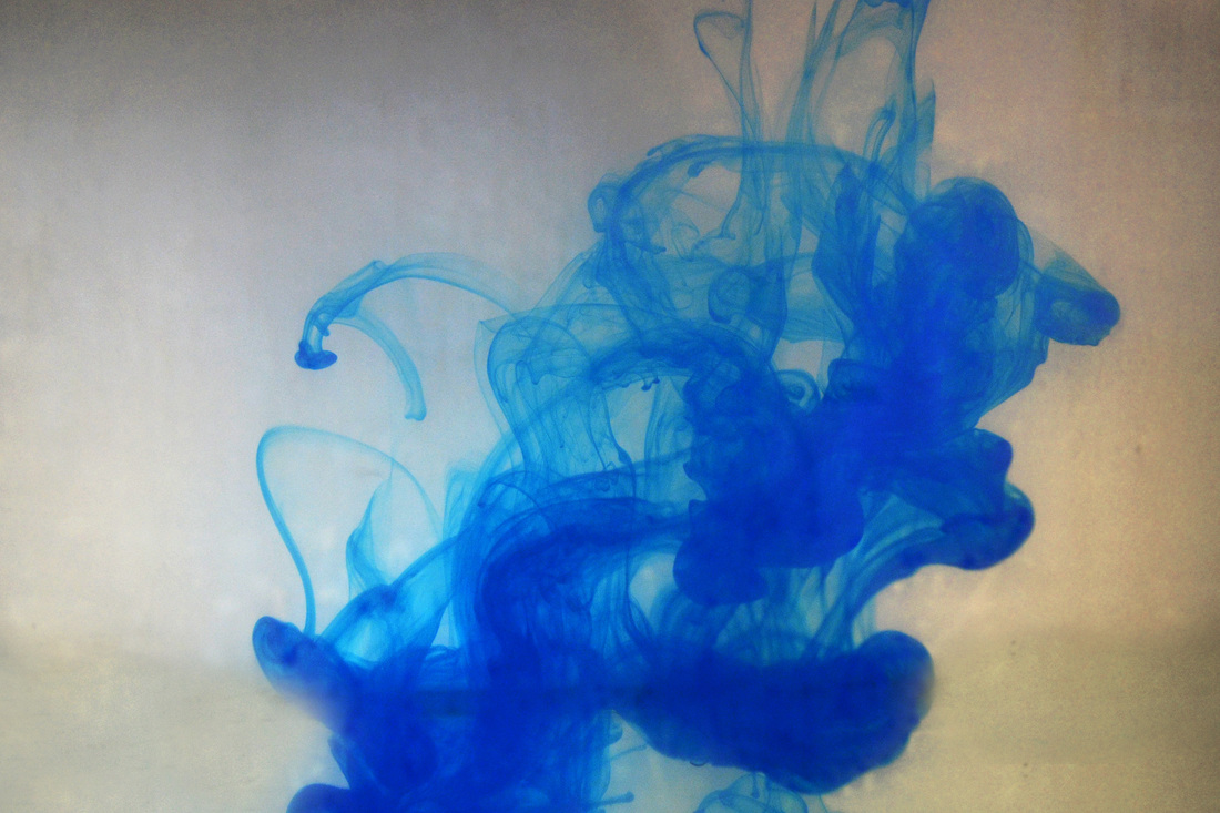
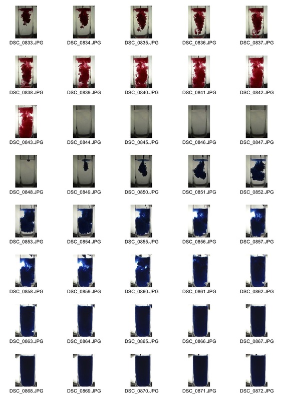
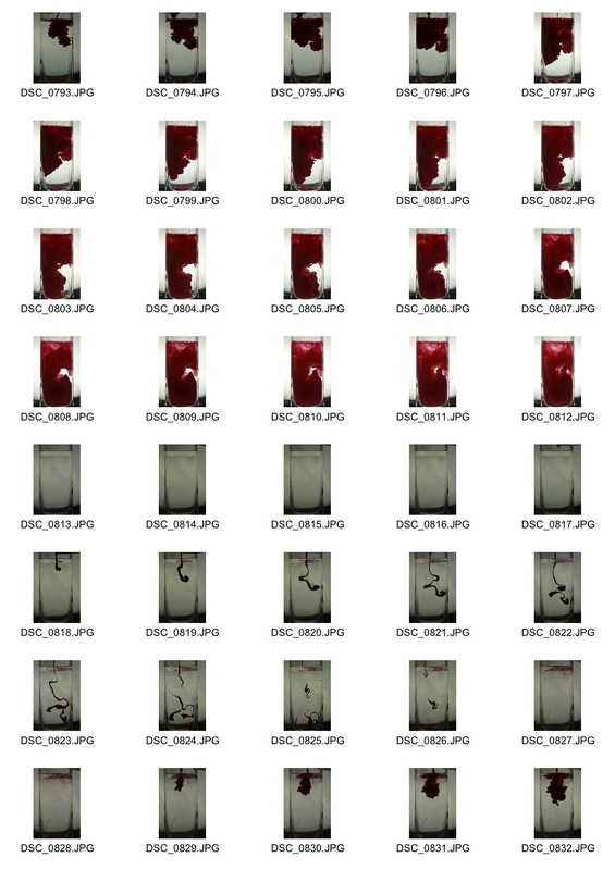
Selects from the photographs I took
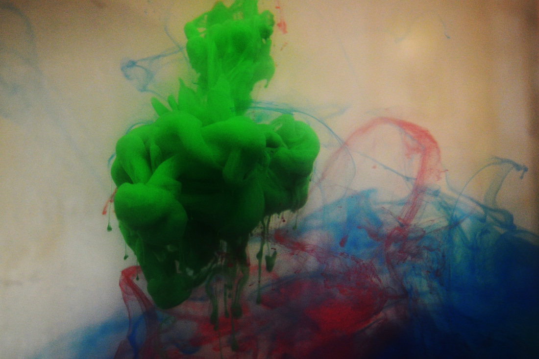
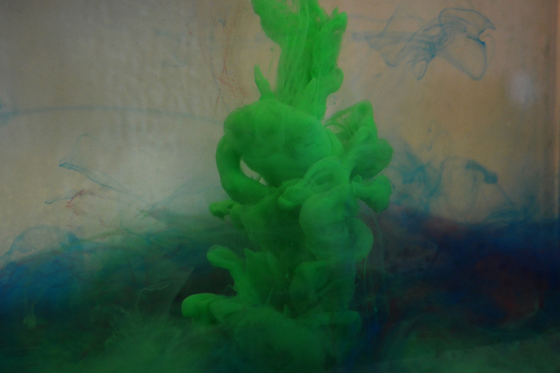
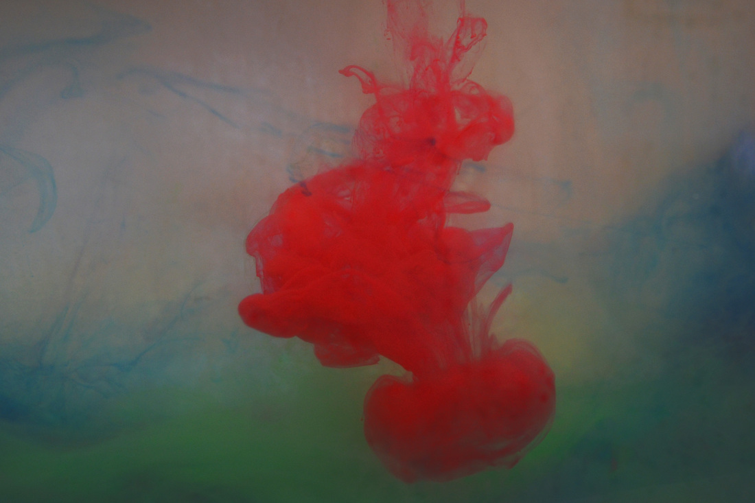
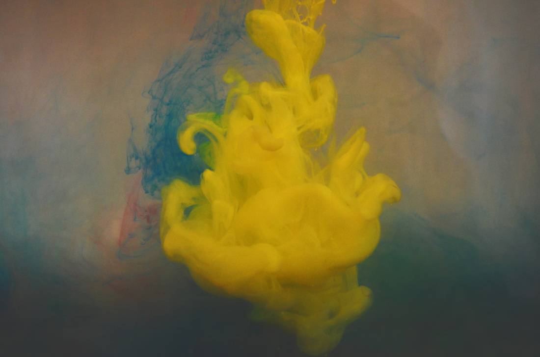
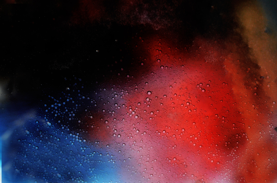
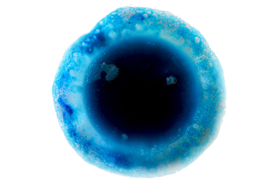
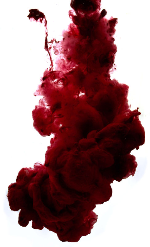
For my second strand, I decided to experiment with dropping paint into water and photographing it. I used paint because I wanted it to diffuse into the water and stay as one body of colour for a longer period of time, rather than separating very quickly like the ink did (as it was of a more watery texture.)
Second Strand
Artist inspiration: Alberto Seveso
Mise en scene
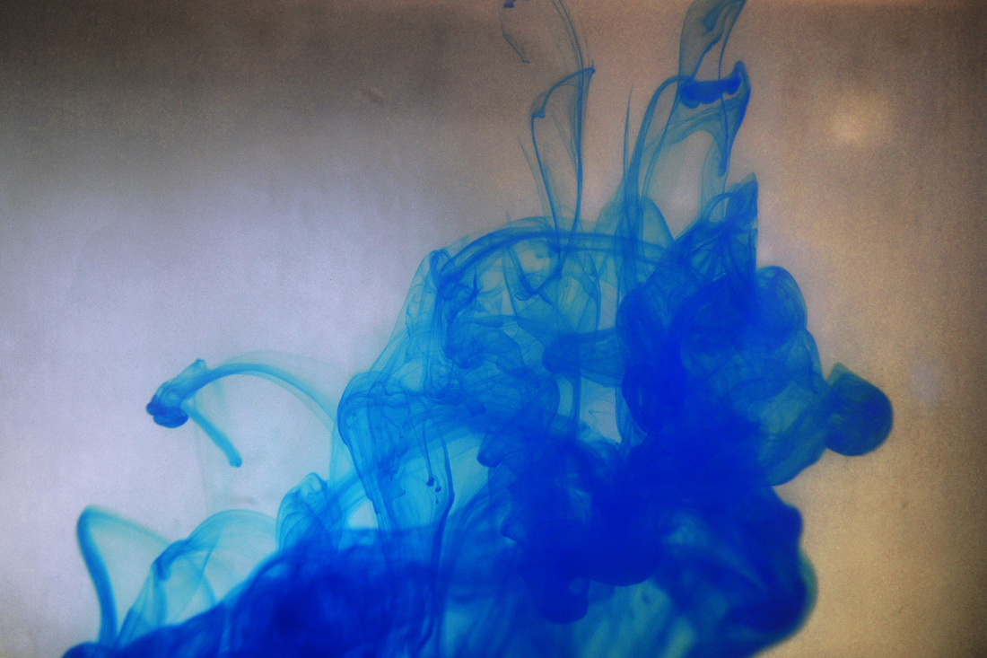
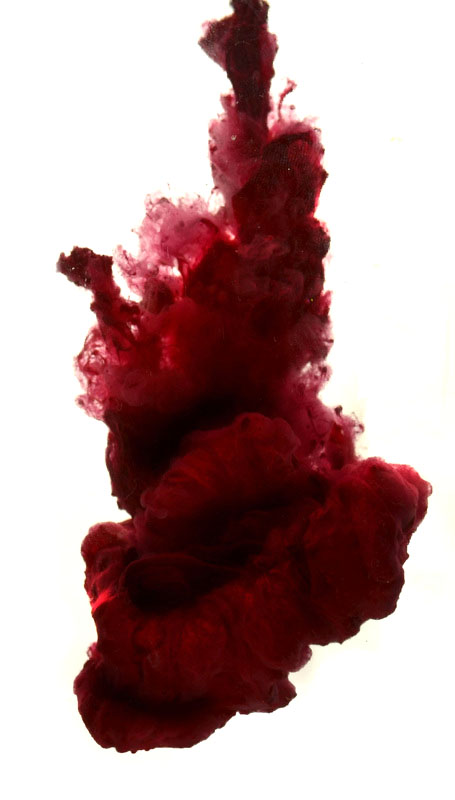
These photographs by Alberto Seveso are of ink in water. He says the photographs make him think about 'the possibility to stop time in a click'. The process of adding ink to water is will create an ever changing scene and so the photograph is just a split second view of an ongoing process. he has experimented with various inks and liquids to get the effect he wants and in these photographs he uses more than one colour together. This one is green blue and yellow and the ink looks very thick as the image created is solid and looks like an organ or body part almost. Process He has experimented with various inks, varnish and other types of liquid to create the image that he wants. He may have mixed them with water to thicken them. He also may have used a macro lens to allow the photo to be in focus and have depth to it. Then he edited the photo so that the individual colours look more vibrant. Keywords Organic. colour, mixture, liquid What ideas do I take from the artist? The idea of taking one photograph of what is an ongoing process so you can examine something that in reality is ever-changing. Also the mixture of colours is beautiful. Again it is using a close-up view to make an abstract picture by taking something out of context. |
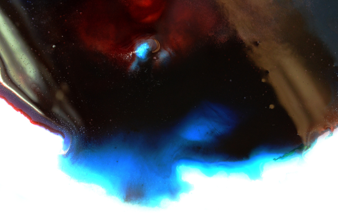
Mise en scene
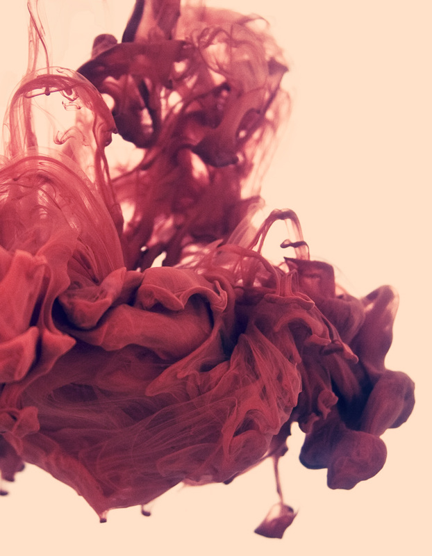
This next photograph uses the same process but is a single purple colour and not so solid looking. The ink also flows into the side and the top of the photograph and so the image is not contained. This makes the image look more like part of an ongoing process rather than an object. The lighting is particularly interesting in this photograph and it is almost translucent in places giving the image a ghostly quality. Process Same process as previous photo. Keywords Ghostly, light, transparent, flowing What ideas do I take from the artist? This image seems to be changing into something else and is more fluid that the previous photograph. I like to translucent quality and the way the colour spreads out across the image. |
Mise en scene
This last image is more like the first one. It looks solid and organic though in this case is red and green. As it is solid and the colour does not spread across the whole photograph it looks more like an object than part of a process. Again it is like an organ or part of an animal or plant. Process Same as first photo. Key words Organic, natural, creature, blood What ideas do I take from the artist? I like the idea in all these photographs of creating beauty from something that is not in itself beautiful. It is just a process, but by stopping time for a split second you can creat a beautiful image. Also the idea of creating an abstract view of something by using a still close-up photograph |
My Response
|
|
|
|
Selects
I like how on these two photos the blue paint separates inside the water. This created variety in the shades of paint. Because I had a light behind the paint, it meant more light could shine through the sections with less paint. This meant the blue colour changed shade in different parts of the photo. I also think the sense of motion was good. these photos were taken as the paint was moving down inside the jug. I think you can see this by the shape of the paint (ie how its less separated at the bottom of the photos and how there are small bits of paint separated at the top.)
|
|
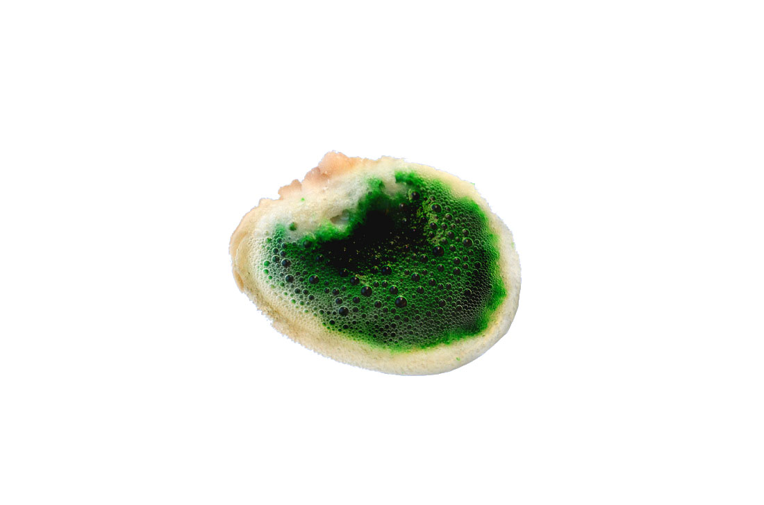
These photos came out very differently as to how the photos with blue paint did. This is because I mixed corn starch with the paint. This meant that it was thicker and so less sections of paint separated from the main body of paint. These photos are more similar to Alberto Seveso's work due to how the paint looks more bubbly and together. The effect of this is to give an abstract image that is does not look like what it actually is. The image looks more like a solid object.
I think if I choose to develop this strand I will try to focus on images like these.
I think if I choose to develop this strand I will try to focus on images like these.
|
|
Artist & me
His work
|
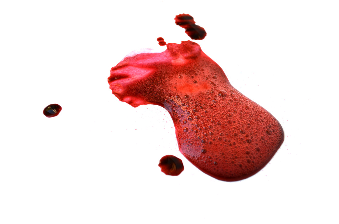
These two images are similar and both were made by taking a photograph of red ink in water. In my photograph the ink is mixed with corn starch. I am not sure what it is mixed with in the Alberto Seveso photograph. The composition of the two images is similar as the ink expands beyond the photograph frame. I think Alberto’s photograph is more successful because it has better lighting that shows the shapes formed within the ink. My photograph is interesting but a little dark in the ink part so the viewer cannot easily see the shapes and forms within the ink. The edges of the ink shape are similar in both photos and I think my image is successful as the shape is nicely framed within the photograph, similar to the Seveso image. Both images capture a tiny moment of a physical process that is moving and changing and create an abstract view of everyday process.
|

My work
|
Exhibition Visit
Nick Waplington and Alexander McQueen: Working Process
Nick Waplington and Alexander McQueen: Working Process
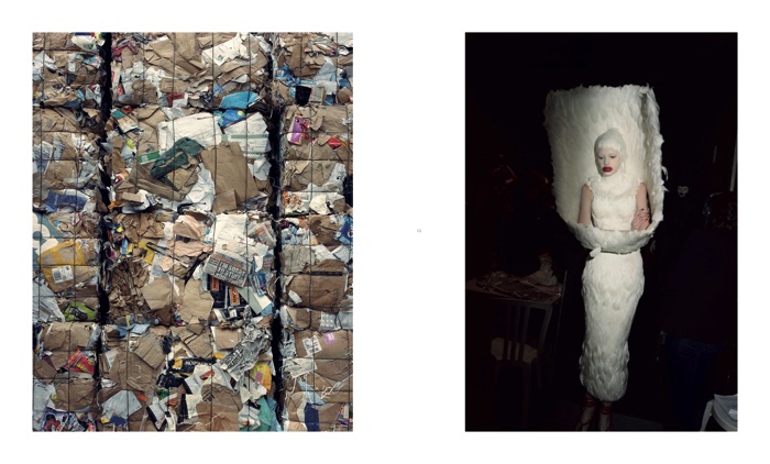
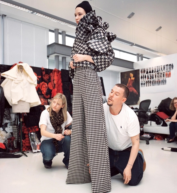
I visited the Nick Waplington and Alexander McQueen exhibition Working Process at Tate Britain. This exhibition is the result of a collaboration between the artist Nick Waplington and the fashion designer Alexander McQueen. Waplington is a well known photographer who has worked with the themes of class, identity and conflict and McQueen invited him to document the making of a collection in 2009. This collection was supposed to represent a retrospective view of McQueen’s career using patterns and fabrics from earlier collections. The photographs show images from the first fittings right though to the finished collection on show in Paris and are displayed alongside images of landfill sites and recycling plants. The exhibition shows two artists working together but also two processes working together - the design and manufacture of the clothes alongside where they may end up. The collection was called Horn of Plenty which was supposed to make a statement about the planet and the finite resources that they are, which also links into the idea of recycling shown the photographs. It is ironic that some of the the clothes in the collection that are supposed to look like they are made from bin bags are actually made from very expensive fabrics.
|
Mc Queen said that the collection was ‘a sackable offence’ , it was meant to be extreme and disagreeable. He said he wanted people to look at the clothes and think of over consumption and that the was referencing recycling’ in a twisted way”. He wanted to make people ask questions.
|
|
This exhibition was all about working together, but in lots of different ways. There are many ways that the theme could be interpreted with the 2 artists working alongside each other, or the 2 views of fashion being good or wasteful, or the idea of new and recycled clothing and fabrics. It was very interesting that there were so many interpretations that you could make yourself, rather than just being told what it all meant.
|
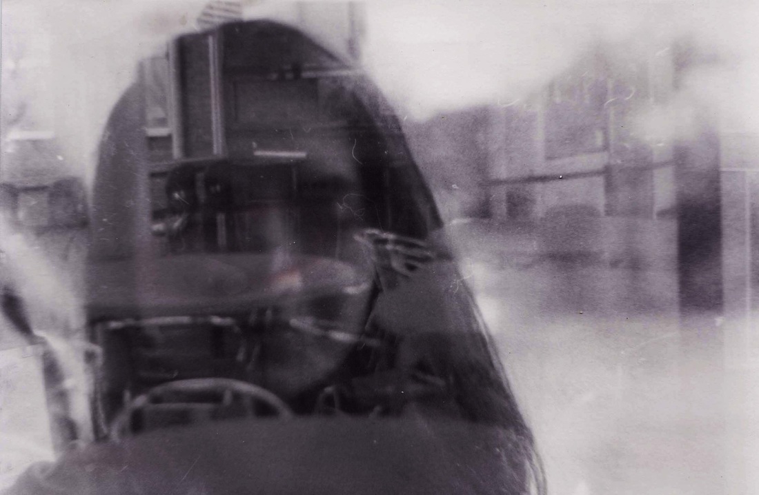
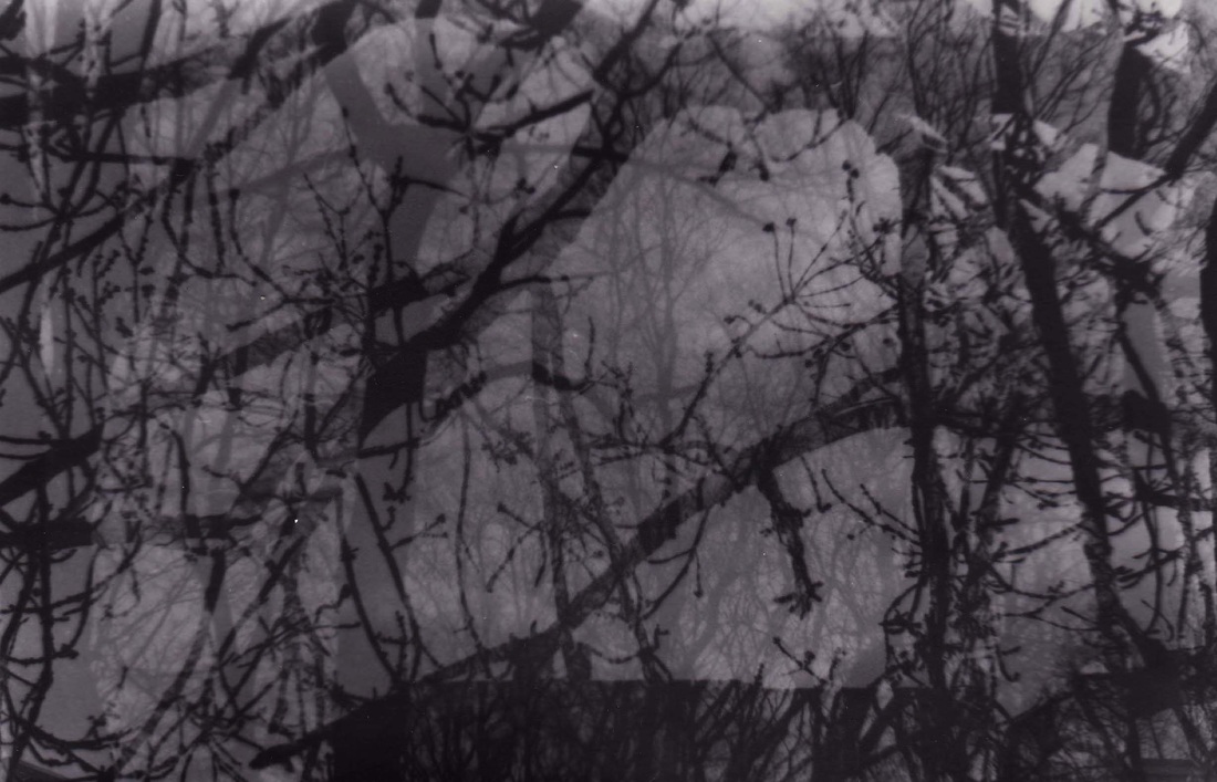
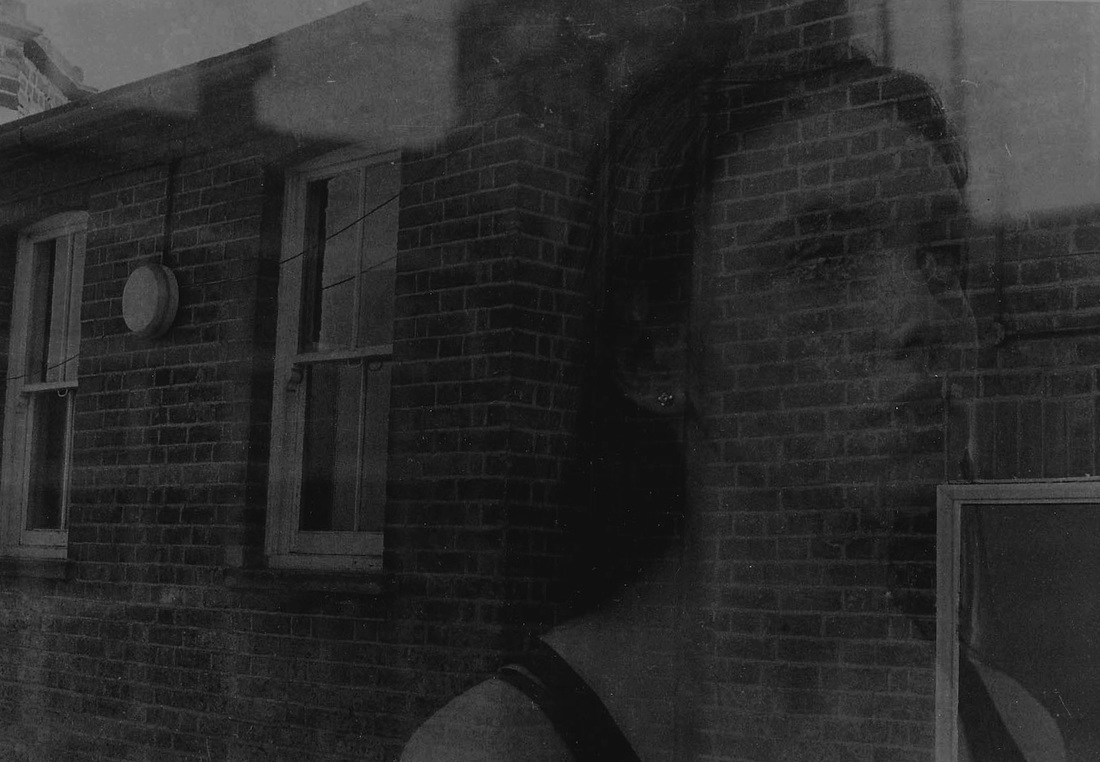
Third Strand
For my third strand I decided to exposure a roll of film twice, meaning that each image was double exposed. By putting two images together, you can create new, strange and unique images. I do not know how my work will turn out, but I think that adds to the unexpected and experimenting quality of it.
Artist Inspiration: https://feroce.wordpress.com/
Mise en scene
in this photographs double exposure has been used to show multiple images. The street scene to the right of the image is shown horizontally and so the building facades look like they are on the floor. To the right of the picture there is a view that looks like a park in winter with snow, trees and a gatehouse. The photograph is in black and white. There is a figure in the centre of the image and they are positioned almost where the two photographs meet. This makes you focus on the figure and you see the image as a setting for the figure. Process The image was created using film camera and using multiple exposure to create a multi-layered image. See process below from my response. Keywords grey, winter, isolation, bleak What ideas do I take from the artist? The idea of using multiple exposure to create images. I also like the idea of turning one image sideways as this can create an interesting effect. Using black and white makes a stark image and emphasises the double exposure effect. |
Mise en scene
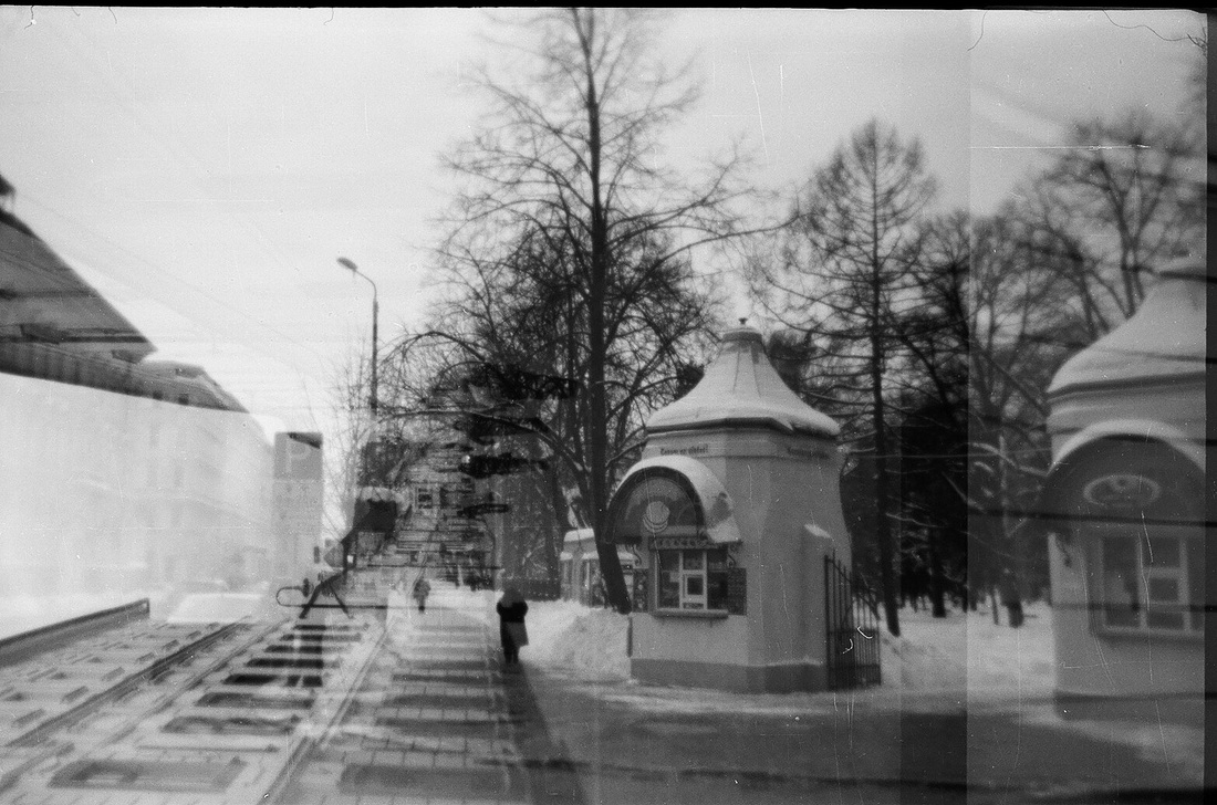
This is another multiple exposure photograph. It looks like there are more than two images. There is a photograph taken on a tram superimposed with a street scene in Riga. The image is black and white and the building are not modern which gives the image a slightly historical feel. This photograph also has a figure in the centre, who is sitting on a seat in the tram and the parts of the image to either side frame the person. The street scenes look almost as if they could be glimpsed through the windows of the tram and the overall effect is one of travelling on a tram and seeing fragments of views as they pass by. Process The image was created using film camera and using multiple exposure to create a multi-layered image. See process below from my response. Keywords travel, older, life, glimpse What ideas do I take from the artist? I like the idea of using double exposure to layer images and to create a new scene. The process using film is partly accidental as you don’t know exactly what image you are overlaying, or where parts of the images will appear. Using Photoshop you can arrange the images to create an effect but I think there is something magical about using film and double exposure as you don't know exactly what the outcome will be. |
Mise en scene
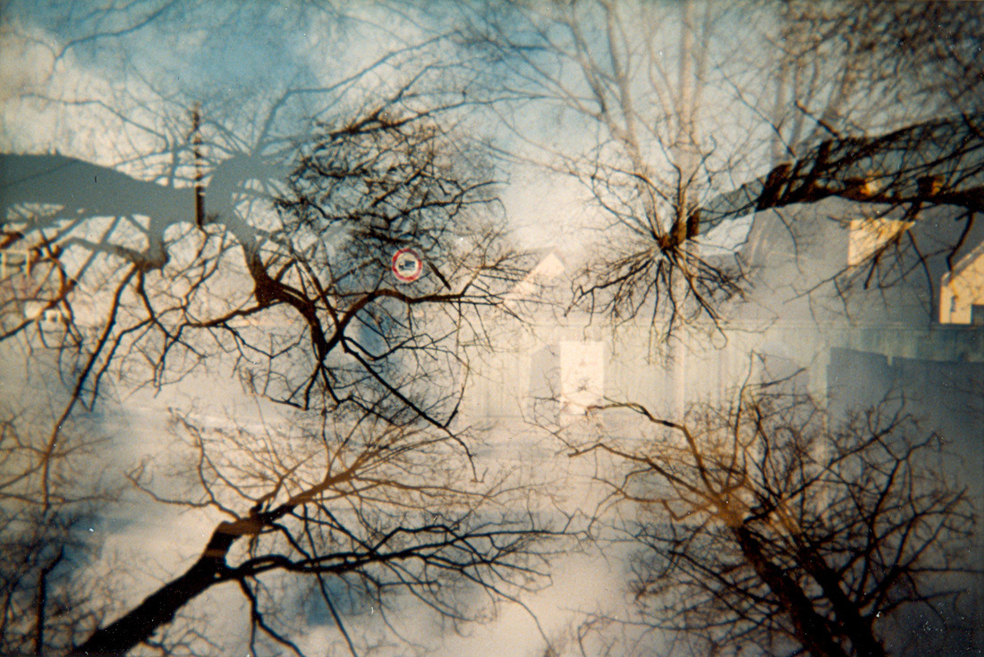
This photograph is different form the others as it is in colour. It also uses multiple exposure and it seems to show houses behind a fence superimposed with trees and sky. The sky is blue and this is the main colour in the image and so gives a feeling of light and openness. The trees are photographed looking upwards, which gives an interesting view (and links back to my architectural photographs where I looked up at buildings for the Apart:cut up work). There is a traffic sign in the centre of the image that is outlined in red and as with the previous images the positioning of an image in the centre affects the composition of the photograph and encourages you to focus on the central image. Process The image was created using film camera and using multiple exposure to create a multi-layered image. See process below from my response. Keywords nature, light, sky, clouds What ideas do I take from the artist? Using colour for double exposure is interesting and can create a different effect to black and white photography. This not something i am intending to do as part of this project as I am developing the photographs myself in black and white, but I may experiment with this one day. This image also makes me think about the angle at which the photograph is taken and how you can use double exposure with two different angles of view to create an interesting effect. |
My Response
Firstly, I took a series of photos using the whole roll of film. Then I winded this film out of the camera and then put it back in again so that when I took my next series of photos, they would be directly on top of each other.
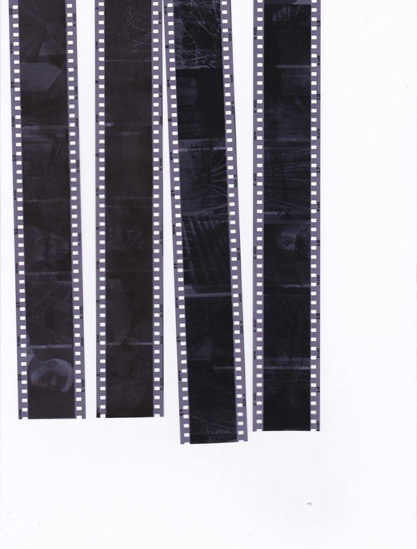
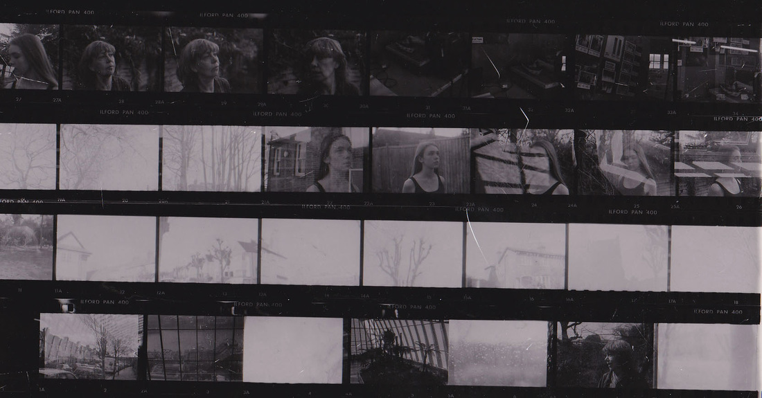
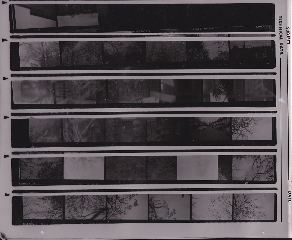
Here are my rolls of film with both the photos from the first photos I took and the second double exposed onto each other.
|
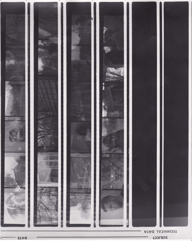
First contact sheet made, exposing different parts of the paper for different times.
|
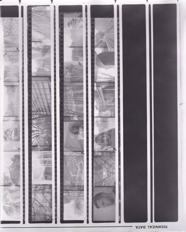
Second contact sheet made using an appropriate time to exposure the paper.
|
How I developed my film:
The first print I made was of my 4 rolls of film which can be seen above.
1. I put the rolls of the film in the enlarger and then put the photographic paper down on the enlarger to be printed on.
2. Then I placed a black piece of paper to cover the photographic paper.
3. Because this piece of paper, when I turned the light on the photo did not shine directly onto the photographic paper.
4. I adjusted the enlarger so that it was in focus and projected light which was the right size.
5. I exposed the first 1/5 on the photographic paper by moving the black paper along to the side.
6. I left the light shining on this section for a few seconds then moved the black paper again so more of the photographic paper was exposed.
7. I repeated this until the whole piece of photographic paper had been exposed.
8. I placed this is the first chemical, developer, for about 5 minutes. Then fix, for about 1 minuter then stop for about 5 minutes.
9. Then I rinsed the print and dried it.
10. I looked at which time of exposure worked best and repeated every step again but without using the black paper and just exposing the whole piece of photographic paper once. This gave me my second contact sheet which I then used to decide on which prints to develop.
11. Now I could make my first print.
12. I repeated all the steps with the black paper to once again see which time of exposure would be best for my first select. I did this on a strip of paper which can be seen below.
13. By looking at this I decided on an appropriate time to expose the first photo.
14. I repeated all the steps buy without using the black piece of paper to develop my first photo.
15. I repeated all the steps 5 times to develop 5 more selects, as can be seen below.
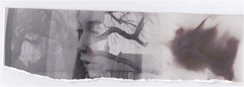
Test strip for first photo.
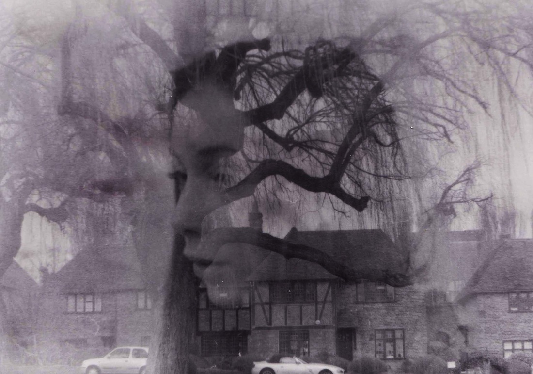
My first developed photograph.
The rest of my developed selects
|
|
|
|
|
I edited my selects using the dodge and burn tool to correct any areas that did not turn out how I wanted them to and to lighten and darken certain areas.
|
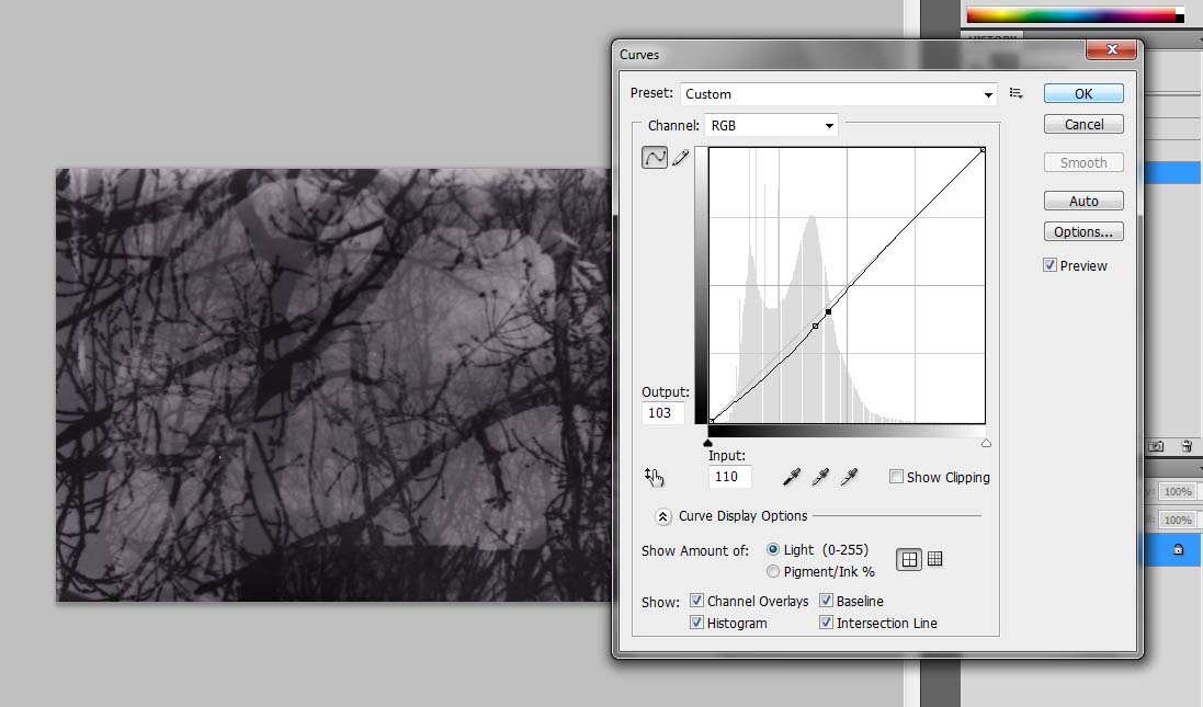
I also used the curves tool to adjust the contrast and tones of my images.
|
Second Observation
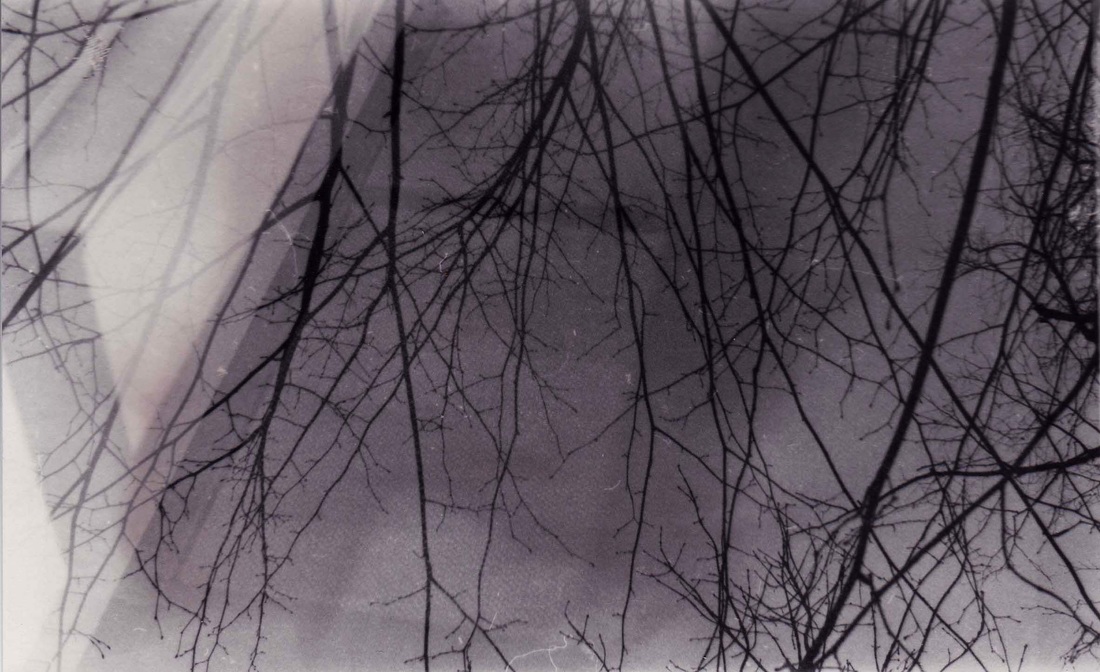
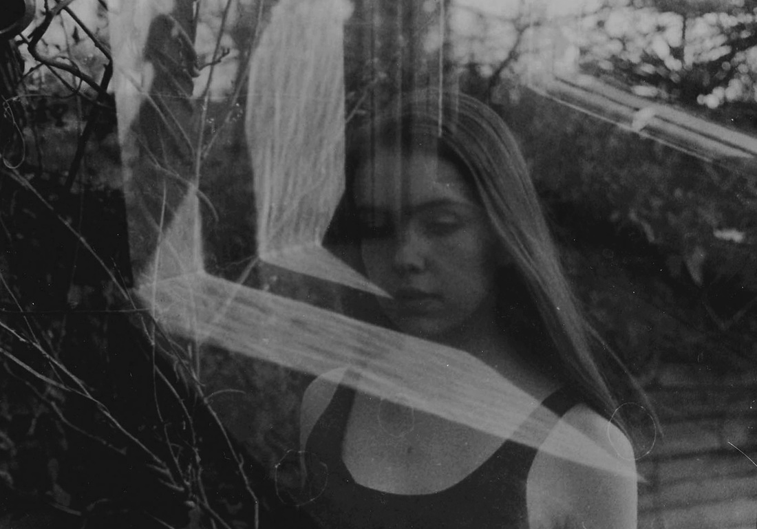
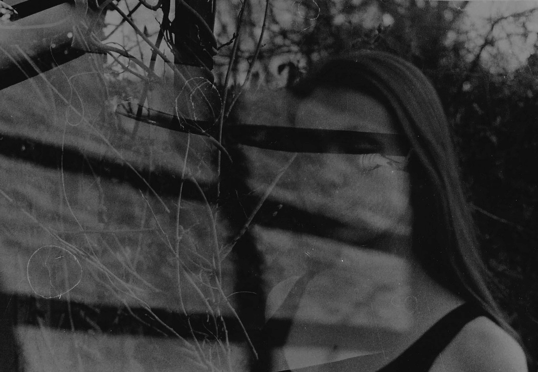
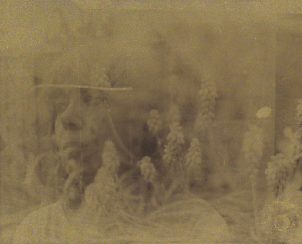
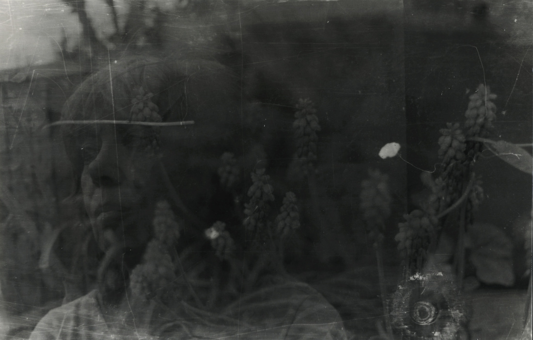
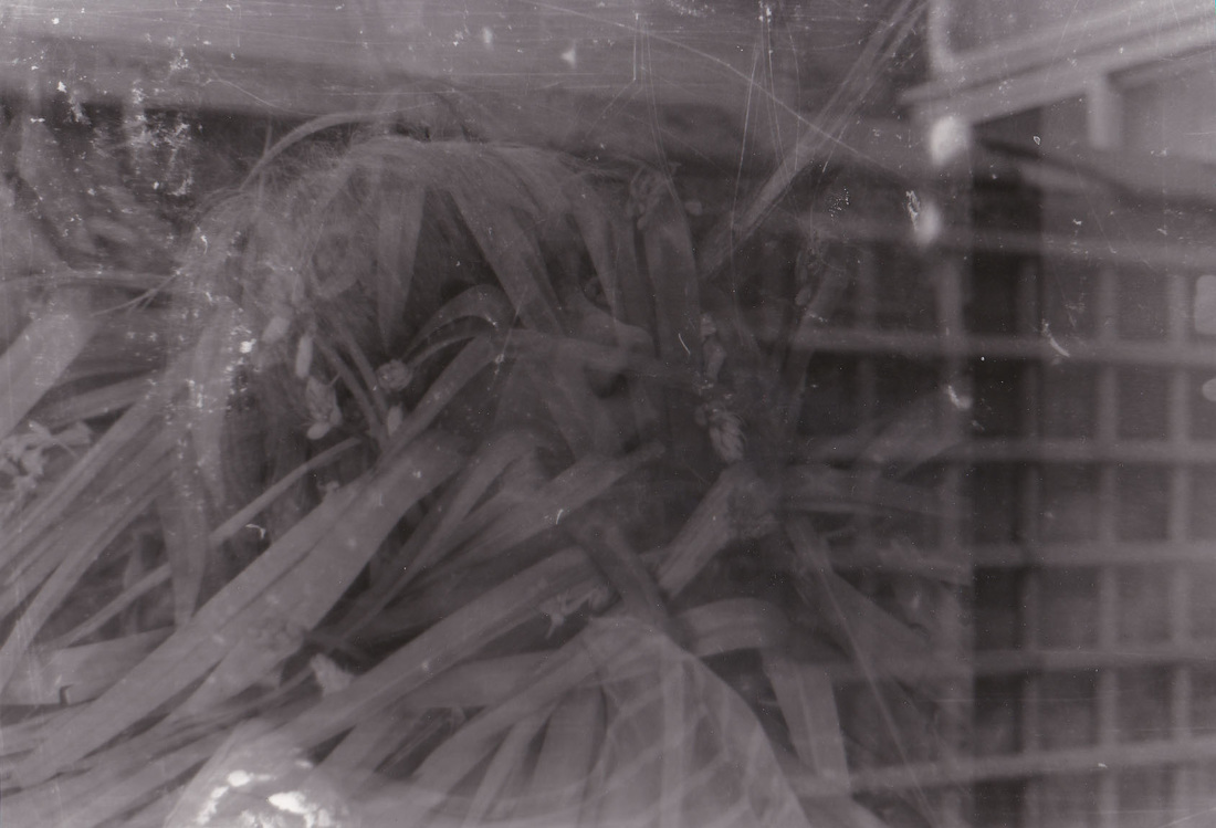
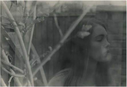
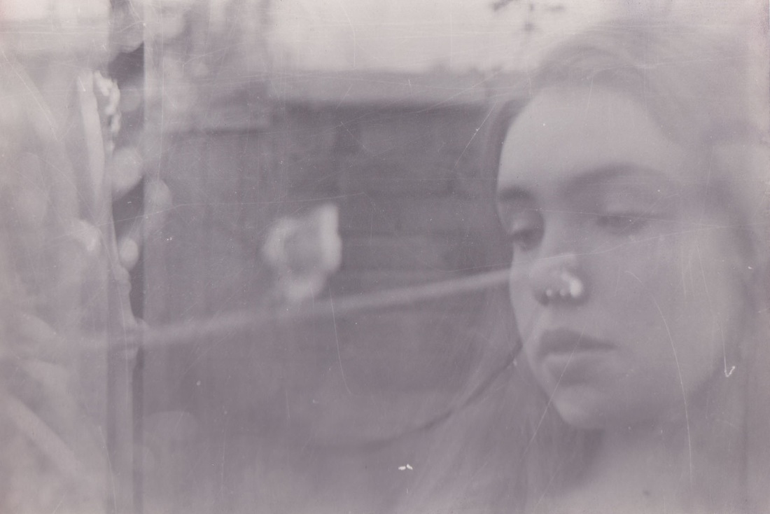
I repeated my first observation and took photos based on nature and then portraiture. The first roll of film I used I only took photos of trees, plants, flowers, light etc and then when I exposed the film again I took portraits. This meant that the nature was double exposed with the portraits.
For the portrait photos I used a shallow depth of field by using a wide aperture so that the background was blurred. This can be seen where there is bokeh on the third and fourth select.
For the portrait photos I used a shallow depth of field by using a wide aperture so that the background was blurred. This can be seen where there is bokeh on the third and fourth select.
Selects

|
|
Contact sheet
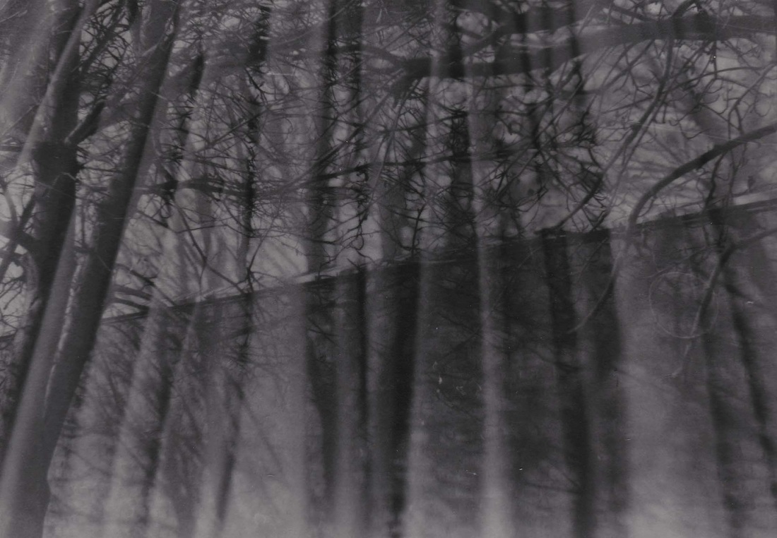
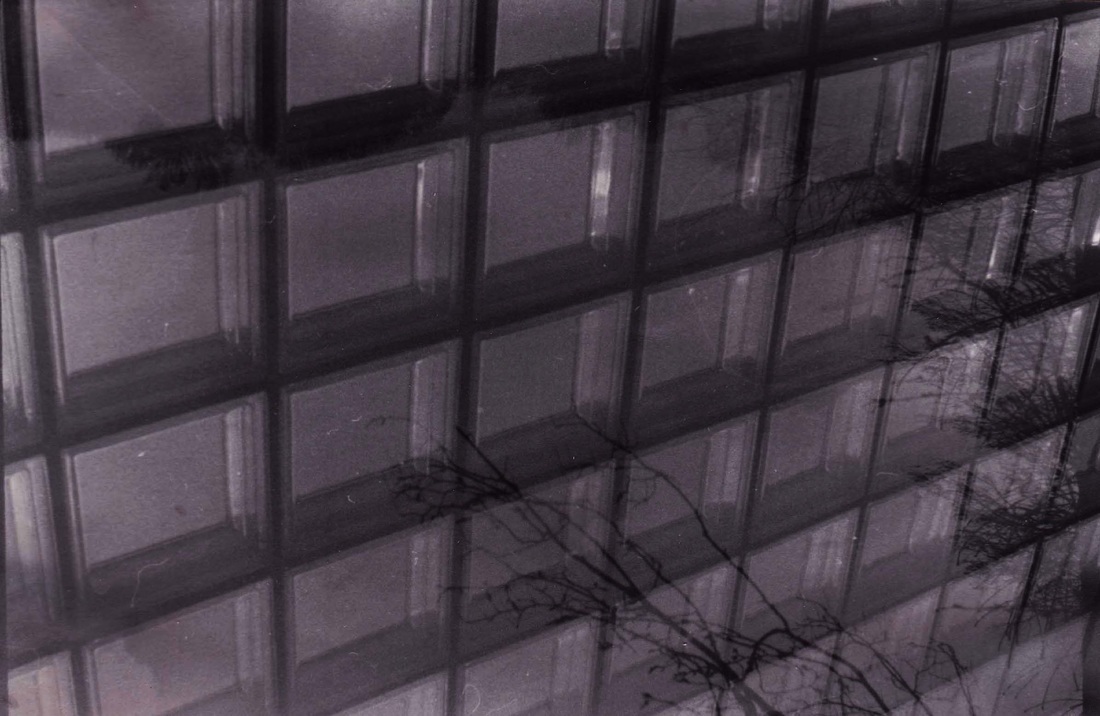
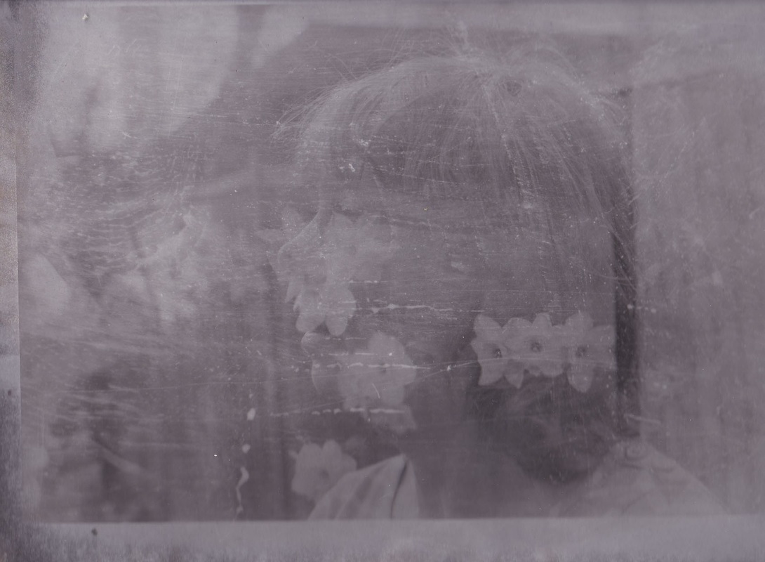
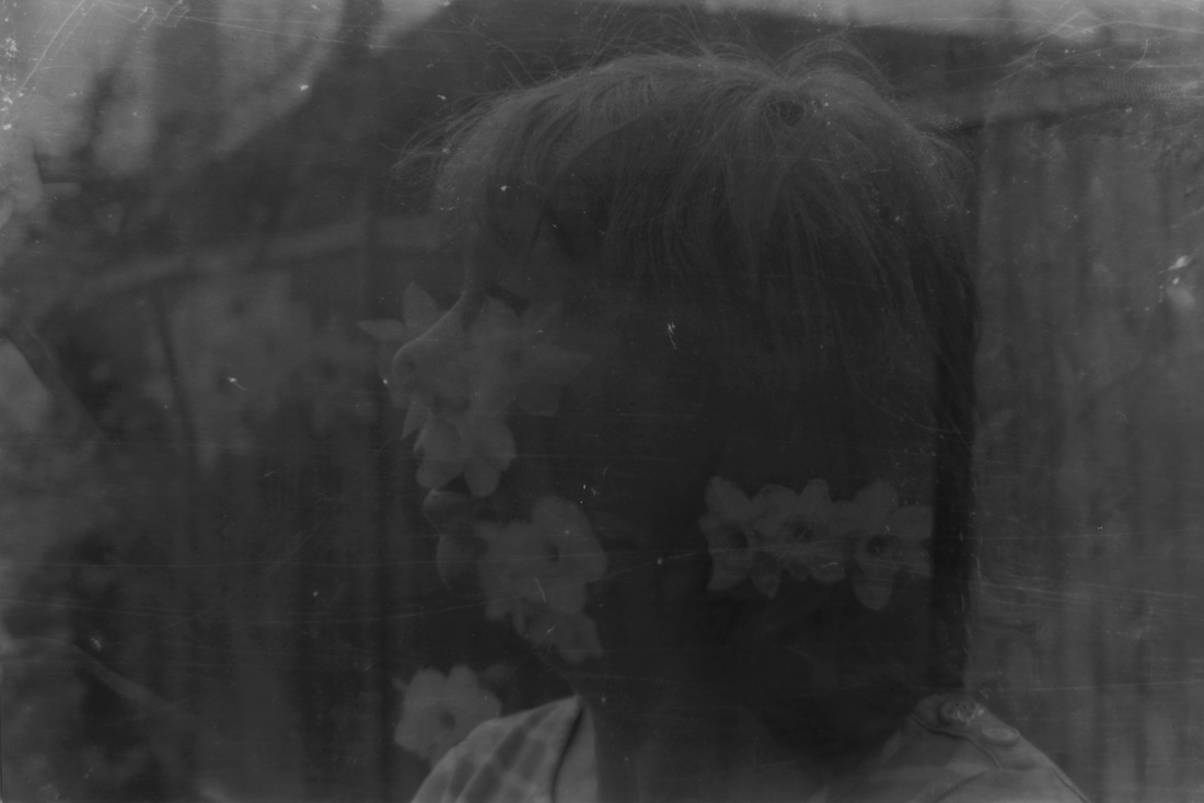
Third Observation
I developed my first two observations and used the film camera for a third time to create a third observation of double exposure on film. Once again, I took photos relating to nature for my first roll of film and then portraits on the second roll of film.
Whilst developing these photos I experimented with different types of paper and the different outcomes of these.
As seen here, this is the same photo but developing using gold paper and then ordinary photographic paper.
As seen here, this is the same photo but developing using gold paper and then ordinary photographic paper.
|
|
Here the paper I used on the left creating a harsh, scratched look whilst on the right the print was clearer.
|
|
Here are my other selects.
|
|
|
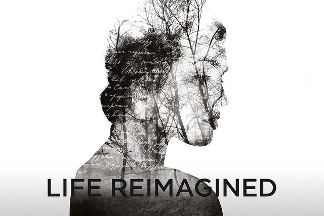
Inspiration: Life Reimagined Poster
I saw this poster when I was traveling on the tube. It is from an advertising campaign for the Royal Opera house. The images and a video that is on the ROH website use the same effects that I used in my photography project with images overlaying each other. I imagine the ROH poster images were all done using Photoshop. The poster has multiple layers of a head, trees and writing which are overlaid to create the final effect. The other images I found on their website have also been created with multiple images.
|
|
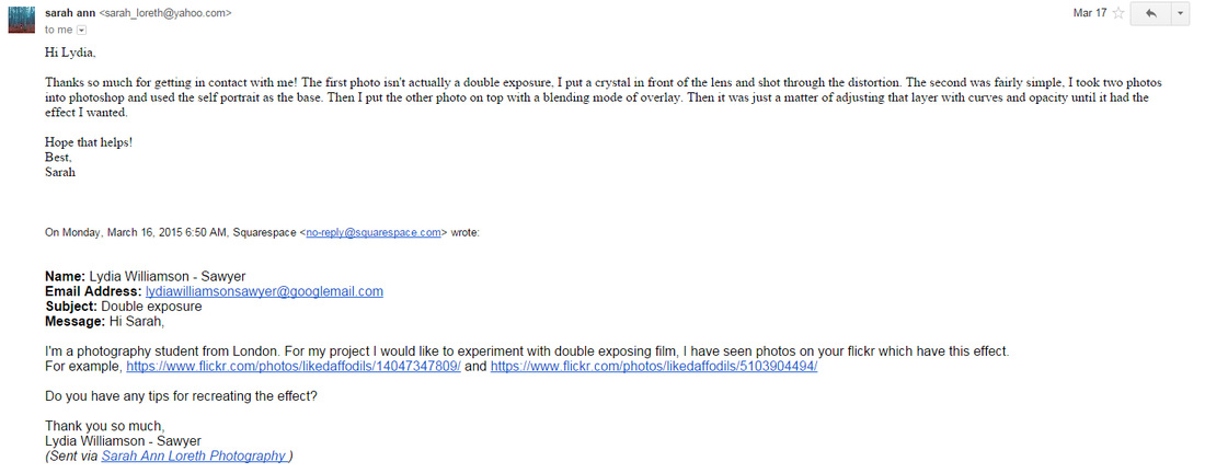
Sarah Ann Loreth Correspondence
I decided to develop my project into looking a creating a double exposure effect digitally. One of the things which inspired me to do so was Sarah Ann Loreth.
I emailed her asking her for tips on how she created her double exposure photographs. She responding explaining what she did, which was helpful for my development.
Here are the two photos I was inspired by and asking her about.
I emailed her asking her for tips on how she created her double exposure photographs. She responding explaining what she did, which was helpful for my development.
Here are the two photos I was inspired by and asking her about.
Mise en scene
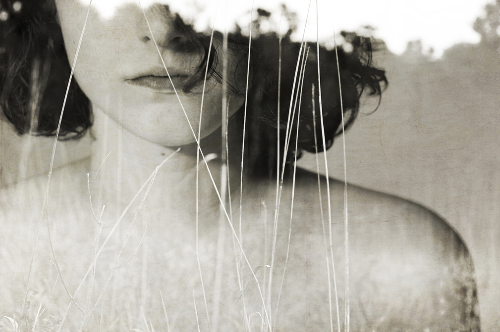
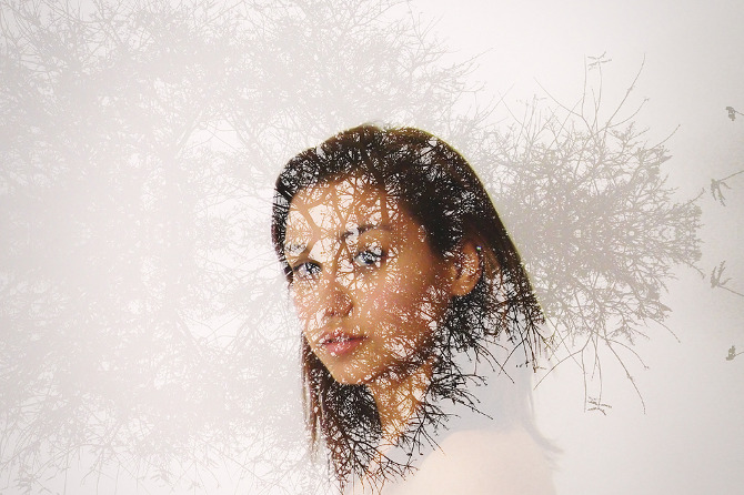
In this photograph a face is overlaid with another photograph that looks like grass and maybe trees. It is an interesting portrait because as well as the overlay effect, only the bottom half of the face is shown. The combination of the half-portrait and the overlay makes a great picture that inspired me to try to experiment with double exposure using portraits as well as other images. Key words Face, enigma, nature Process Two separate photographs are overlaid using Photoshop. What ideas did I take from the artist? This is one of the images that inspired me to try to experiment with double exposure using both Photoshop and film. |
Mise en scene
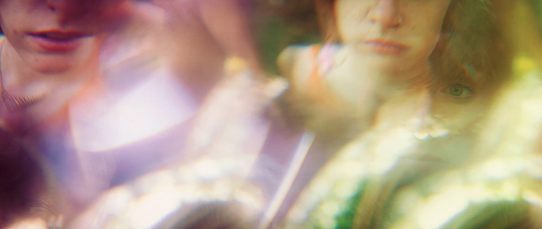
When I found this photograph I thought it was made using double exposure but as Sarah Ann explains in her email it is actually shooting through a crystal to get a distorted effect. The colours are soft because of the distortion, exposure and lighting. The effect that is achieved is almost like movement. The images look blurred as if the people are moving. As with double exposure the image itself becomes something new and different. Key words Colour, movement, people, light Process Taking a photograph through a crystal to get a distorted effect. What ideas did I take from the artist? I like the idea of a portrait that is altered, not juts a normal view of face. In this photo in particular I like how you are seeing many sides of something all at once. |
Development
Artist Inspiration: Andre De Freitas

Mise en scene
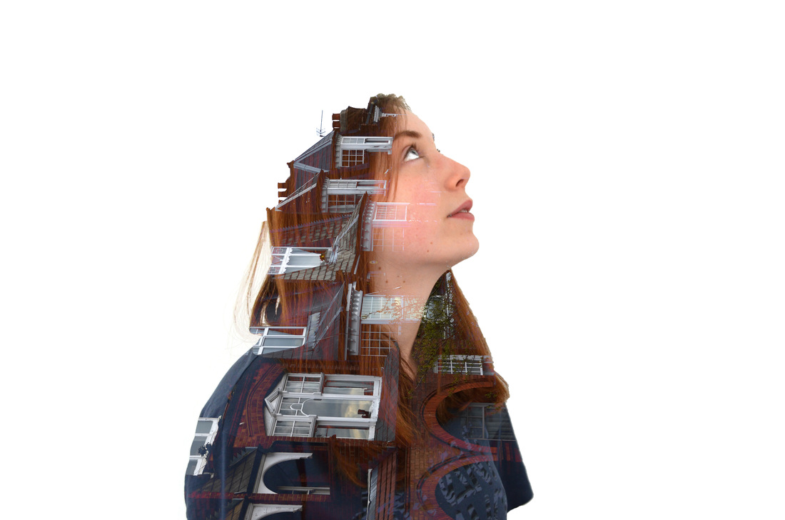
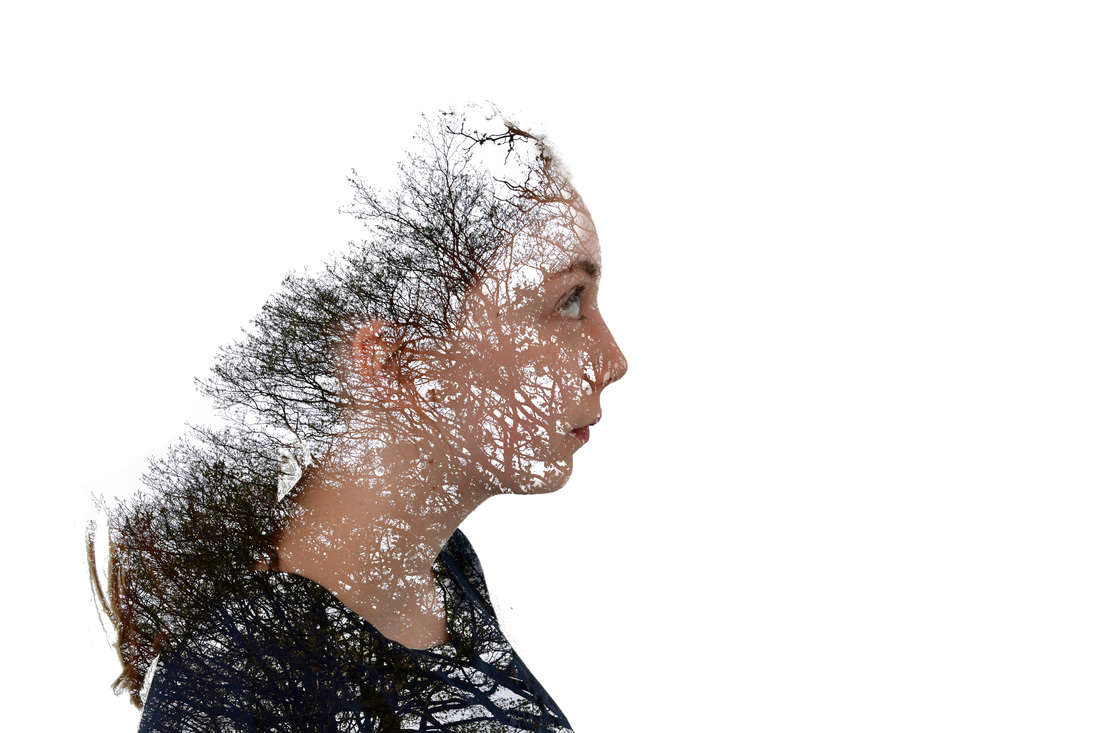
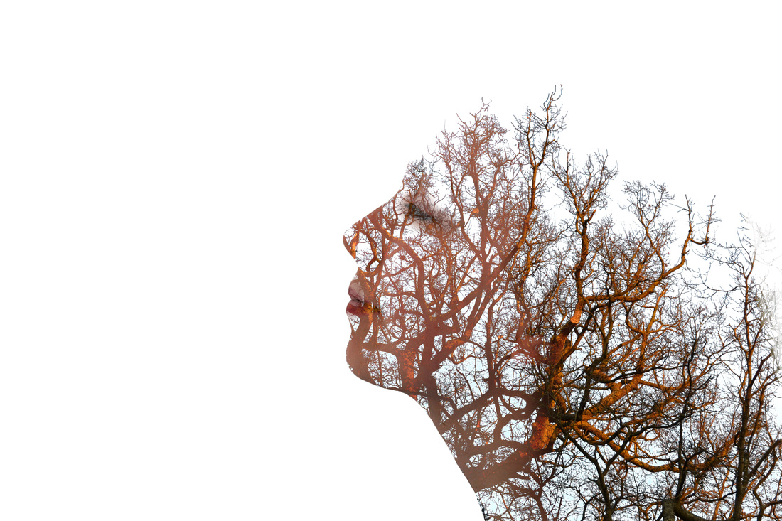
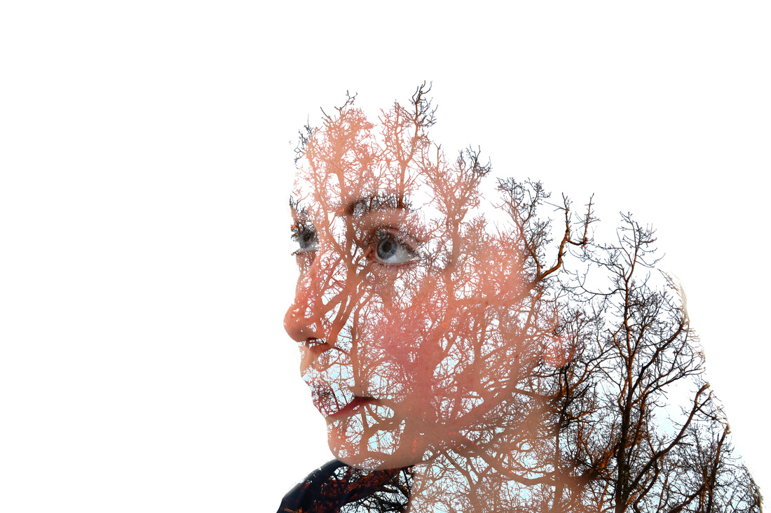
This is an image of a person in profile and an image of a city has been superimposed. The images have been adjusted so that the profile is kept and the city fills in the the person’s chin and body. The photographer, Andre de Freitas, is from Peru and the city looks like it may be in that country. The image is black and white. He describes himself as an illustrator and occasional photographer and this image does look almost like a drawing as the image has been manipulated to create an effect. Using a person and city means that the image can be seen as an illustration of a person within city, part of it but separate. This links in to the theme of Apart and/or Together. Process Freitas took 2 images and then using Photoshop, layered them on top of each other. Then lowered the opacity of the layer on top to create the double exposure effect. Keywords Inhabitant, city, alone, person What ideas do I take from the artist? I like the idea of manipulating an image like this to create an effect that uses double exposure to make a new picture.This is not just accidental overlay, or even overlay that this designed but meant to look accidental, but is purposely designed to create an effect. |

Mise en scene
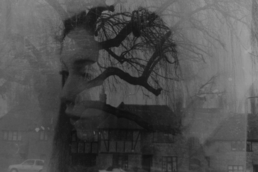
This next image is a colour photograph of a woman’s head which is superimposed with a black and white photograph of a tree. The picture of the woman’s face is still clearly visible and the tree creates an lace-like effect over her face. The photograph is still a portrait even though it has been manipulated using the double exposure style. The woman’s body is not clearly visible and so her head seems to float which with the tree overlay gives the image a slightly ghostly look.It made me think of someone ‘with their head in the clouds’. Process Freitas took 2 images and then using Photoshop, layered them on top of each other. Then lowered the opacity of the layer on top to create the double exposure effect. Key words Face, tree, floating, airy What ideas do I take from the artist? This is a beautiful image and an interesting way of creating a portrait, where you can still easily identify the person but make adjustments to create an effect. The idea of suing colour and layering it with black and white is also interesting. |
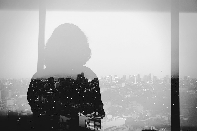
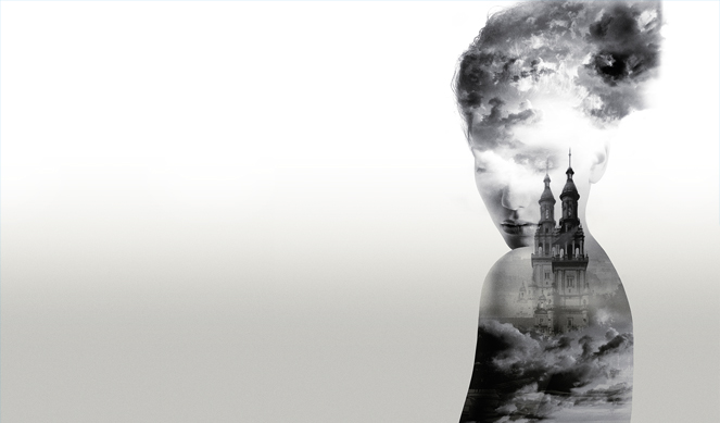
Mise en scene
This is a black and white image of a person in outline and a city view. The person looks like they could be standing in front of a window with the city view shown through the window, but the city is in the foreground over the lower part of the person’s body. The image of the city that is over the person’s body is much darker and clearer than the surrounding view and so emphasises the outline of the person. The photographs look like they were taken at night as the buildings appear to have lights on which create a sparkly effect on the person’s body. The line of the horizon cuts horizontally across the image, with the upper part just showing the person’s head in outline against a clear grey sky. Process Freitas took 2 images and then using Photoshop, layered them on top of each other. Then lowered the opacity of the layer on top to create the double exposure effect. Keywords Night time, tall, buildings, lights What ideas do I take from the artist? The idea of creating an image where the viewer is not sure what is in front and what is behind. also using a night time image - or making it look like night time - to create an effect. I also like the idea of using the outline of a person’s body or head to create an edge that then can be filled in with another image. |
How I made the double exposure effect on Photoshop:
|
I followed this tutorial which outlined the technique used for double exposure on Photoshop.
|
1. I took portraits and photos of nature.
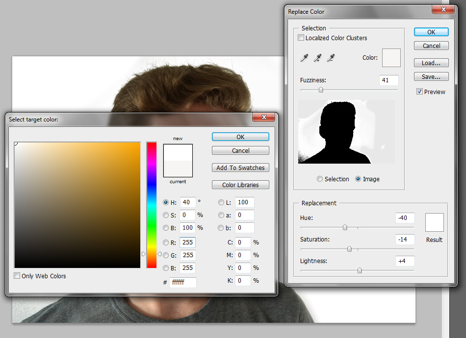
2. I used the replace colour tool to turn the creamy background to plain white on the portrait photo.
|
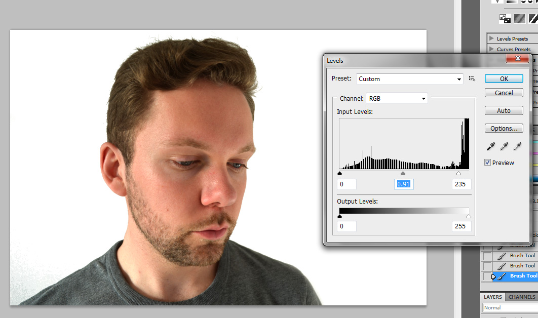
3. I used the levels tool and dragged up the right hand lever to make sure the background was completely white.
|
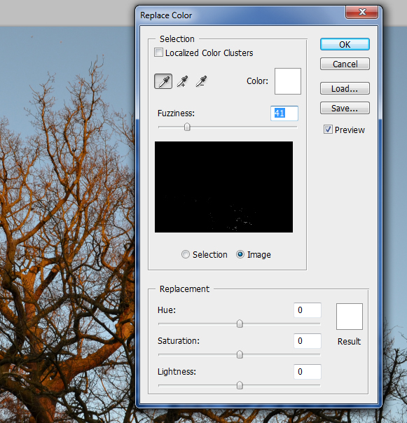
4. I opened an image of a tree which I took and used the replace colour tool to make the blue sky a lighter more white colour.
|
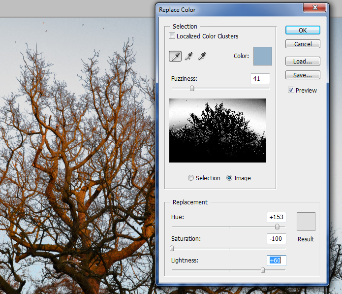
5. Using the replace colour tool I adjusted the lightness to +60 and the saturation to -100 so that the sky was as white as possible.
|
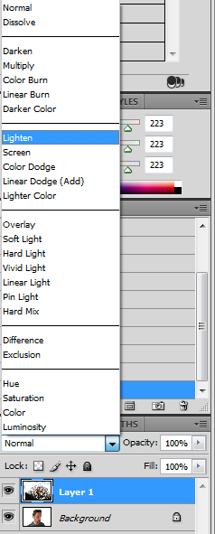
6. I then pulled the tree layer over so that it was on top of the portait image. I set the blending mode of the tree layer to 'Lighten' so that only the tree was visible and it created the double exposure effect.
|
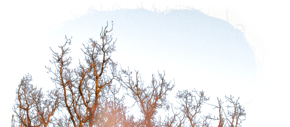
7. However, due to the fact that on the tree layer the sky was still slightly blue tinted there was a blue line around the top of the trees.
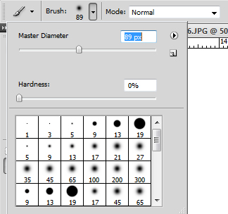
8. I removed this by using the brush tool at 89 px and 0% hardness so that I could easily remove just the blue area.
|
9. I merged the layers so that I could edit the photo as a whole.
|
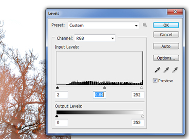
10. I adjusted the levels of the photo.
|
Selects
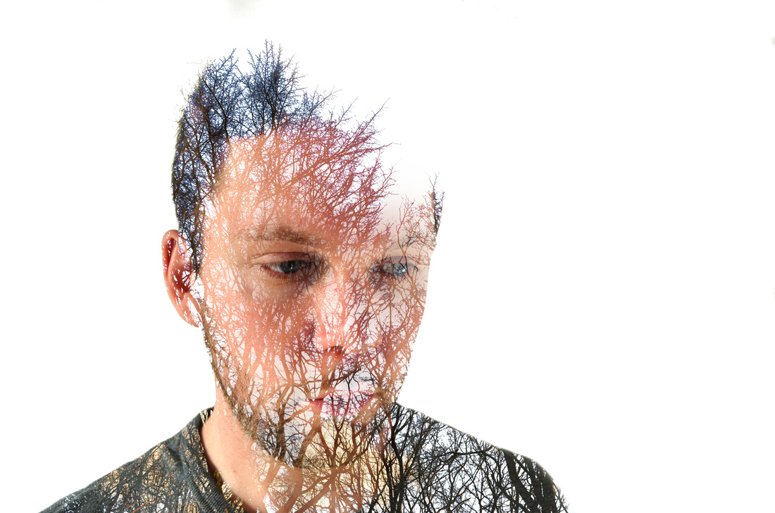
|

|
Artist & me
|
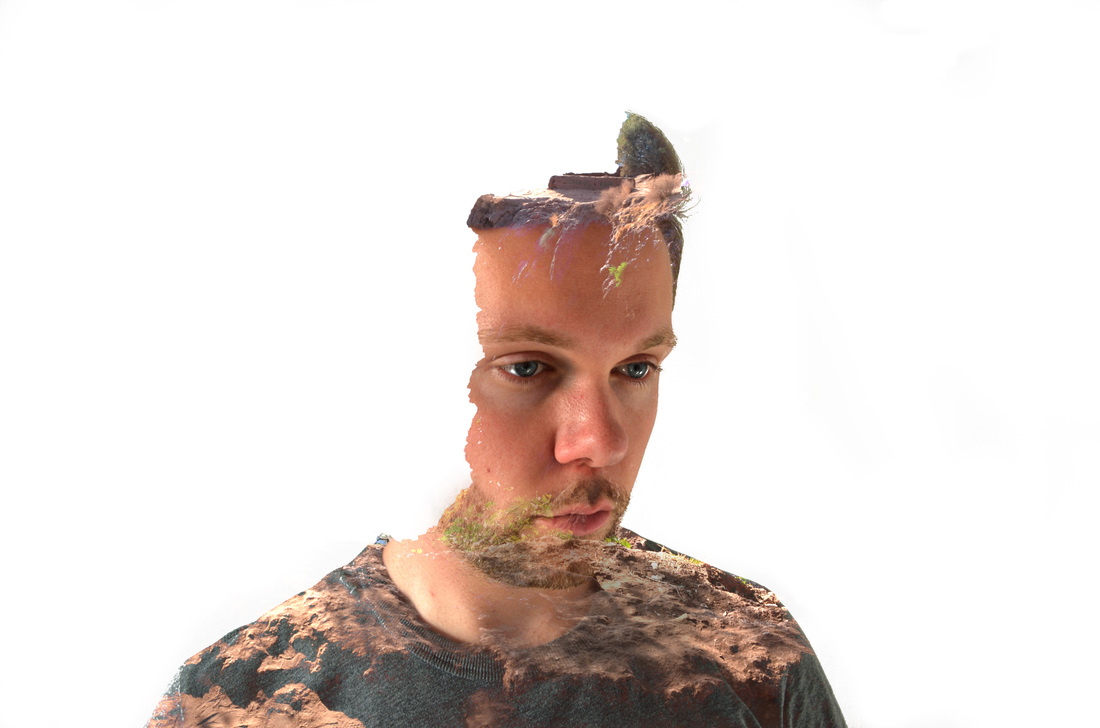
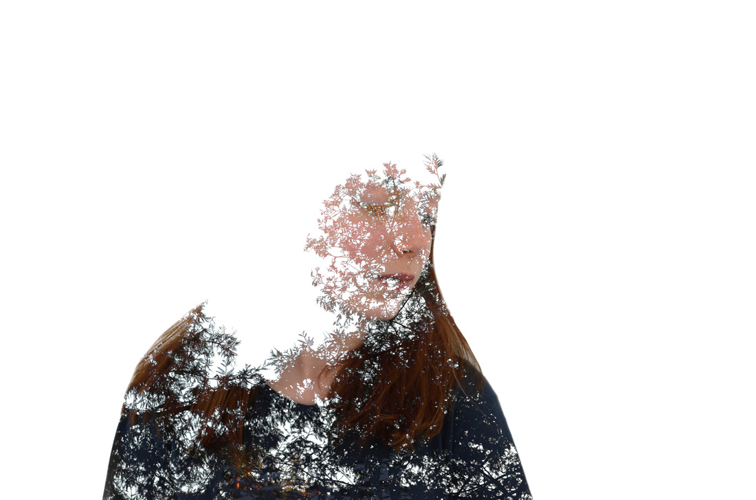
In the de Freitas image the photograph of the tree covers the whole frame and the woman’s head is overlaid by the other image. The head and face are clearly visible and the tree overlay is more apparent when it is over the head due to the contrast. I experimented with various approaches and my image has the second layer of the tree just within the perimeters of the man’s head and shoulders. His head is fragmented and slowly turns into trees. The image is solid at the bottom and disintegrates as it rises. I liked this interpretation of the de Freitas approach as it seemed to fit with my image and the shape of the profile. The similarities are strong but I think in my interpretation the image of the man is more transformed.In the de Freitas image the face is seen through the tree and the tree is like a mask or a filter.
|
|
Development on Digital Double Exposure
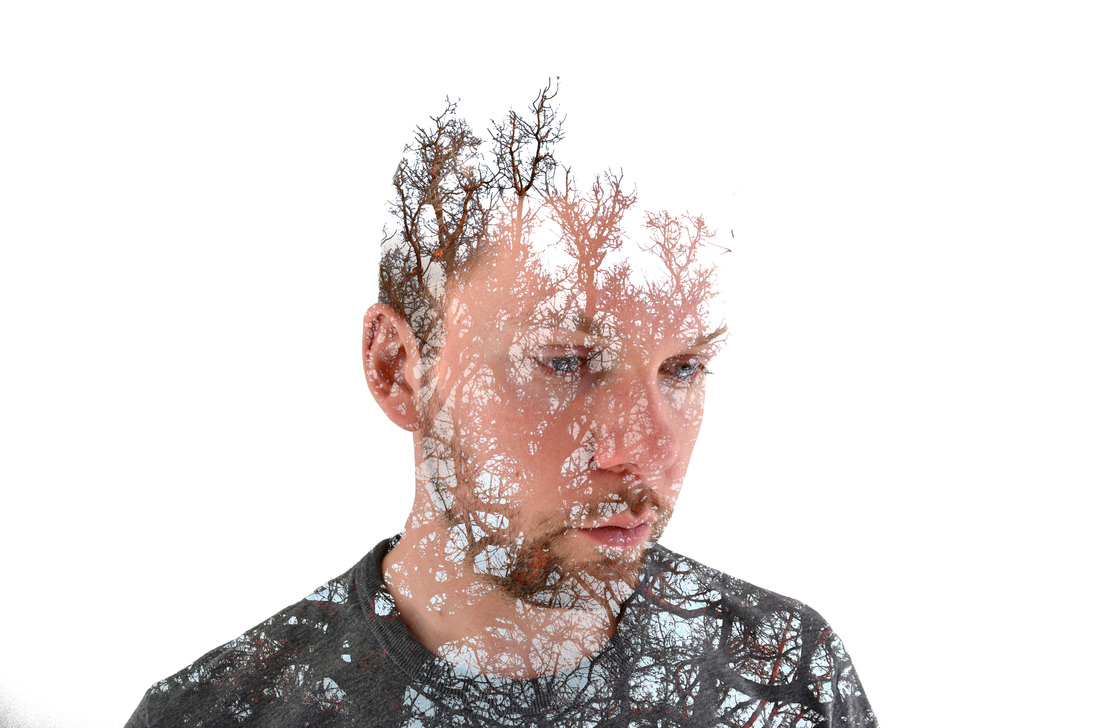
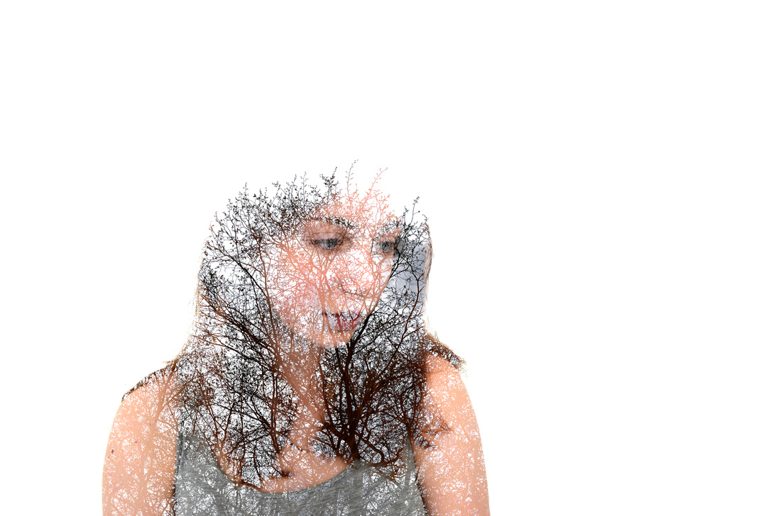
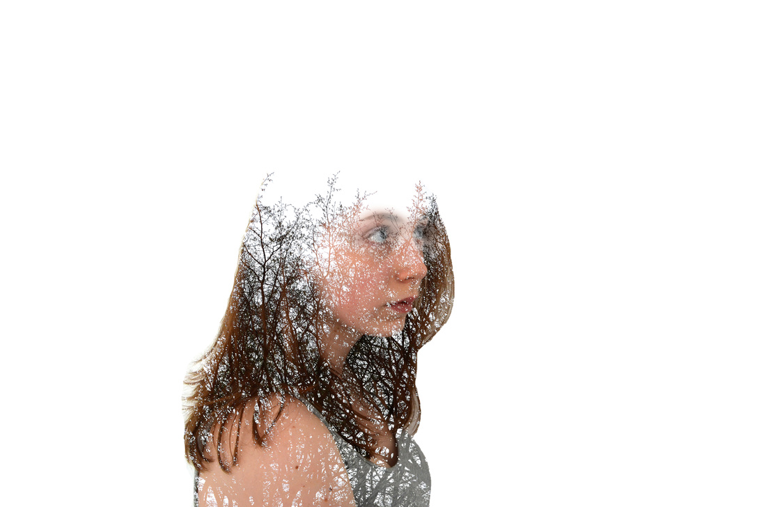
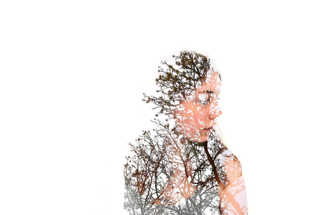
I did a second observation of digital double exposure following the same steps on Photoshop.
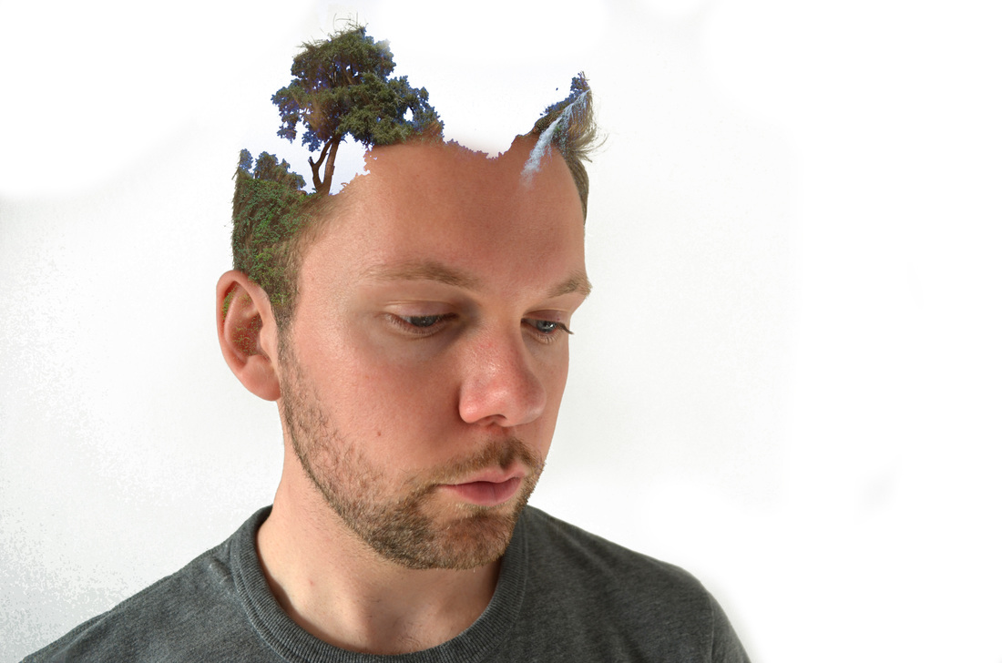
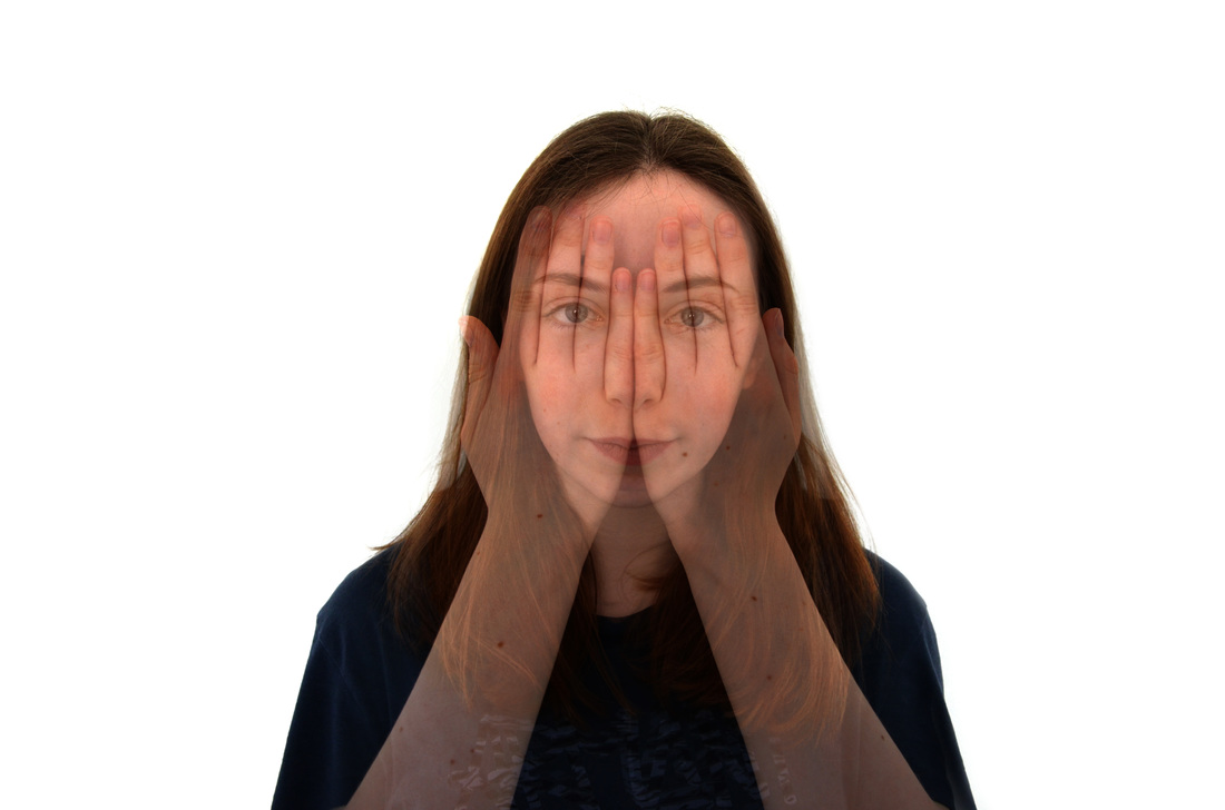
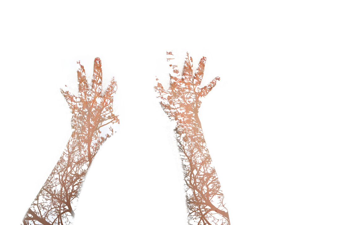
This time I used photographs of a friend and photographs of trees and tried to overlay and blend them in various ways. I wanted to keep the outline of the portrait and fill the shape with the overlay. I also experimented with losing part of the person and slowly blending their image into the trees, so it looked like they were transforming from one thing to another. I tried using my friends arms and hand instead of her head too.
I experimented using a street scene instead of trees, but I think the trees were more successful.
I tried taking a photograph of her face and then a photograph of the same view but with her hands in front of her face, then I superimposed the two photographs using Photoshop. I think this works well and creates an interesting image.
Selects

|
|
|

|
|

|
|
|
|
|
Final Piece
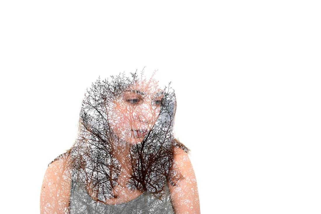
I select my most successful selects from my 5 double exposure observations for my final piece.
Digital double exposure
|
|
Double exposure film

|
|


|


|
Conclusion
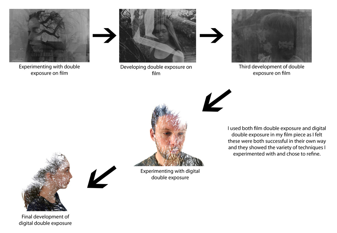
Throughout my Apart and/or Together project I have experimented with various interpretations of the theme. For example I have looked at chemical reactions, portraits, paint in water and double exposure. I used the set tasks as a starting point to develop my three strands from. I then experimented focusing on my three strands and refined them by developing my most successful observations. This led me to my final piece on double exposure. I did multiple developments of this including digital and film work which ensured a broad range of representations of the theme. I then refined this and chose my most successful images from my final piece developments to use as my final piece.
During this project I have learnt how there are many ways to present a certain theme and the processes I carried out to do so. In the earlier strands I experimented with ink and paint in water and chemical reaction using film and still photography. I also used close-up and magnification to create interesting images. It was also very interesting to experiment using the dark room, as this is something which I did not focus on in my previous coursework projects. I investigated the different ways of creating images digitally and using film. I also explored the effects that could be achieved with each method. In my film work I used a variety of materials and methods to produce a range of outcomes. When I based my work on Photoshop I created images using different methods to overlay and blend images.
The images I chose for my final piece reflected the range of the work which I had developed. I chose digital and film based images as I felt both were successful in different ways and showed the variety of techniques that I used. The film images were more experimental and raw as the two images overlaid occurred partly by chance and partly by previous selection. Whereas the digital images were carefully manipulated to create a particular effect. The two methods show different ways of working to achieve the overlaid effect. I find it interesting that these two methods based on the same principle of creating a double exposure image created such a range of final results and I think these two approaches work together because they are linked by the topic even though the resulting images are different.
